Last updated: December 14th, 2020 at 17:16 UTC+01:00
SamMobile has affiliate and sponsored partnerships, we may earn a commission.
Reading time: 8 minutes
There have been six iterations of One UI over the past two years. While they all brought minor UI changes, we haven't seen any substantial changes since then. That's not the case with One UI 3.0. Samsung has overhauled the entire user interface to make it look more modern and work well with the new functionality offered by Android 11.
We have had our hands on the One UI 3.0 beta for some time now and have been combing through it for all of the changes that have been made. We'll continue to update this list as and when we find something else. That remains a possibility until the final public release of One UI 3.0 which will take place before the end of this year.
Compared to earlier iterations, One UI 3.0 is more polished and refined. Samsung has made a conscious effort to making it look more sleek. Everything is a bit more tweaked for ease of use on taller screens. We quite like the look and feel of One UI 3.0 and believe that many Samsung fans will be too.
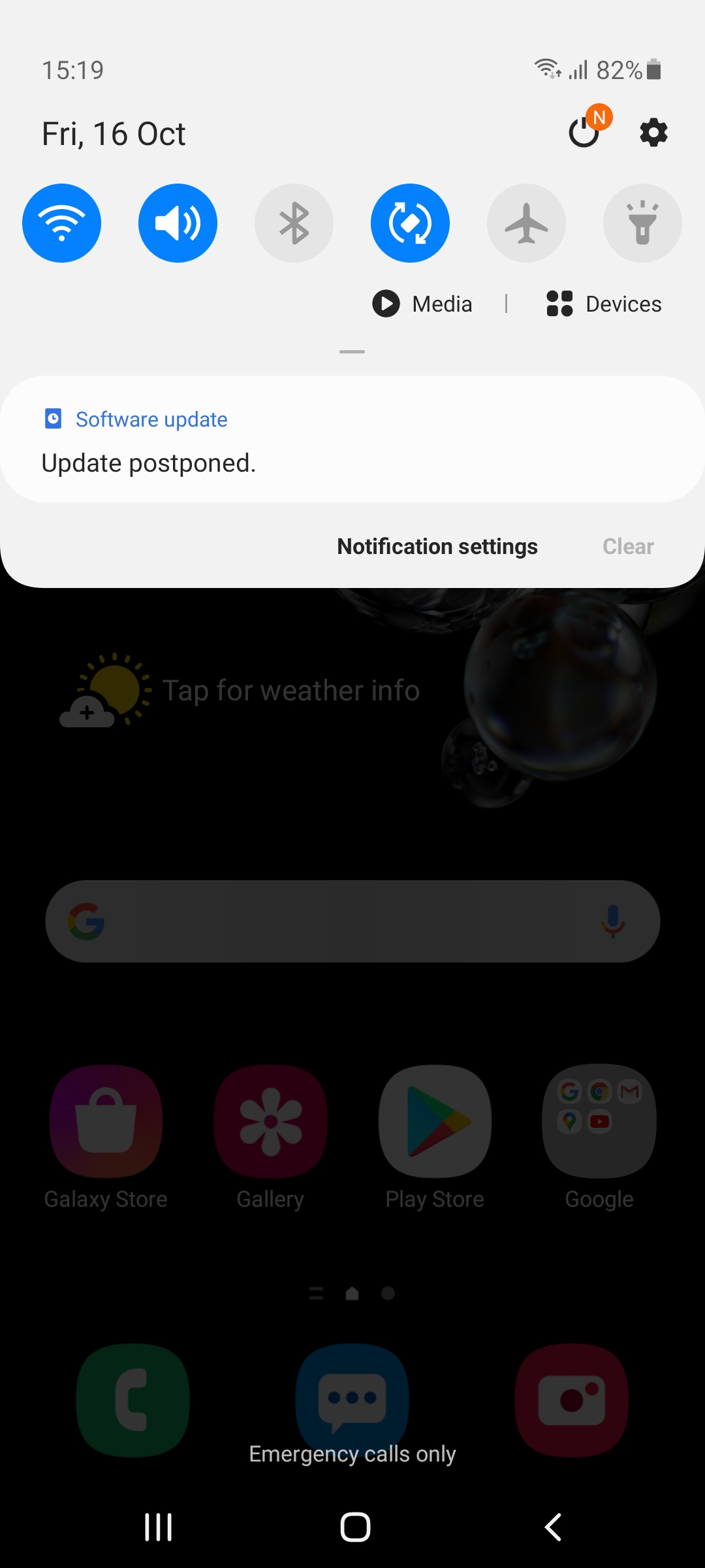
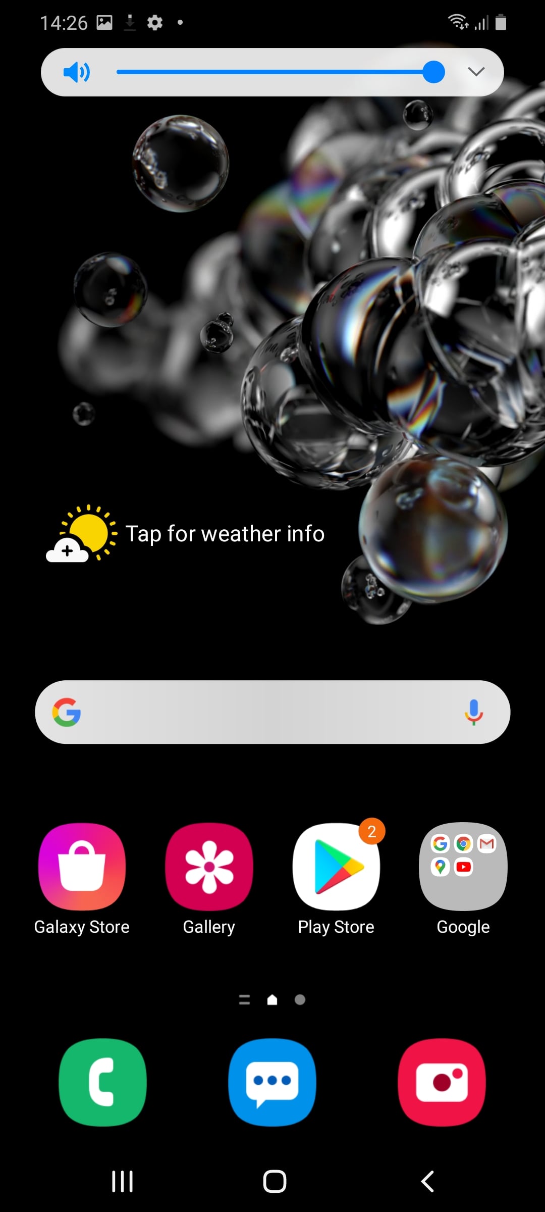
This is one of the first changes that you'll notice after switching to One UI 3.0. The notification shade and quick settings now have a blurred, transparent background so it no longer hides the wallpaper and app icons completely.

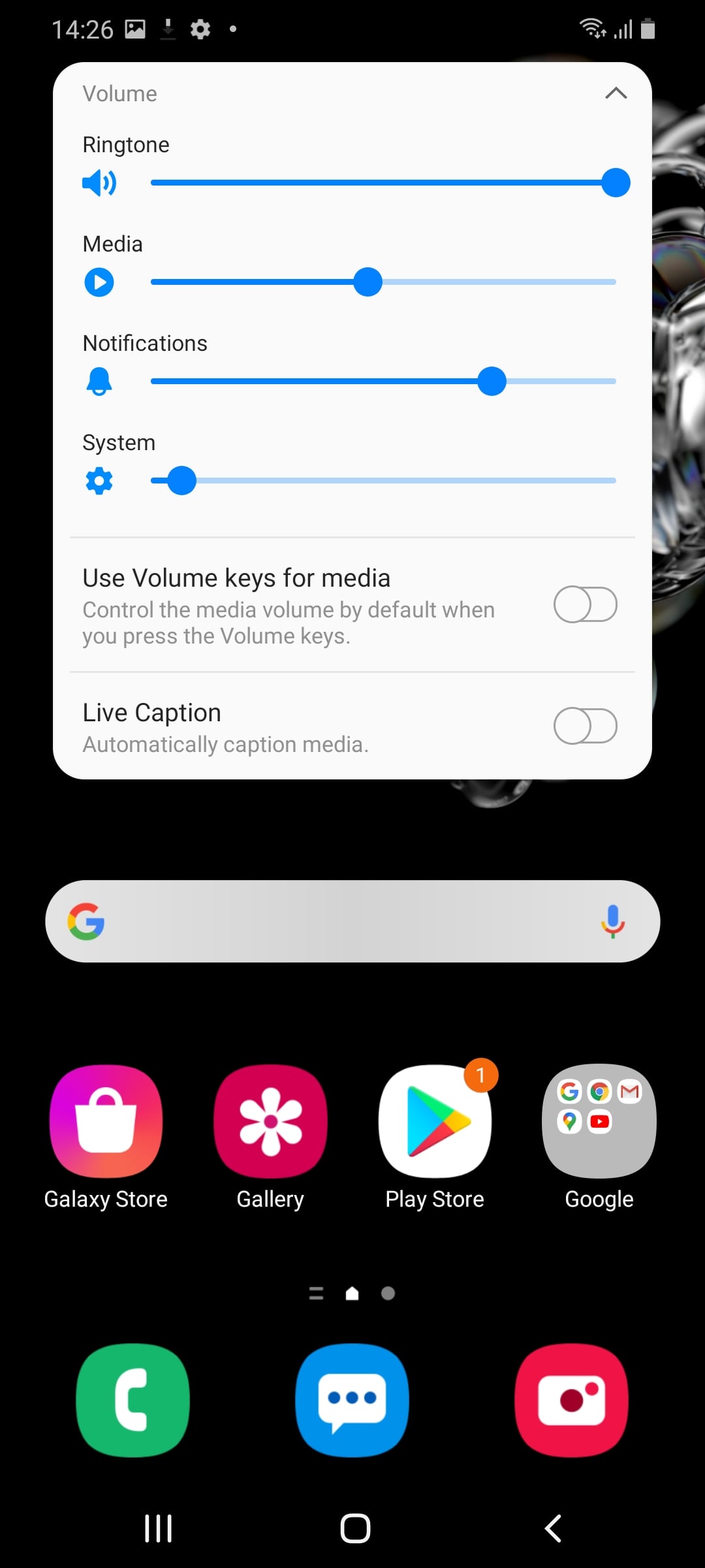

The volume control slider has been repositioned from the top on UI 2.x to the right side on One UI 3.0, the same area where you'd find the physical volume keys. The expanded volume menu now has fewer options and also has the same transparent background.
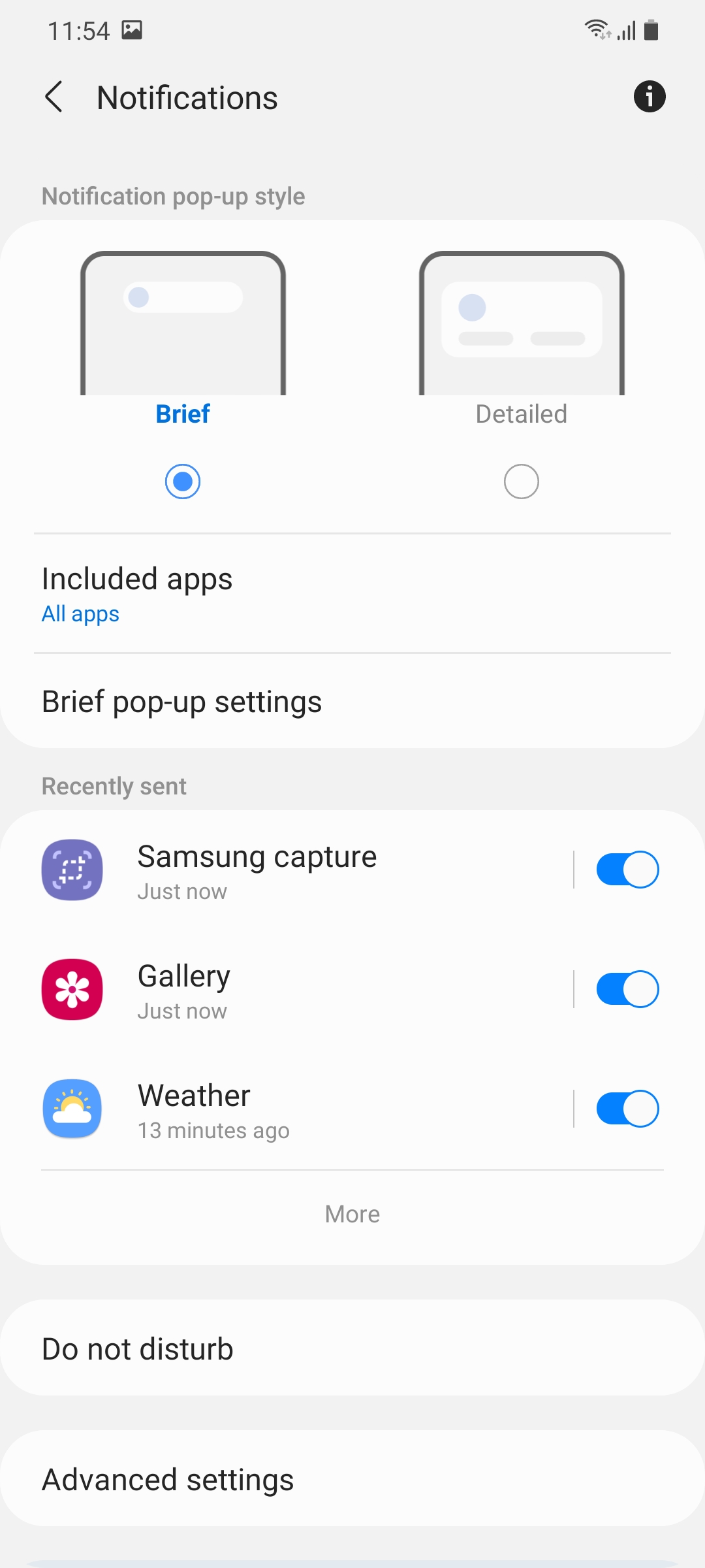
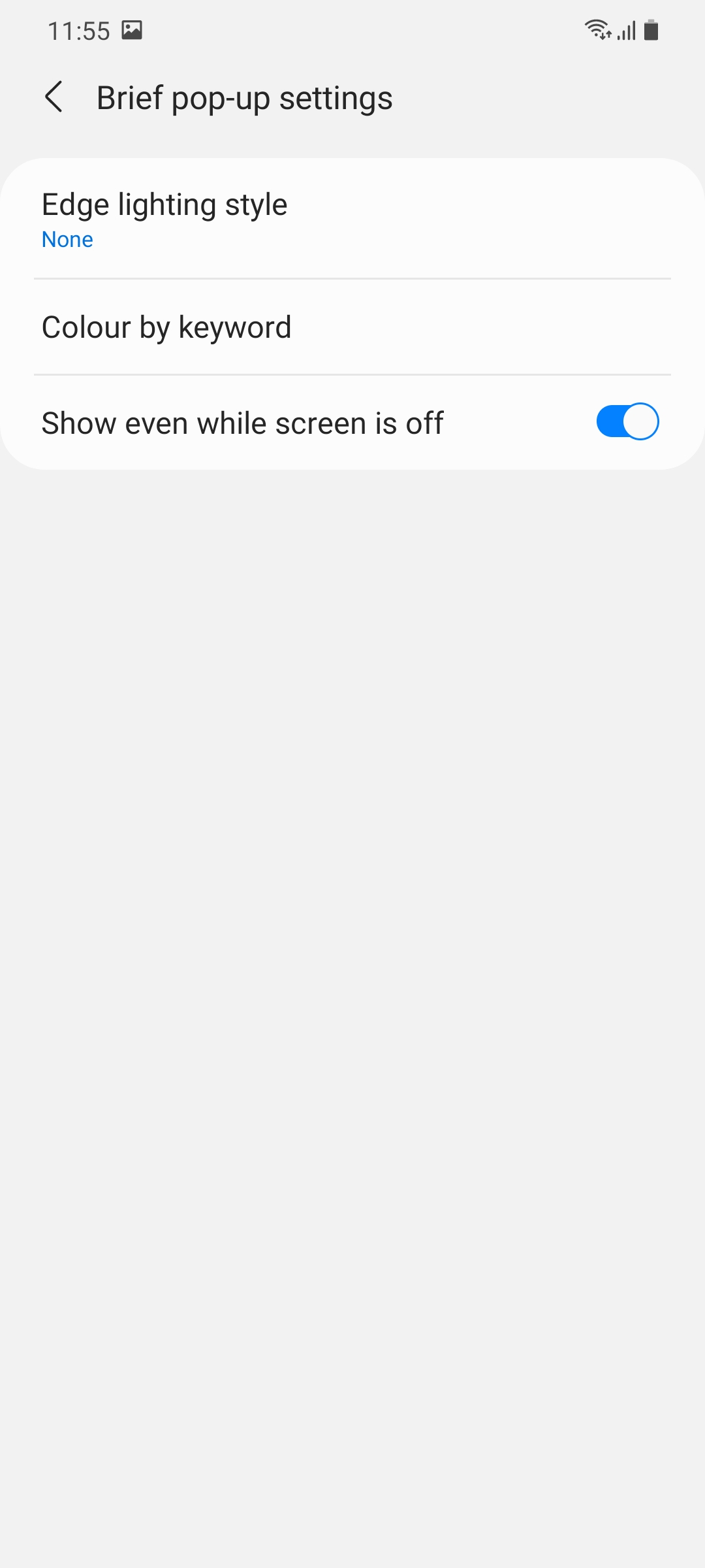
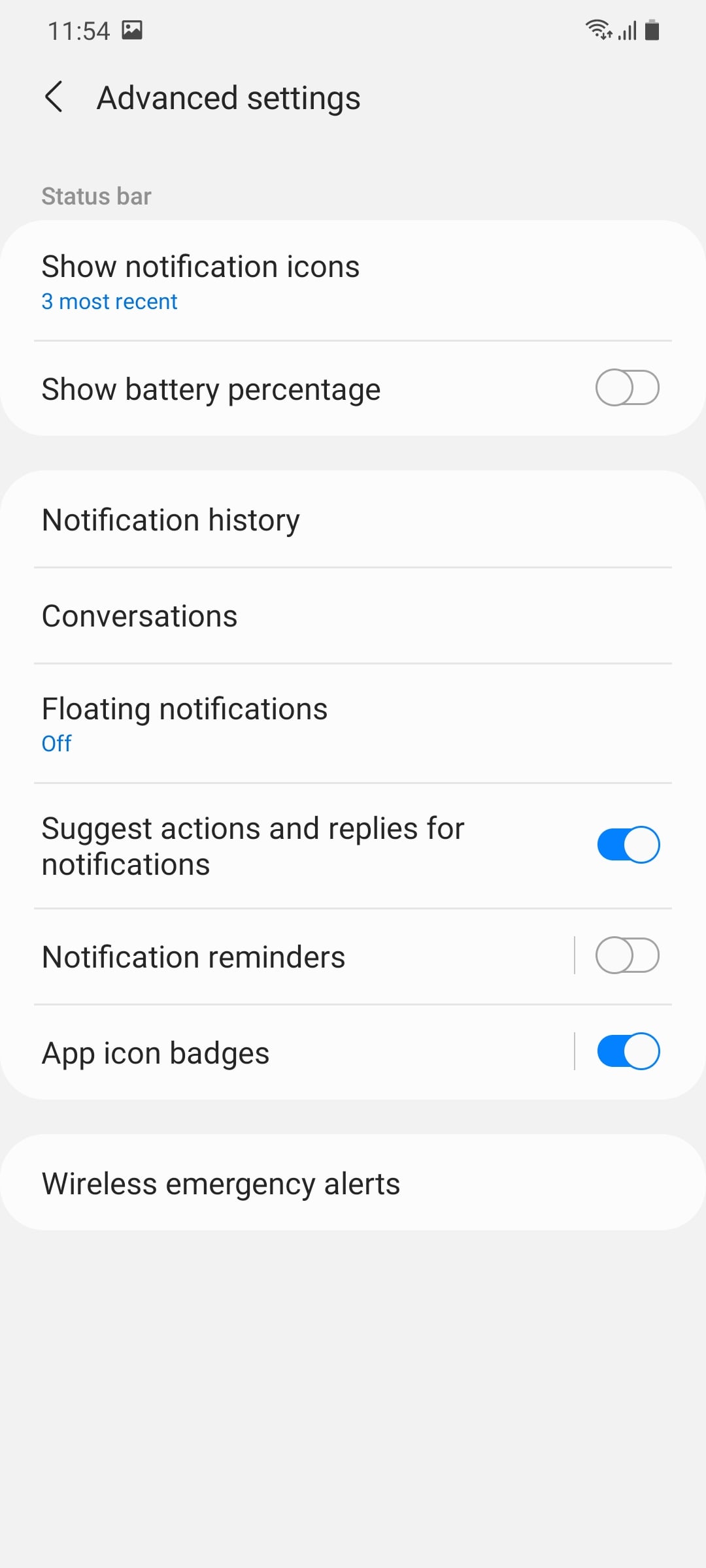
One UI 3.0 lets you choose between two different styles of notifications, brief or detailed. The former is the new default setting and only shows minimal information as opposed to the latter, which is the normal card-style notification pop-ups that users are already familiar with.
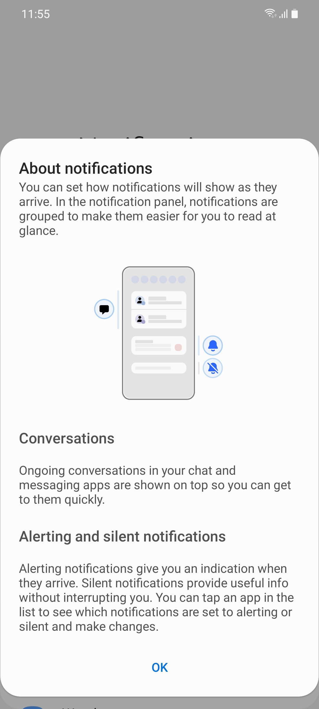
Notification history is an Android 11 feature that's included in One UI 3.0. It lets you view dismissed notifications from the last 24 hours. This feature is disabled by default, though.
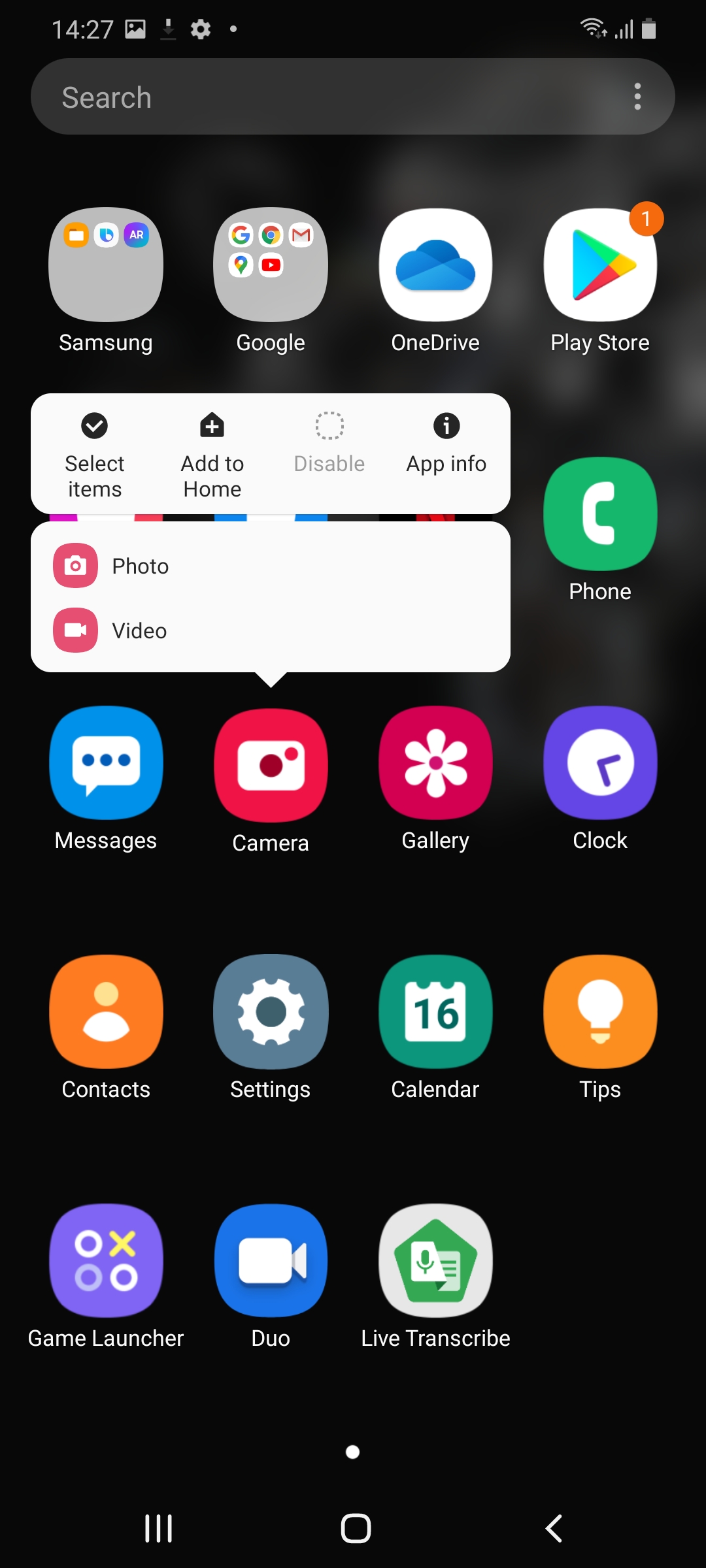
One UI 3.0 cleans up the long press menu for apps in the app drawer and the home screen and it now also shows the app's name in addition to the different features that can directly be accessed through it. The Add to Home and Uninstall options have been repositioned at the bottom.
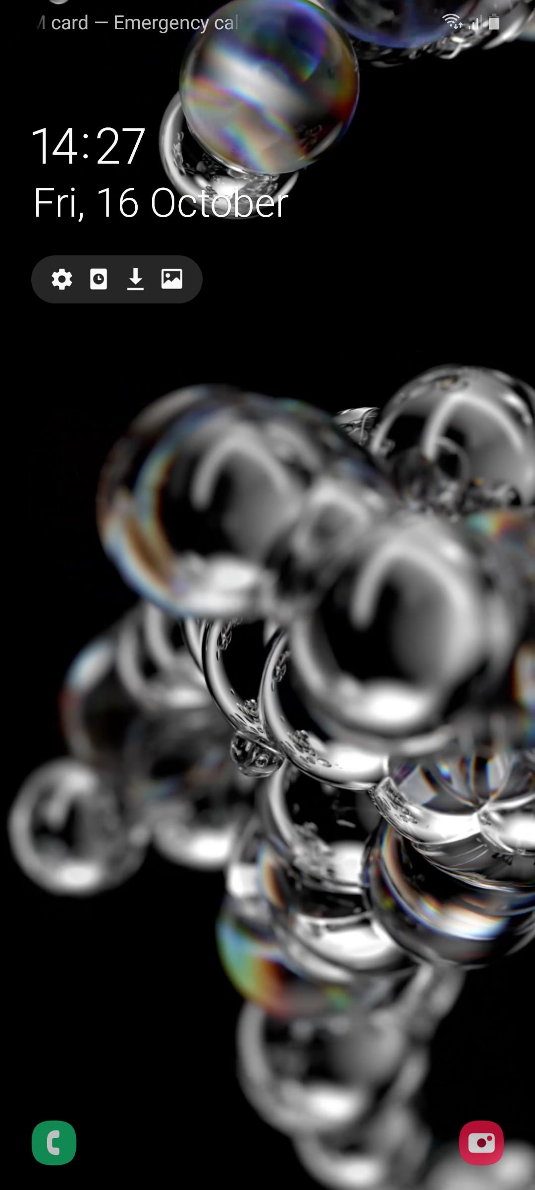

Samsung has made some subtle changes to the look and feel of the lockscreen in One UI 3.0. The icon for the in-display fingerprint sensor is a bit different and so are the animations. The clock and notifications have been pushed down towards the center while there's a new lock icon positioned below the camera punch hole. The app buttons in the bottom left and right corners are no longer full color, they're greyscale and transparent.
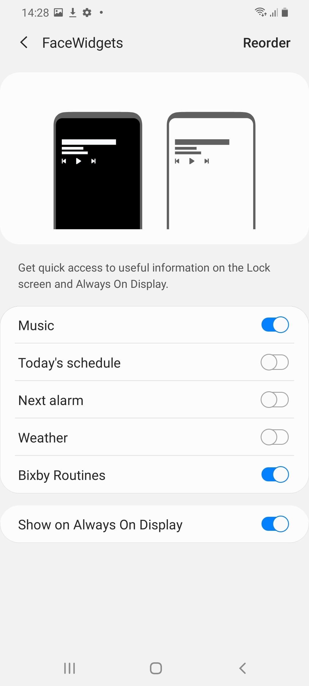
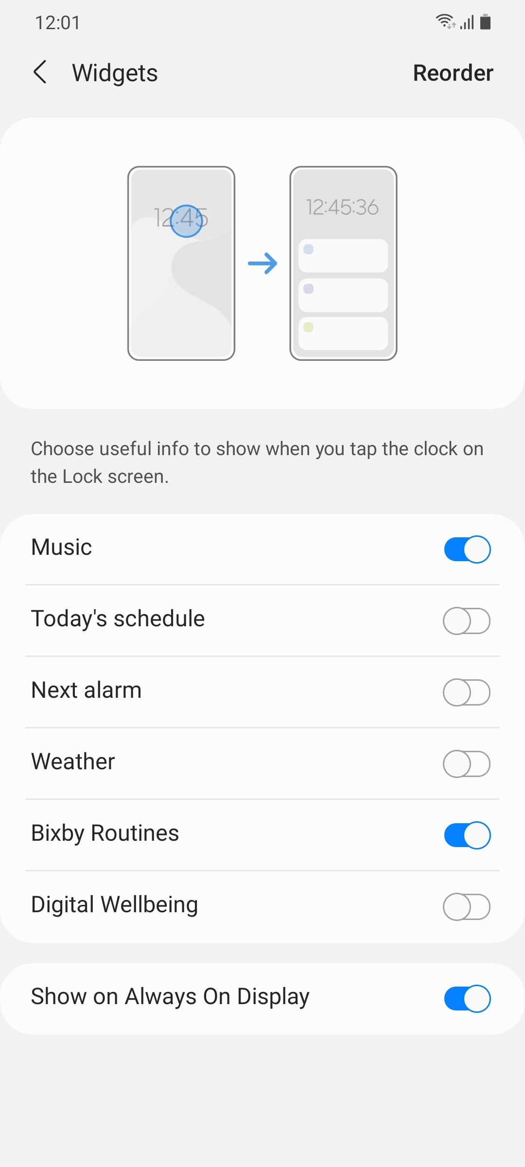
Widgets on the lockscreen behave a bit differently as well. You can access the widget page now to see the various options when tapping on the clock. Speaking of locking the phone, you can double tap on any area of the screen that's not occupied by an icon or widget to lock the phone and turn off the screen.
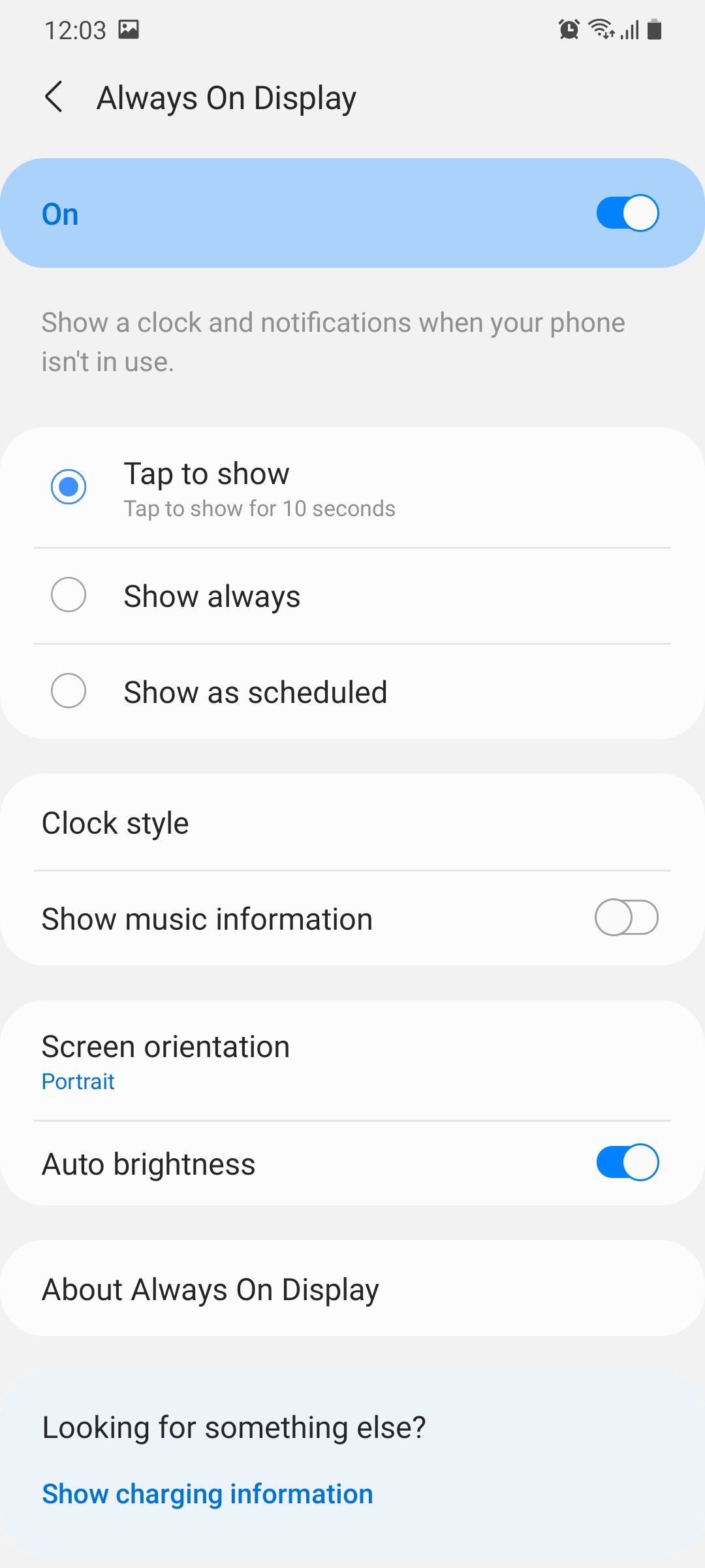
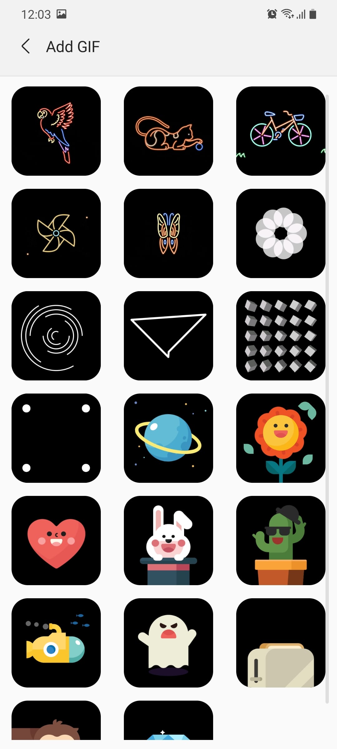

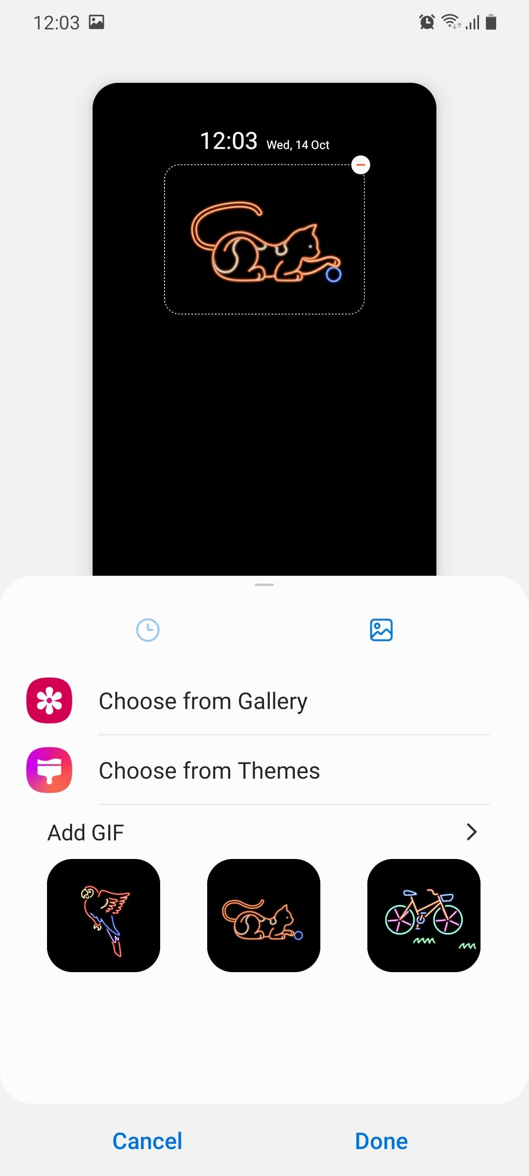
The Always On Display looks much the same on One UI 3.0 as it did in the past. What Samsung has done is provide more customization options, particularly for GIFs. The GIFs start playing automatically when the phone is locked but the animation does stop a few seconds later.
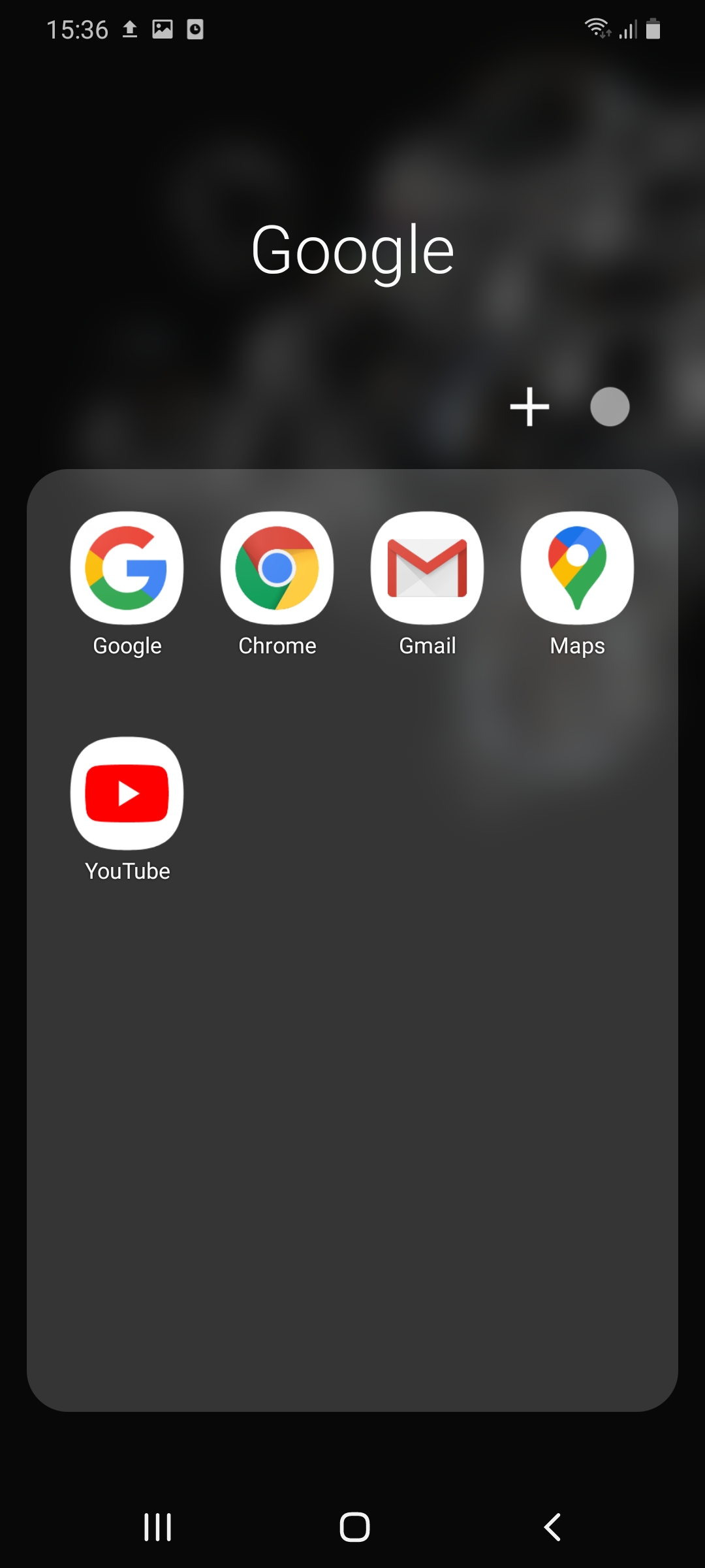
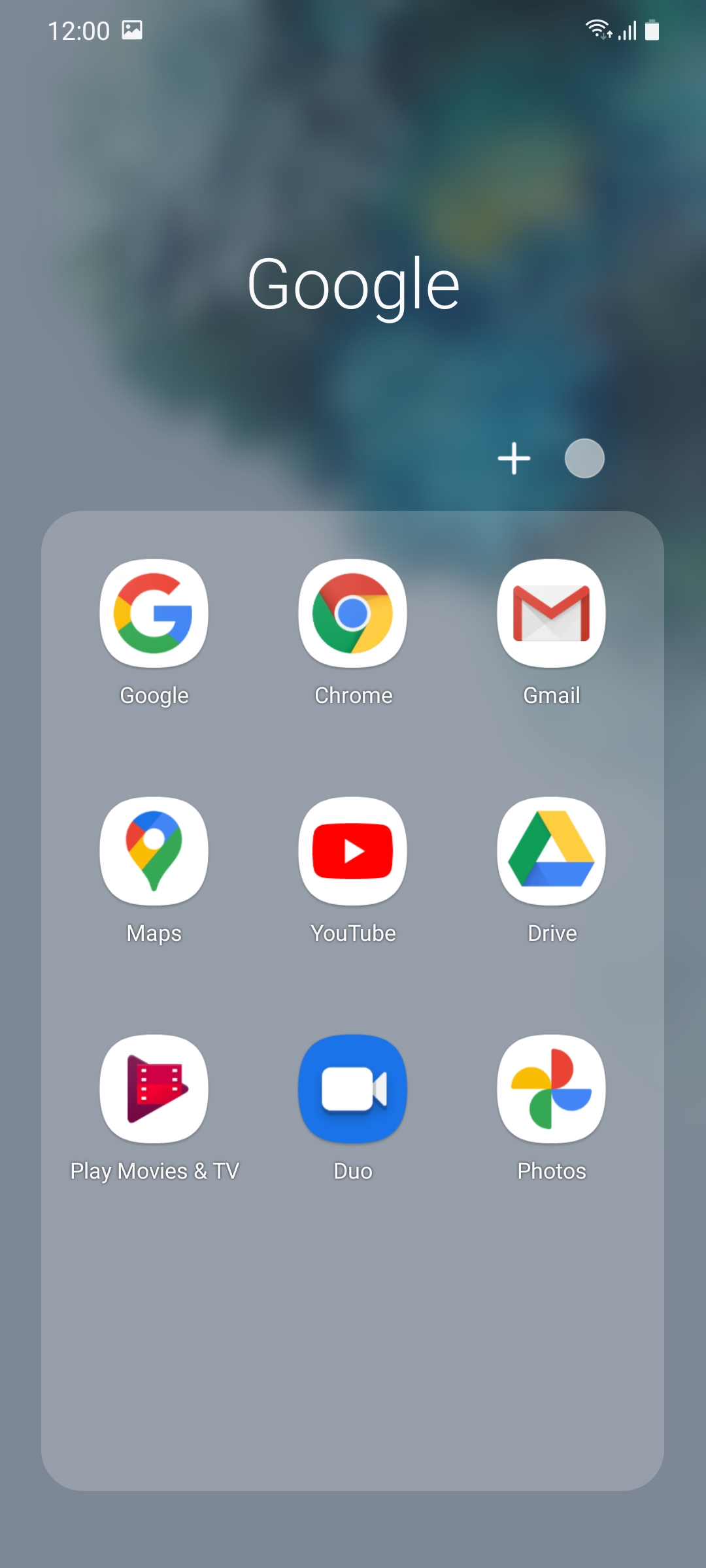
All four sections have received cosmetic improvements. The app drawer gets the same One UI 3.0 transparency aesthetic for a more modern look.
Folders only show 12 apps per page now as opposed to 16 previously. As smartphone displays get taller, such adjustments are necessary to allow for ease of use.
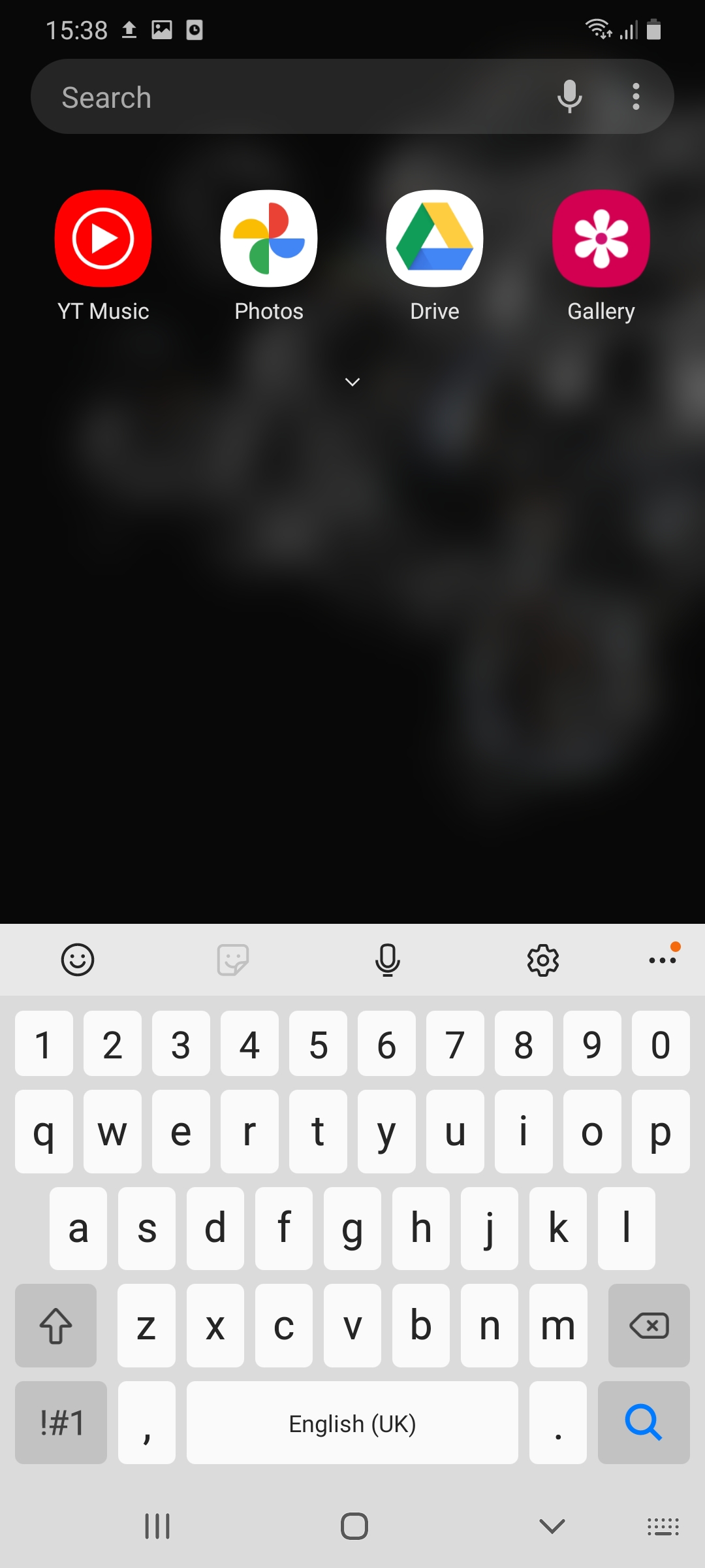
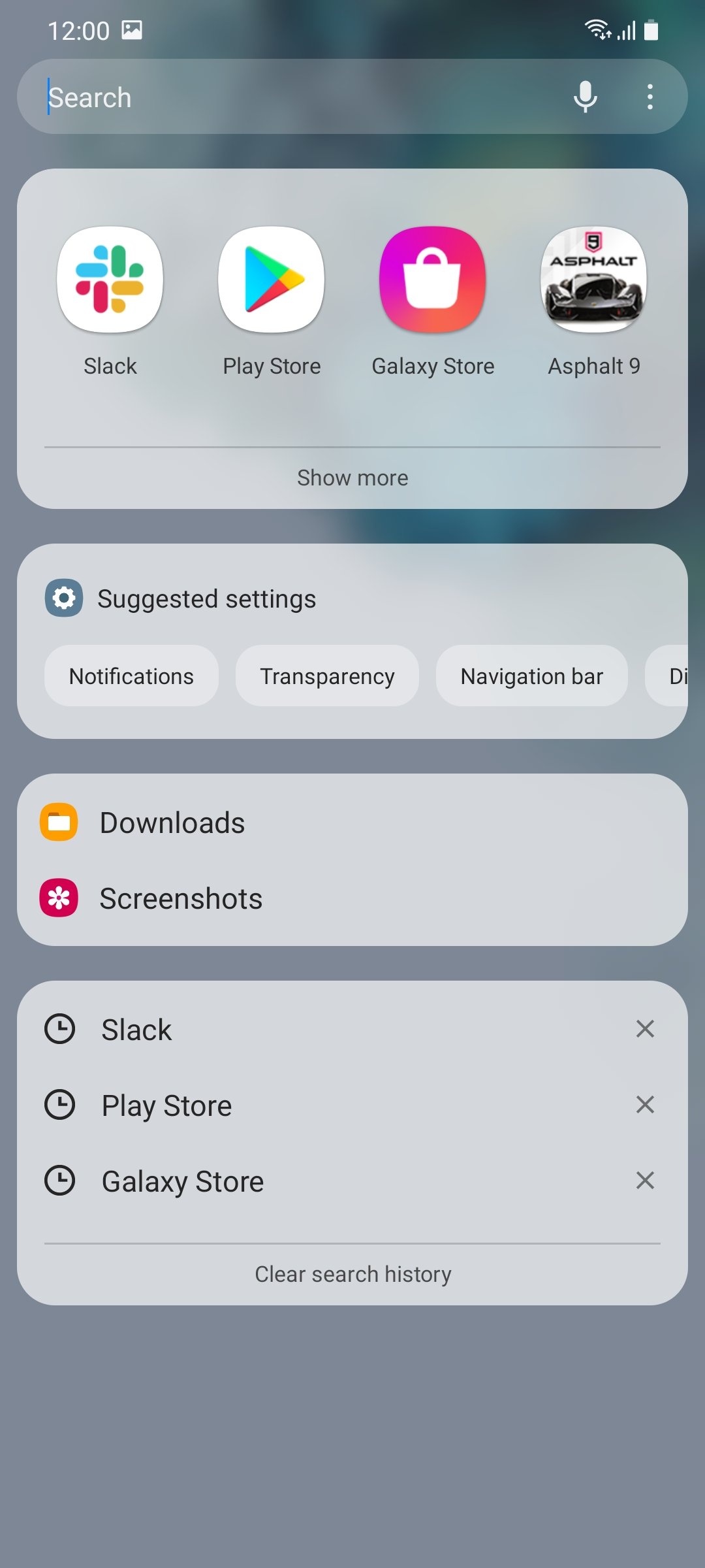
The Finder is now more powerful than ever before. It can provide settings and search suggestions in addition to apps, thereby allowing users to find what they're looking for very quickly.
A similar aesthetic can also be seen in the Recent apps screen. We again find the same transparent feel just so that everything looks a bit cleaner.
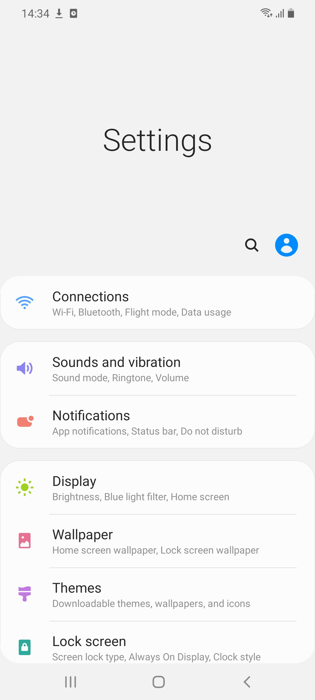
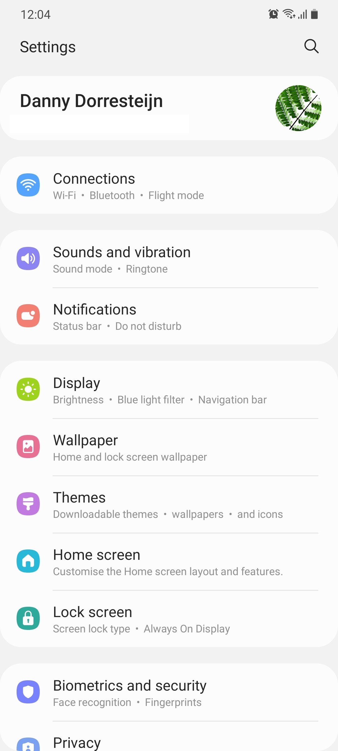
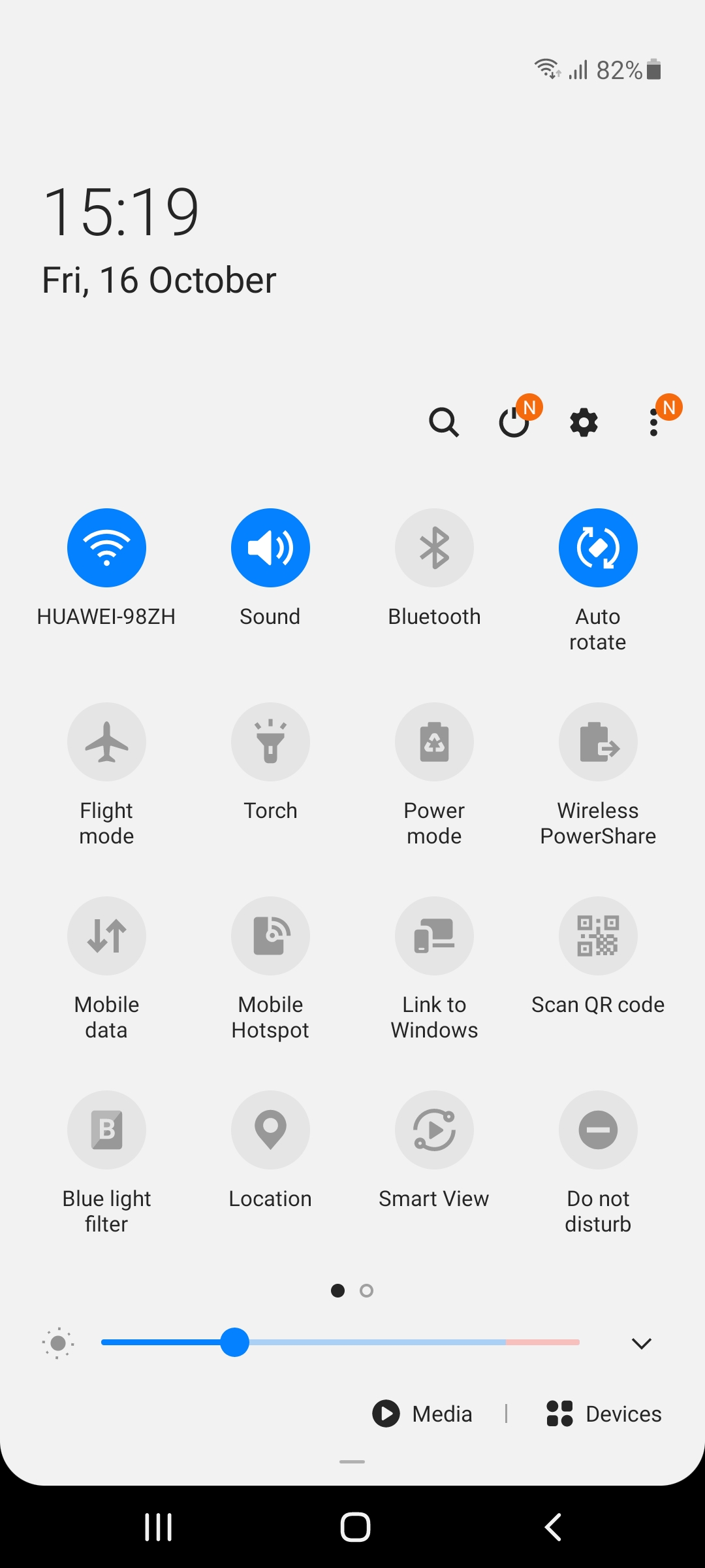
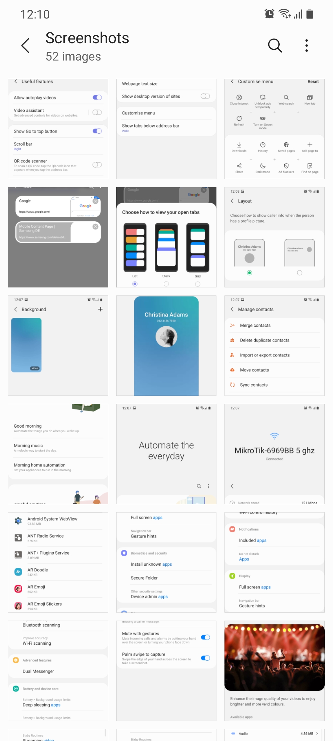
In its effort to declutter the interface, Samsung has also streamlined many of the options and menus in the Settings app. You'll immediately notice new icons for all categories and that the Samsung account is now shown at the very top.
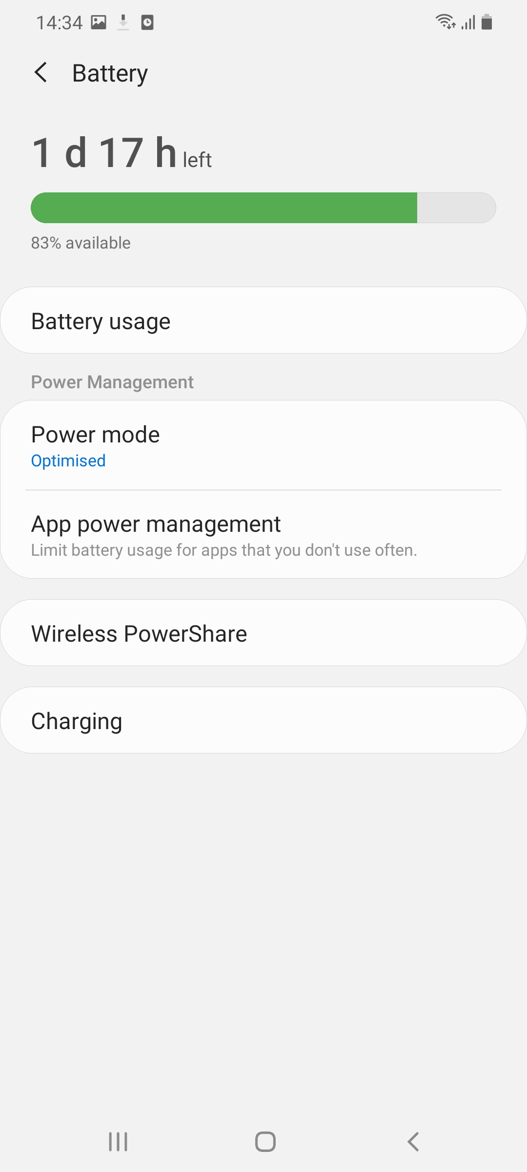
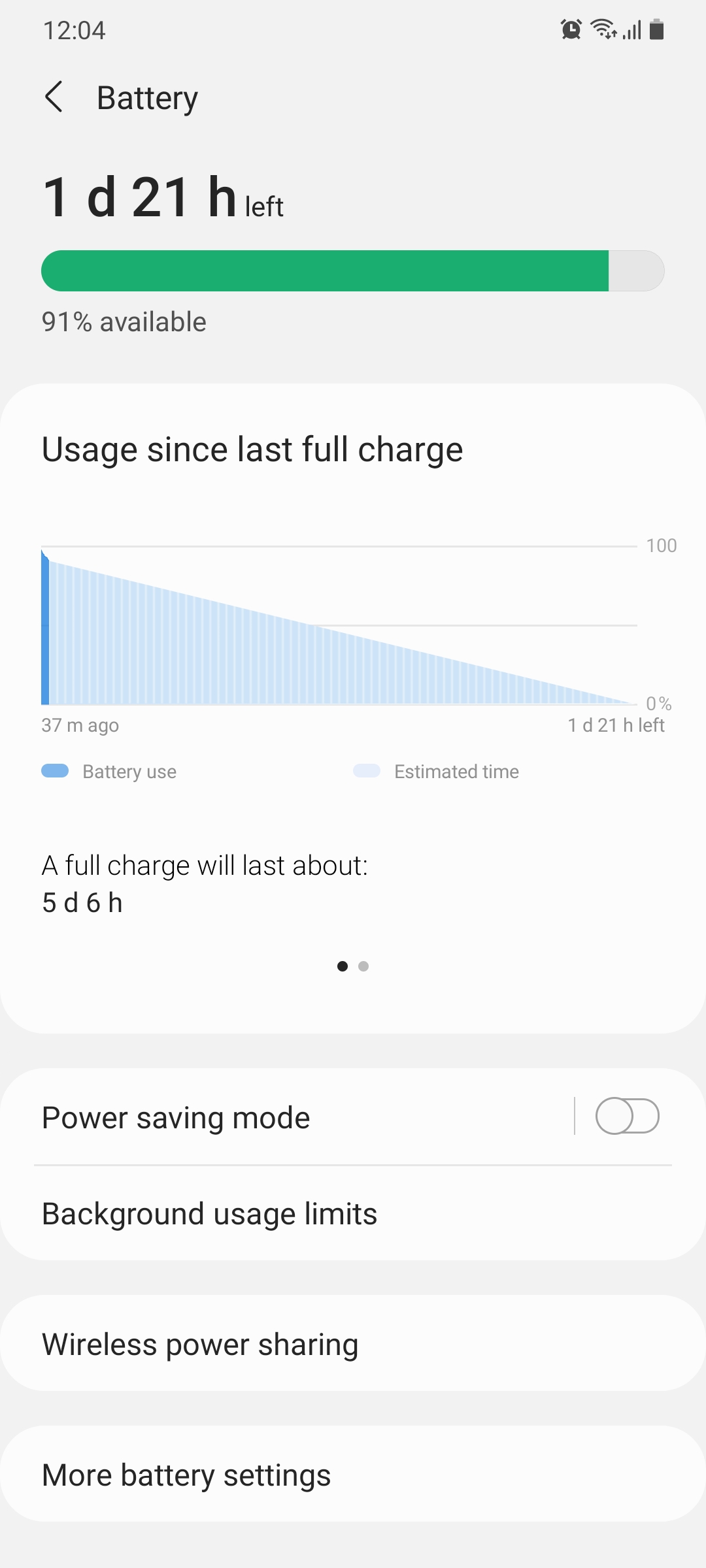
There are new graphics and icons in the Battery menu. The power mode options have been replaced in favor of toggles that basically do the same thing. These toggles lend to a sleeker look in this menu.
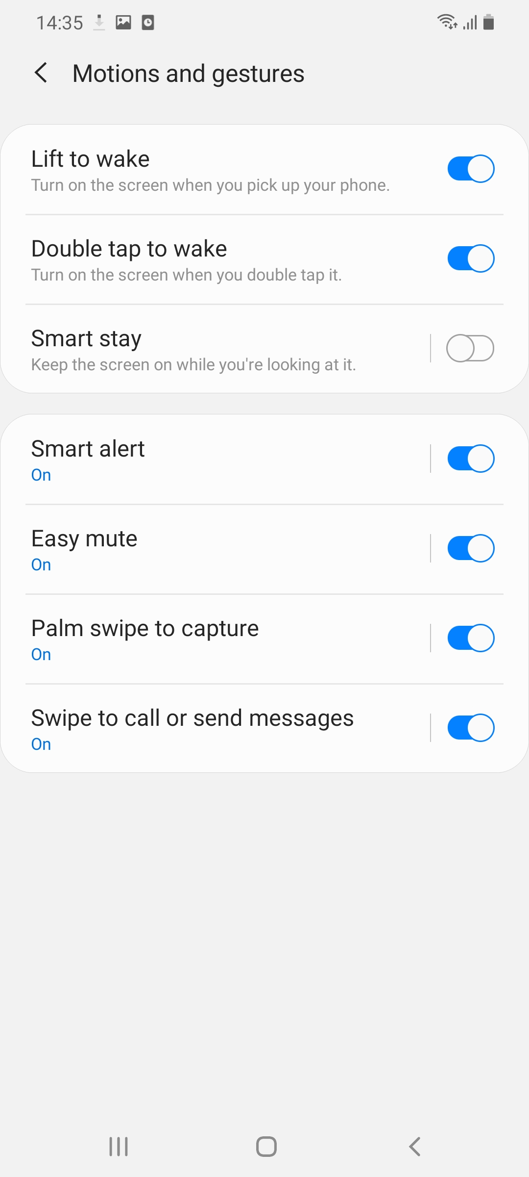
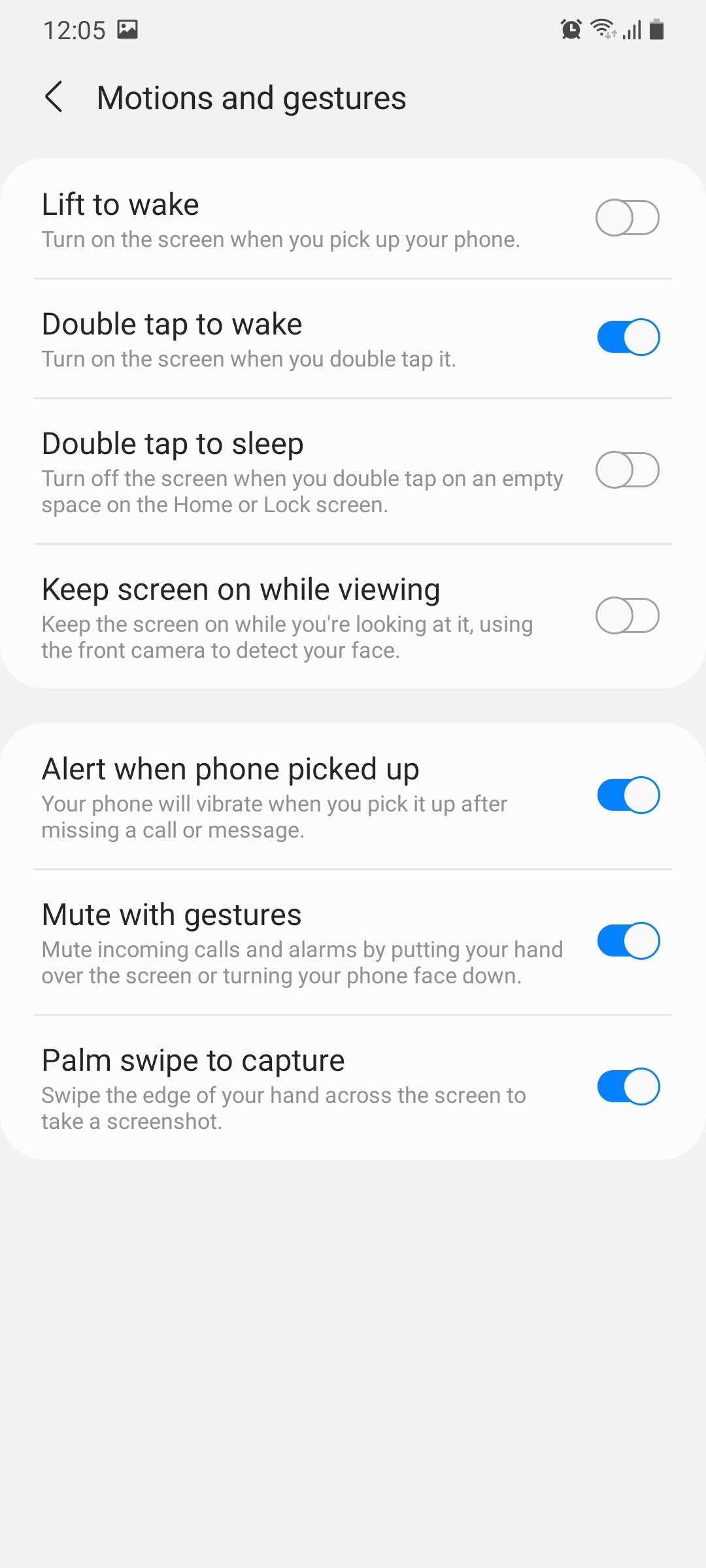
A similar change has been made for the Smart stay feature accessible from the Motion and gestures menu. The feature is still there on One UI 3.0 but it's simply called “Keep screen on while viewing.”
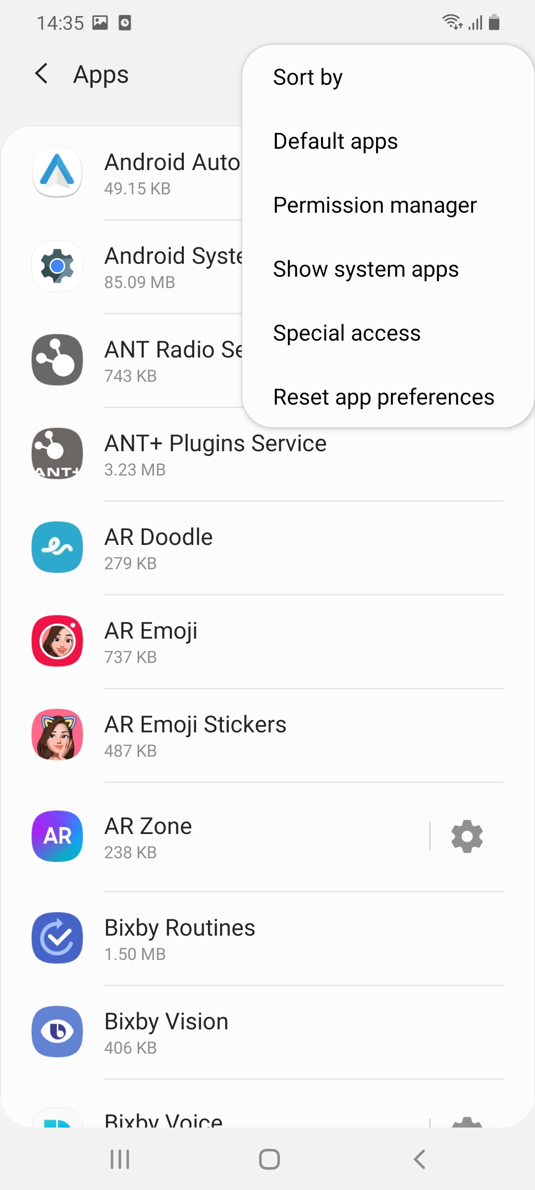
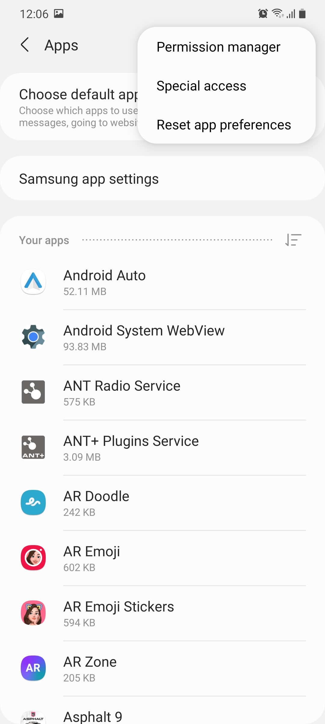
Two sections have been added in the App settings menu to split Samsung and non-Samsung apps. There seems to be little reason for this change other than just requiring an additional tap from users if they want to adjust Samsung app settings.
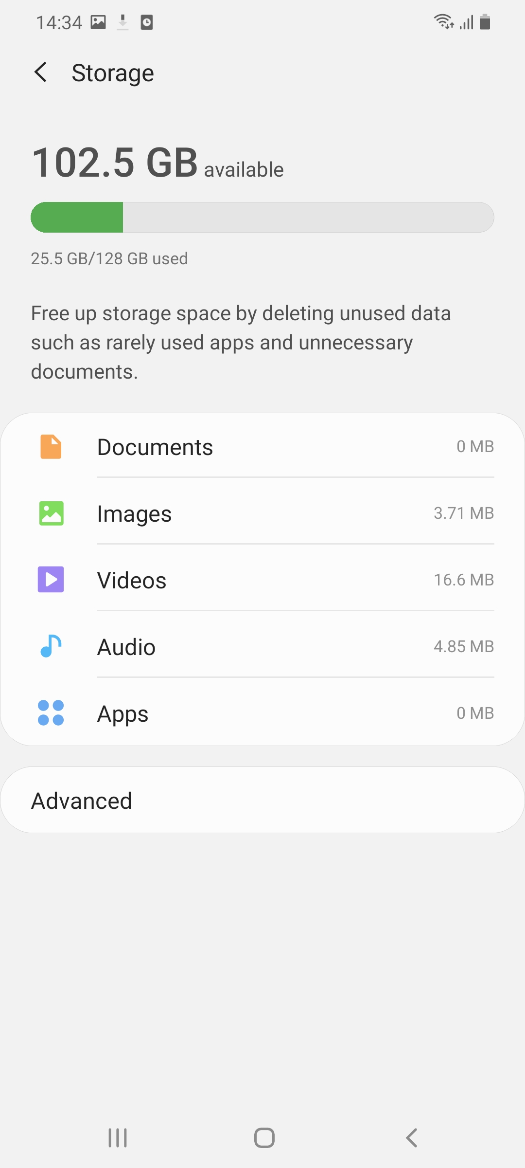
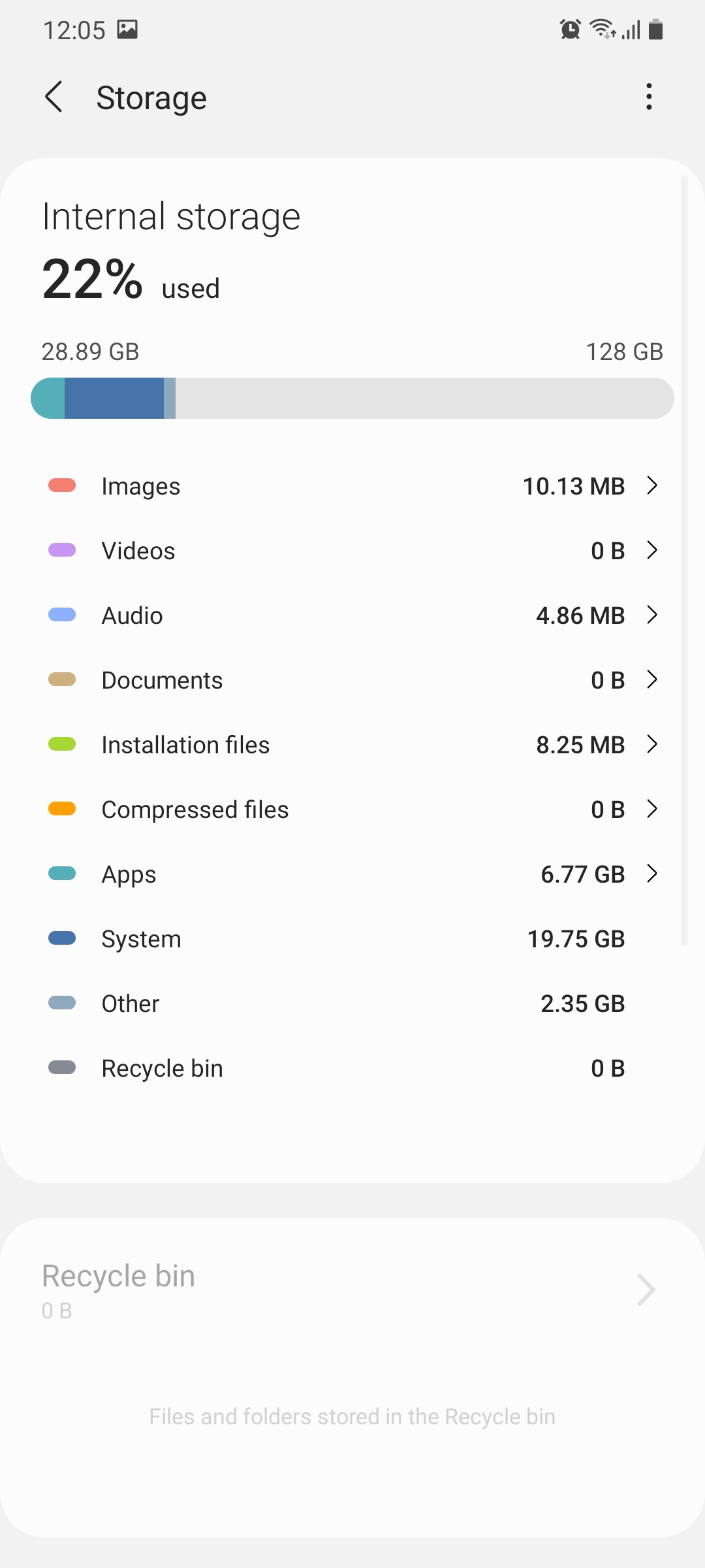
Improvements can be seen in the Storage menu which now looks cleaner and is organized in a much better way. This will allow users to quickly understand what's taking up the most space on their phone and what they need to get rid of.
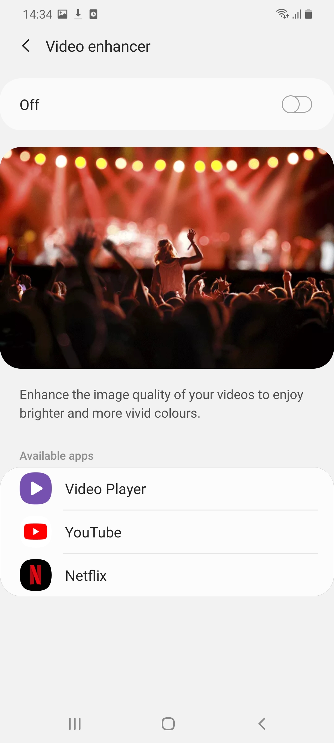
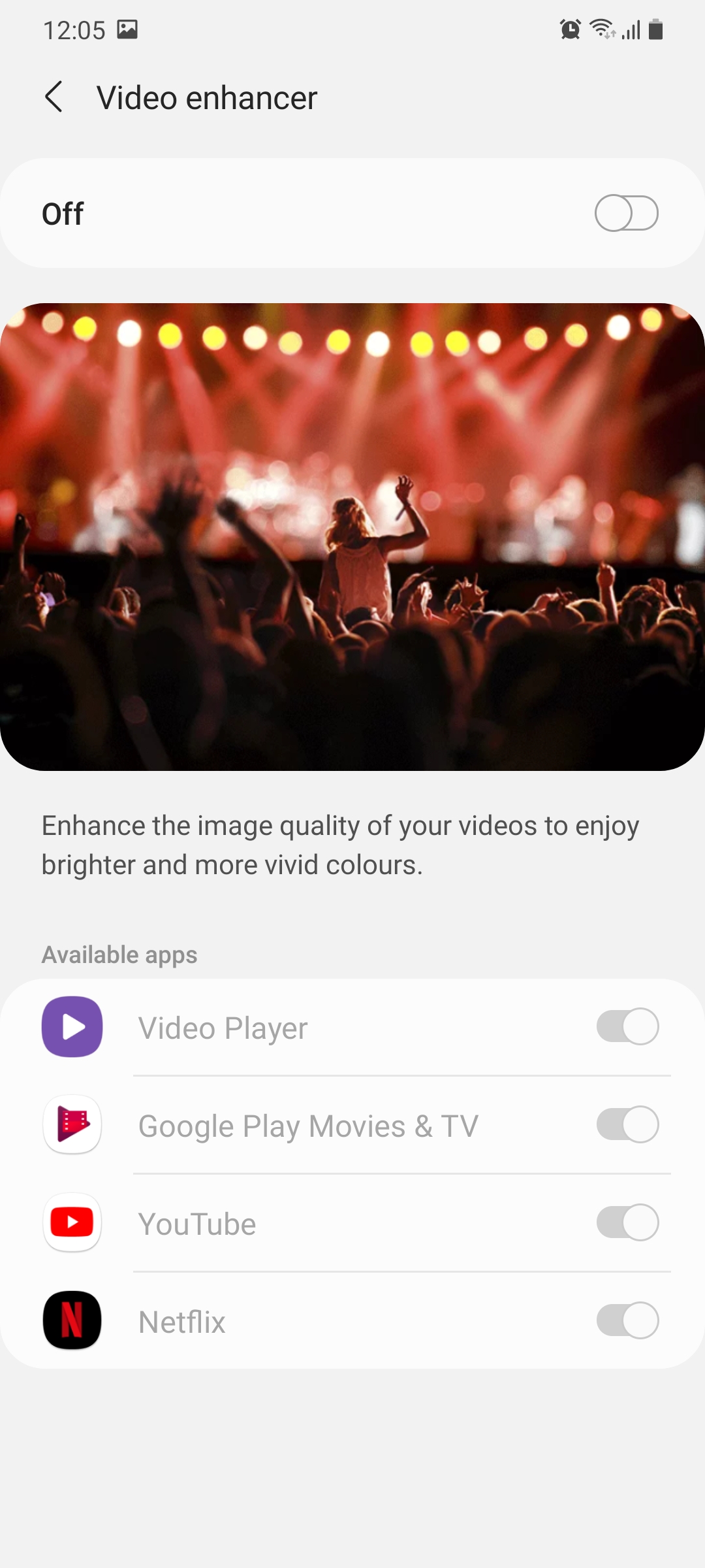
The Video enhancer feature that lets you improve the image quality of videos offers more granular control on One UI 3.0. It can be enabled for specific apps and left disabled for others.
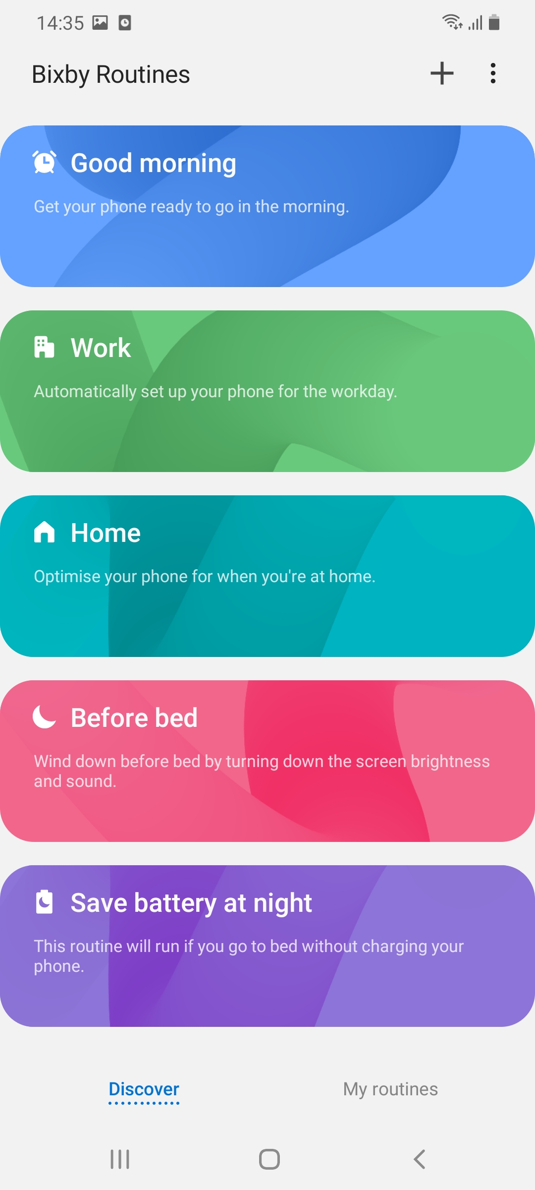
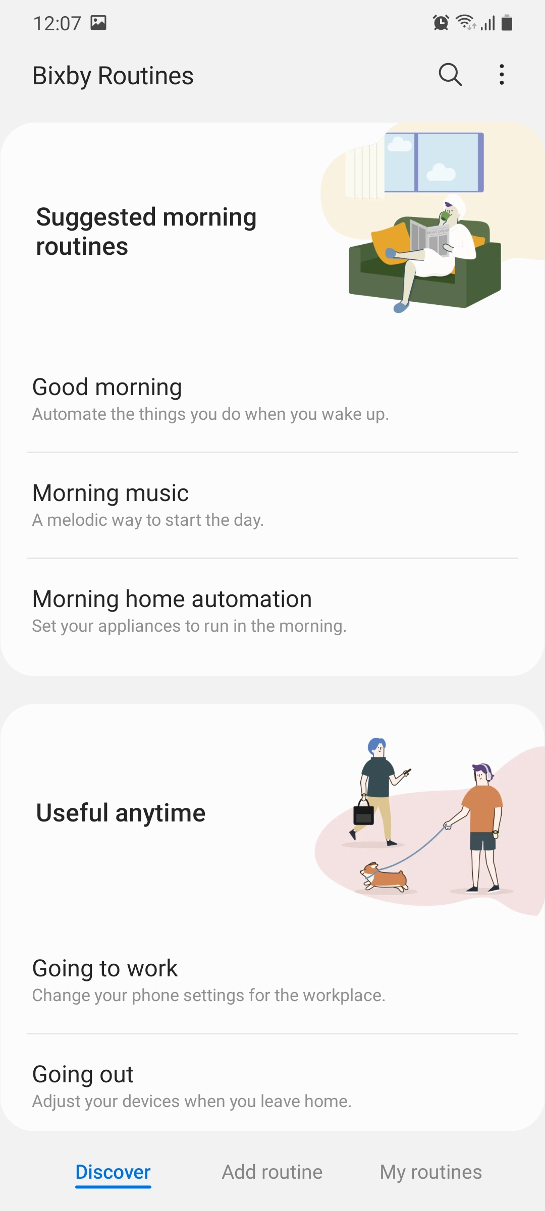
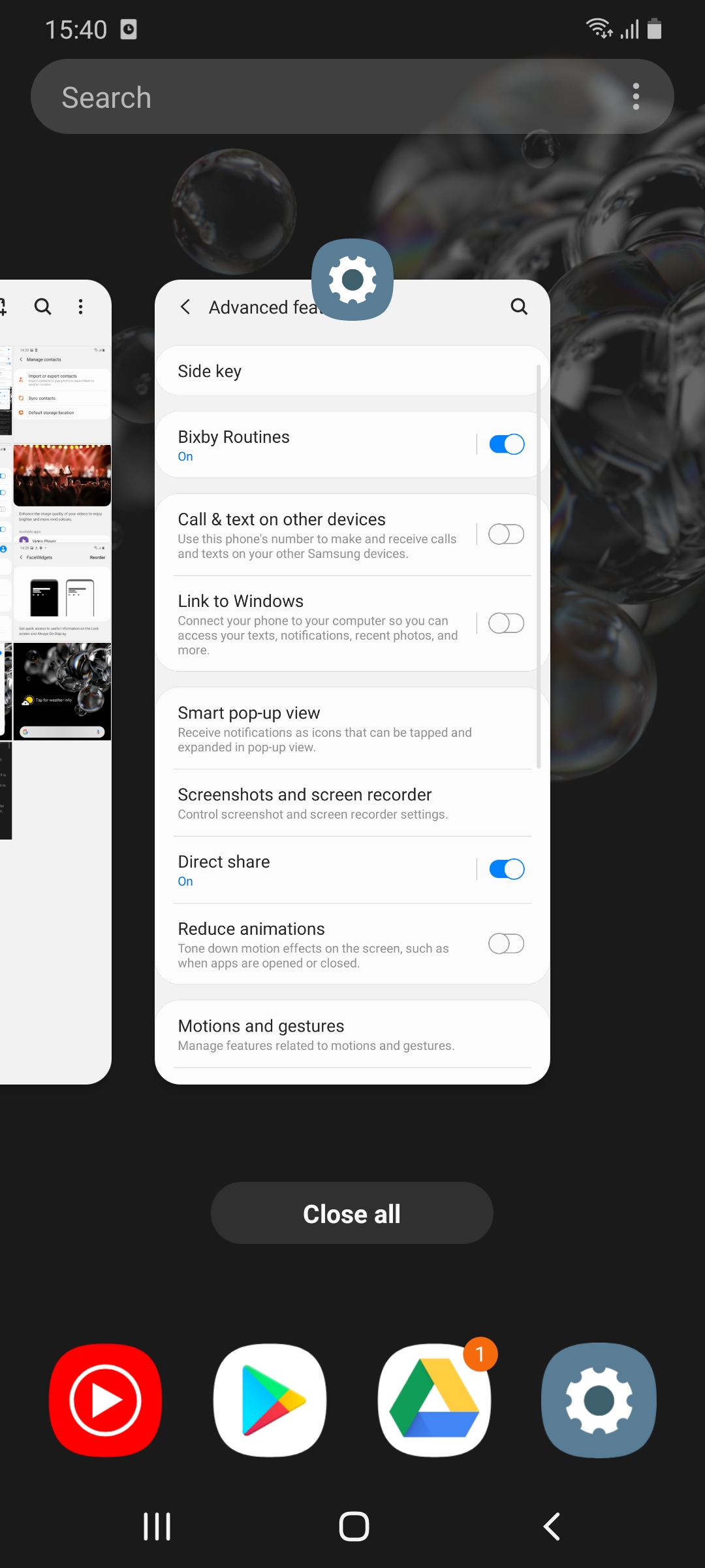
The very useful Bixby Routines feature gets an all new user interface with One UI 3.0. Suggestions are displayed up top and the presets have been clearly categorized and explained so that they're easier for users to understand.
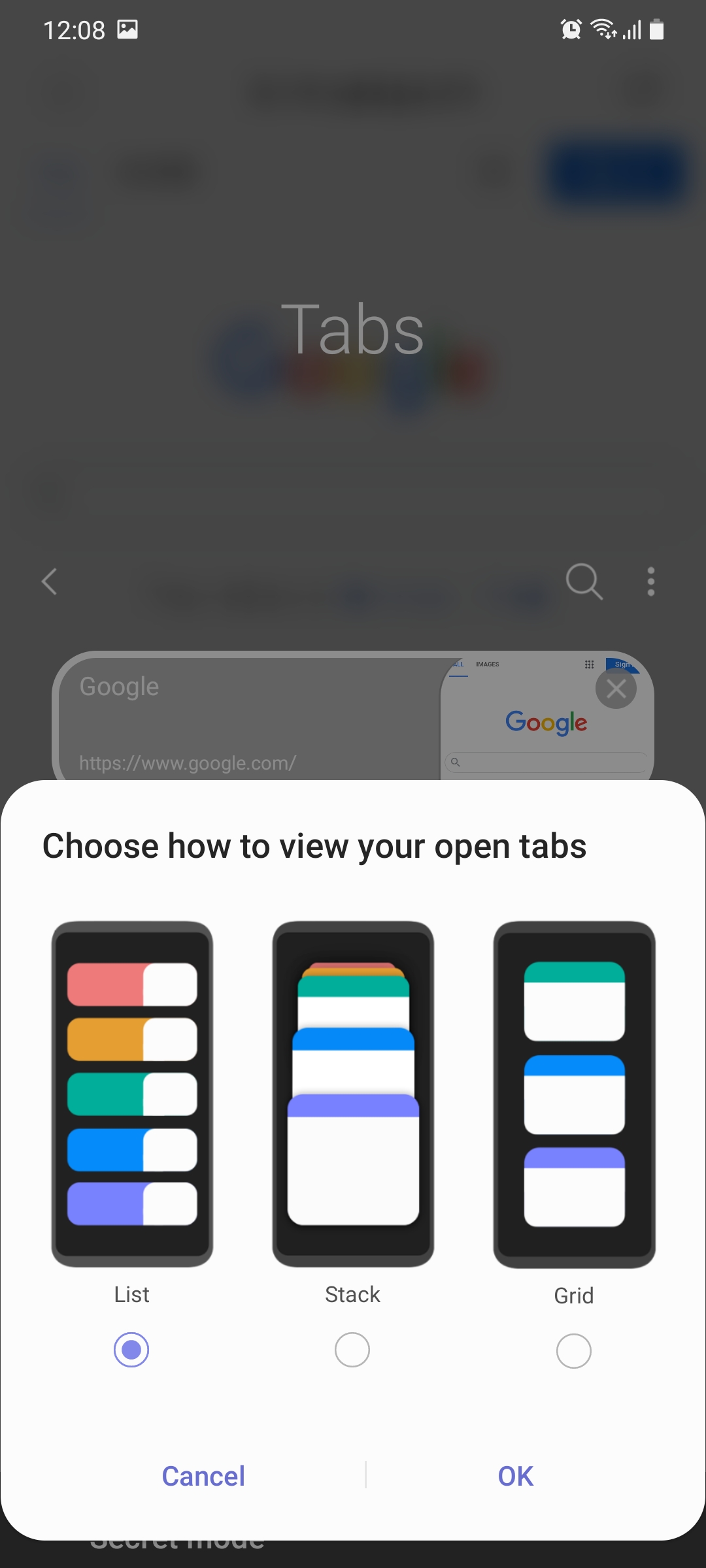
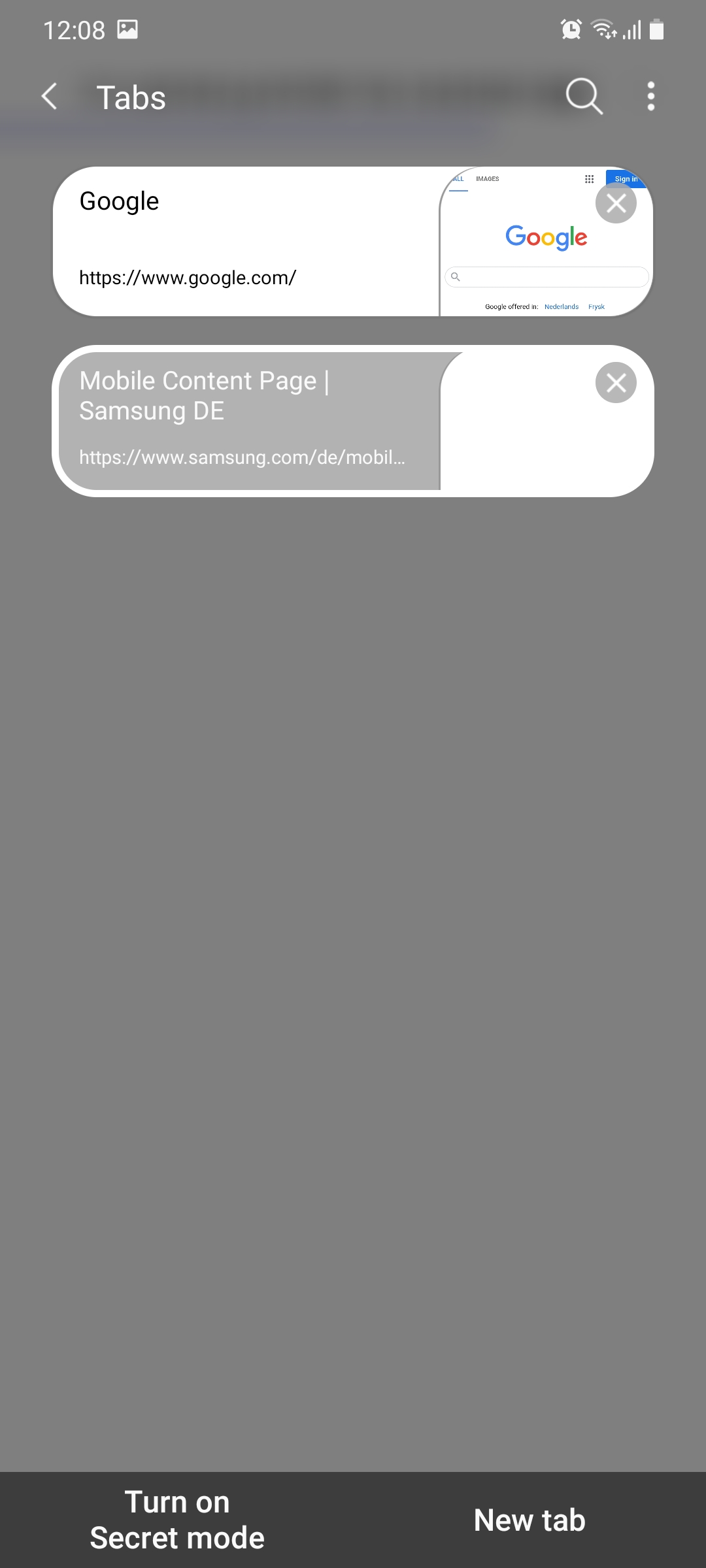
One UI 3.0 comes with the latest iteration of the company's browser, Samsung Internet v13.0. Some cosmetic changes have been made here as well. There's a new grid view for open tabs, an improved menu layout, and disappearing status bar icons when scrolling.
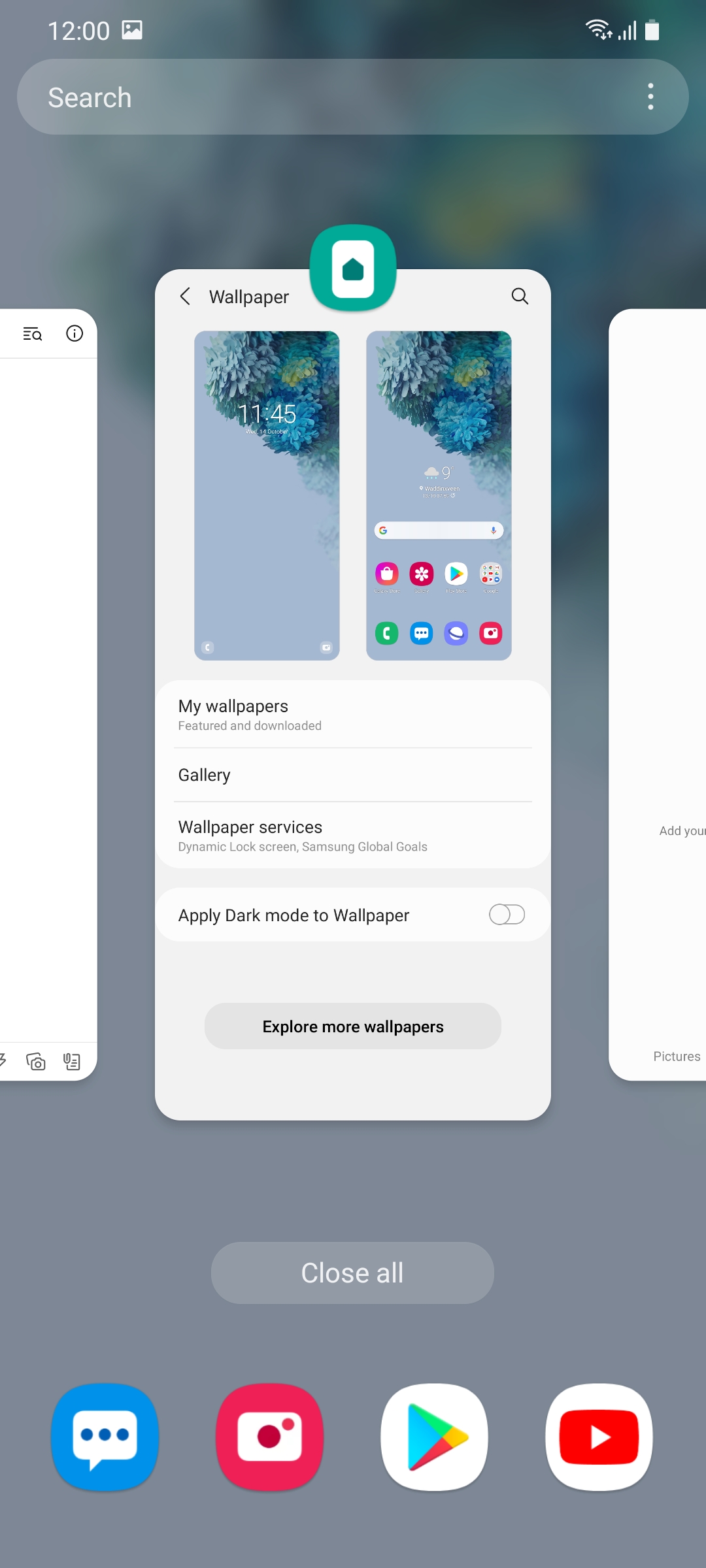
The user interface for the Gallery app has been changed in One UI 3.0. Instead of showing four photos across it now shows three, likely another change made because of taller screens. An edited picture can be reverted back to its original state in the image editor after the edits have been made.
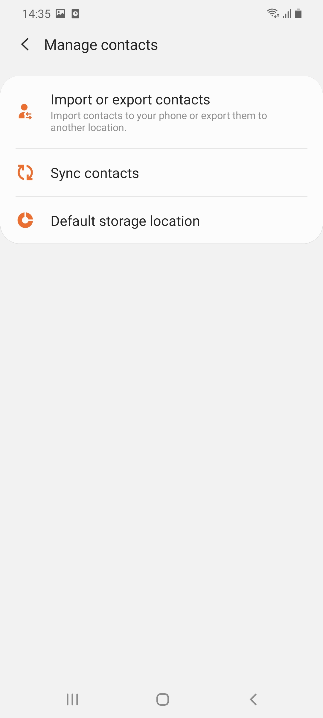
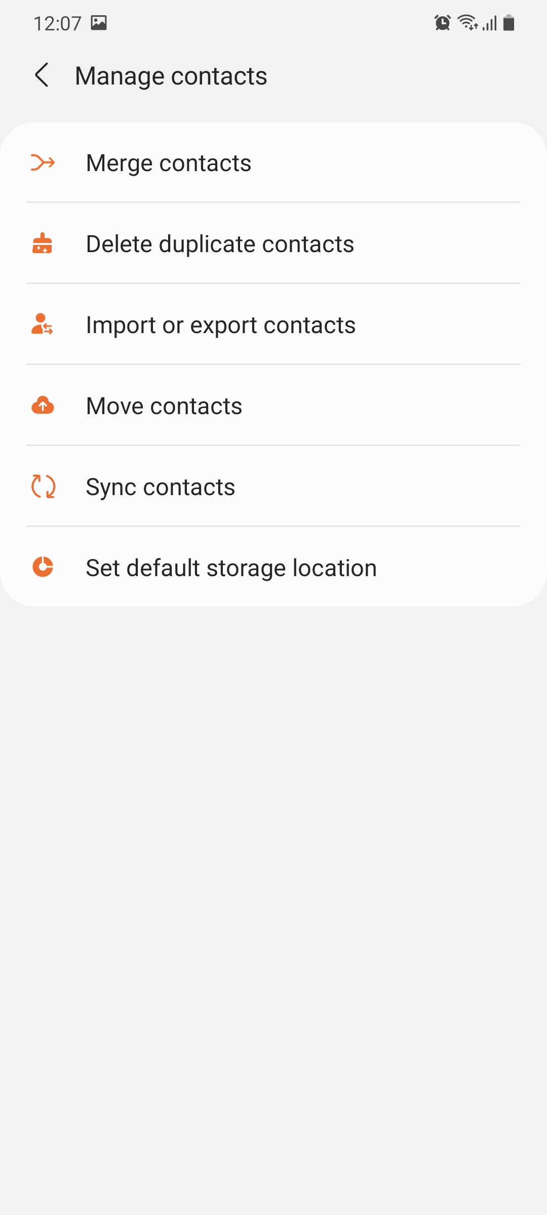
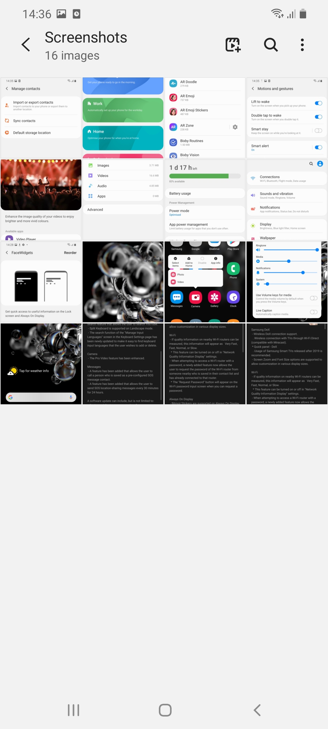
Samsung has also revamped the Contacts and Phone apps in One UI 3.0. Merging or deleting duplicate contacts is easier than ever before and more than one contact can be edited simultaneously. The search feature in Contacts has been improved as well.
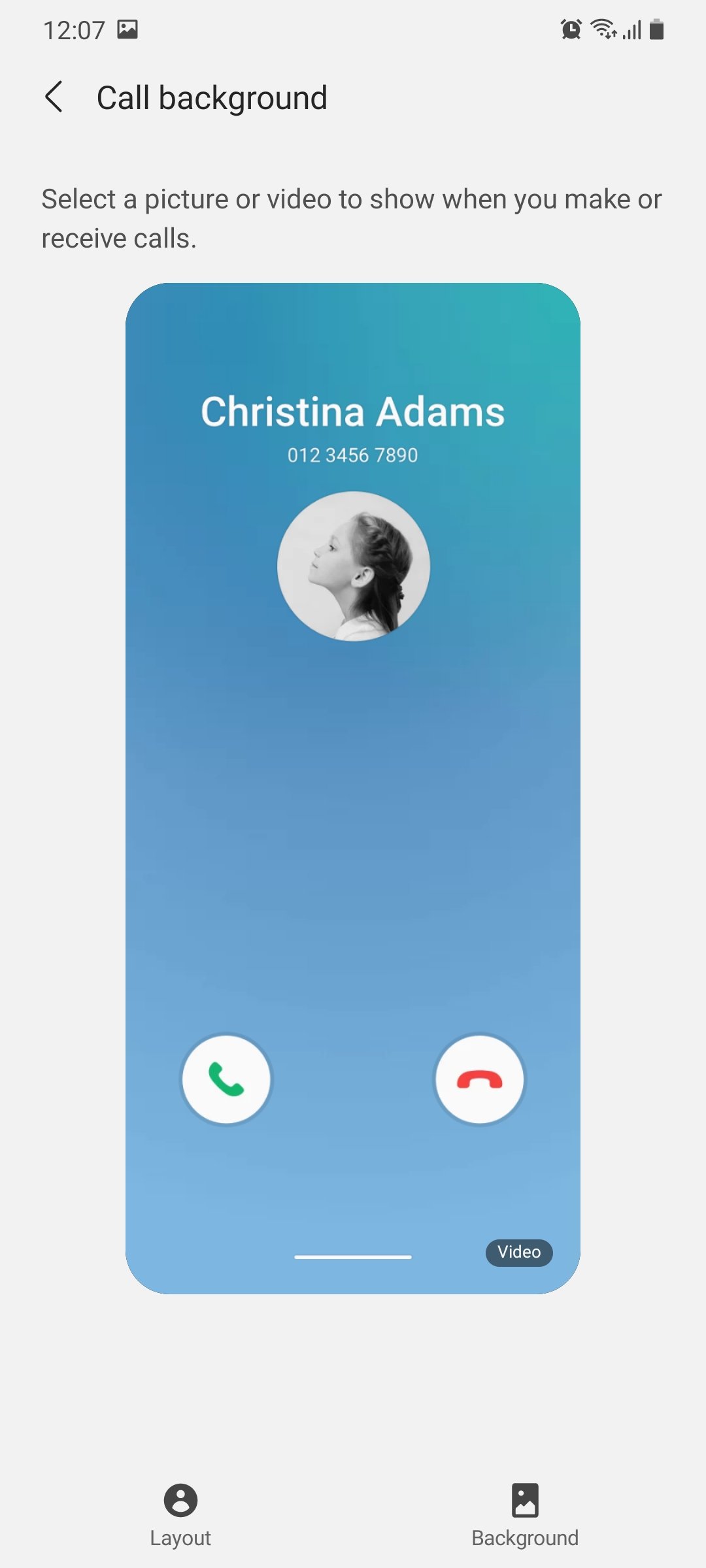
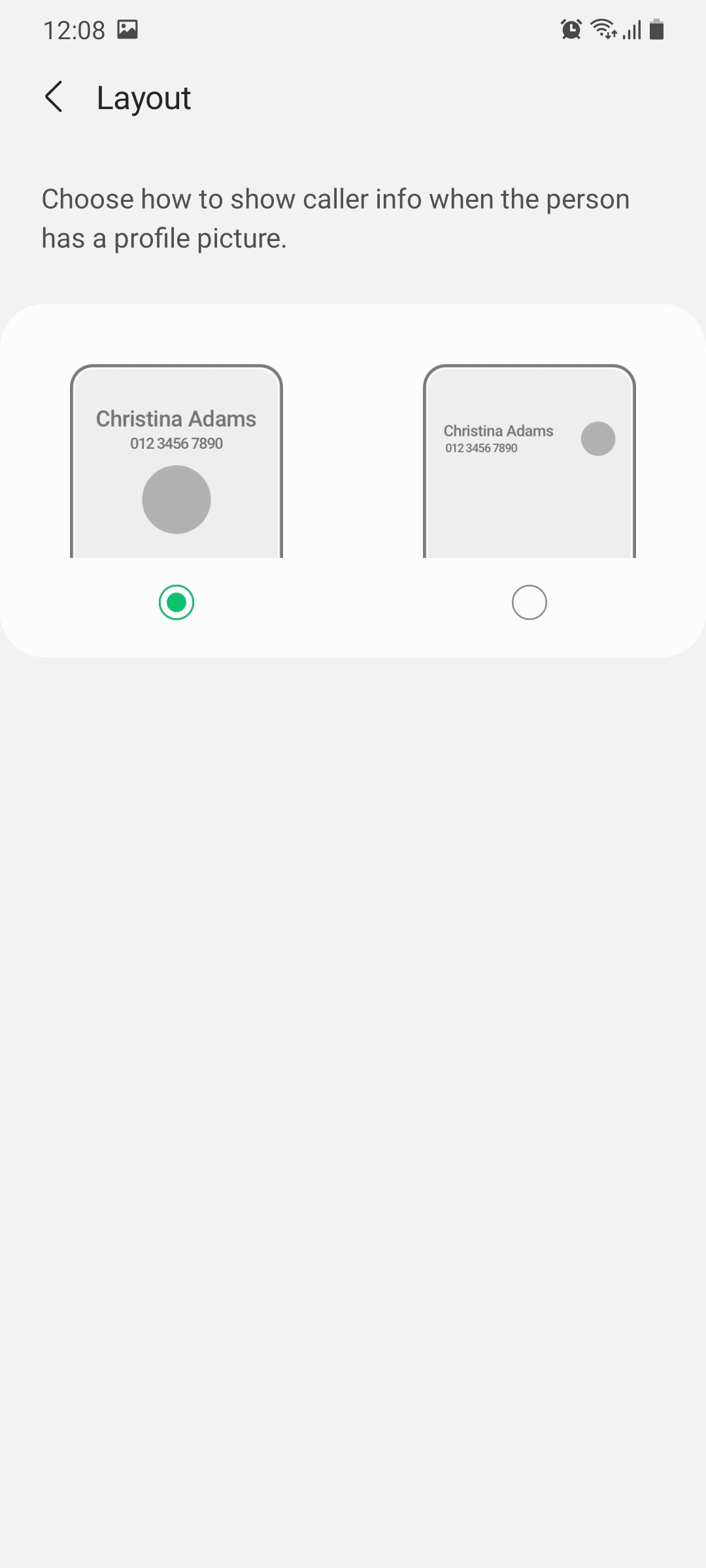
It's also possible now to change the look of the incoming call screen. You can change the background color of the call screen, add an image from the gallery, and even change the layout in which the information about the caller is displayed.
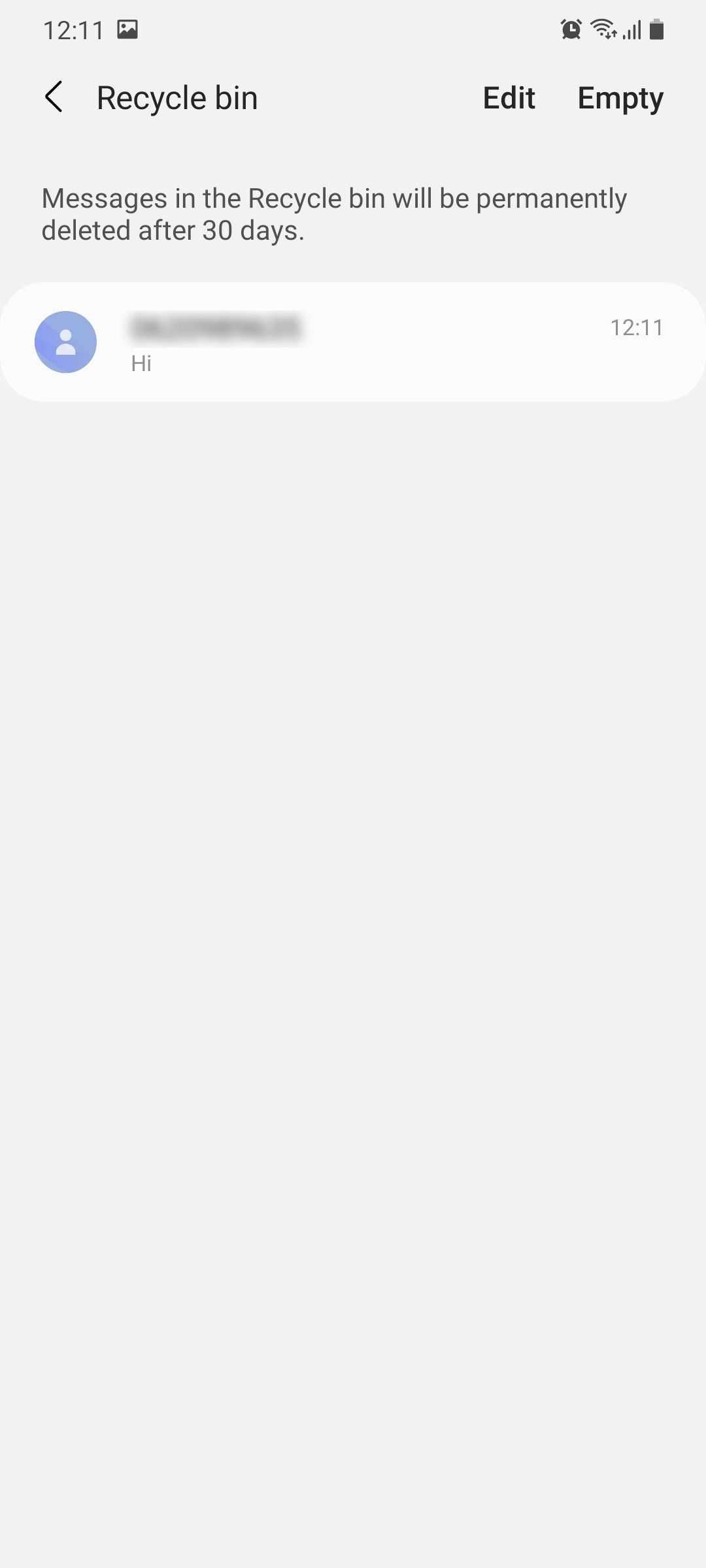
A minor but useful addition has been made to the native Messages app on One UI 3.0. It gets a recycle bin. Once a text thread is deleted, it will remain in the bin for 15 days so you could restore it if you wanted before it's permanently deleted.

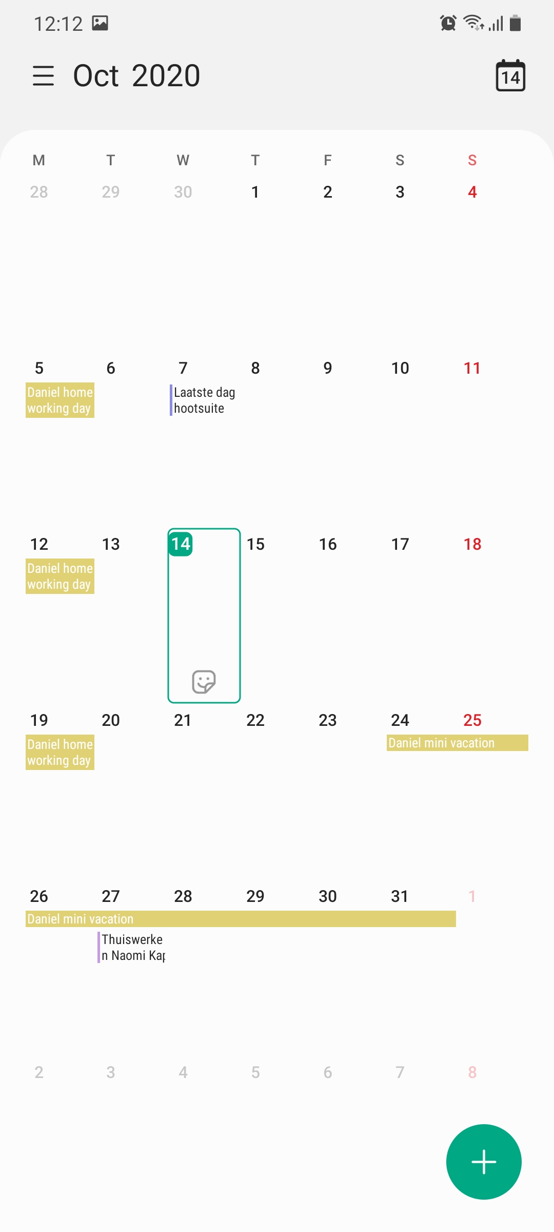
The user interface of the Calendar app has been improved as well. All of the calendar events are now displayed in separate cards instead of just one big card like before.
The One UI 3.0 beta program is currently underway for the Galaxy S20 series. It's likely going to be expanded to the Galaxy Note 20 lineup soon as well. Samsung has previously said that it's going to release One UI 3.0 for the Galaxy S20 handsets before the end of this year.
Find something else that's new in the One UI 3.0 beta on your Galaxy S20 device? Share with us in the comments below and we'll add it to the list.

Adnan Farooqui is a long-term writer at SamMobile. Based in Pakistan, his interests include technology, finance, Swiss watches and Formula 1. His tendency to write long posts betrays his inclination to being a man of few words.