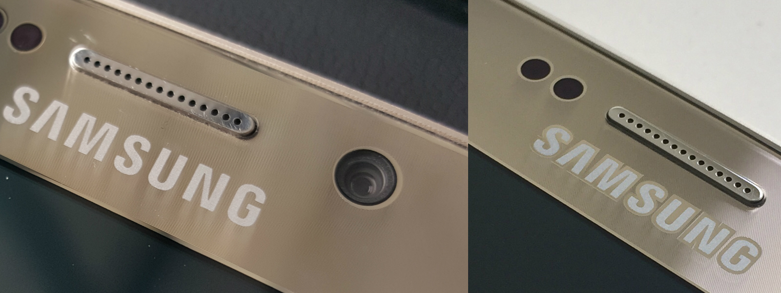
Samsung seems to have slightly changed the look of its logo on the Galaxy S6 edge (and possibly the Galaxy S6) in newer revisions of the device. On one of our Galaxy S6 edge's bought in the initial batch, the Samsung logo at the front of the S6 edge had a highlight around each letter, but as you can see in the picture below, the highlighting has disappeared on newer units.
The highlighted logo is something that was very noticeable on the gold variant of the Galaxy S6 edge when the phone was launched, as it reflected light in odd ways at some angles and would sometimes look too dark as a result. It actually made us wonder whether it was a deliberate move on Samsung's part, but it apparently wasn't as is evident by the revised logo on the units that are on sale right now. We here at SamMobile are rather divided on which version looks better, though at the end of the day none of the revisions do anything to take away from the beauty of the device.
Which version do you have on your Galaxy S6, and which version do you like more? Let us know in the comments!
Thanks, Faryaab!

