Last updated: September 21st, 2021 at 17:40 UTC+02:00
SamMobile has affiliate and sponsored partnerships, we may earn a commission.
Reading time: 6 minutes
The following isn't a wishlist, but I do have a question. Have you ever wished for a feature you felt was perhaps near-impossible to achieve, to the point where you never even bother mentioning it to anyone? I'm not referring to something obvious like the 3.5mm headphone port or microSD card slot. Everyone mentions those. I'm talking about something that never existed, and you wish it would have. If so, leave a comment below, but first, allow me to tell you about my — dare I say — “holy grail.”
It's a feature I wish existed but doesn't, and probably never will. Oddly enough for me, I haven't seen or heard anyone bring it up so far. Which, of course, can mean either that the idea is brilliant (but simple — don't get ahead of yourself, Mihai) or an idiotic one. You're free to lean towards the latter if that's how you feel, but naturally, I'm biased towards what I want from the software I use, so I'd object. I think it's a fantastic idea with positive UX ramifications.
This non-existent feature isn't something I came up with after spending a morning at the local coffee shop, but something that, somehow, my thumb muscles “believe” already exists. It's as if I've built muscle memory for a UI that I have never used, but would love to. Allow me to elaborate.
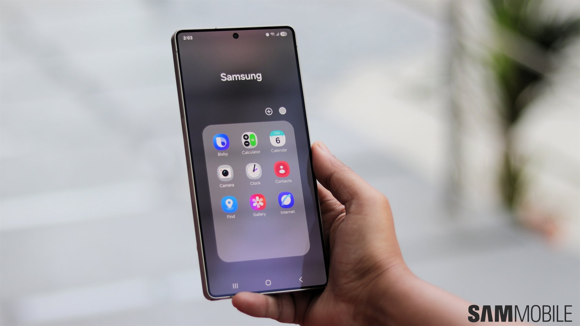
Many times when I access Recent Apps in One UI to switch between apps, I find myself believing, for a brief moment, that it's entirely possible to fully interact with apps in the Recent Apps screen, minimized as they are. My thumb starts hovering over the screen, wanting to interact with a minimized app — as if the feature had existed for some time and I've already grown accustomed to it — but then I quickly snap back to reality. This isn't how One UI, Android OS, or any mobile operating systems/launchers work! At least, not that I know of. Yet somehow, it feels more natural to me than the current Recent Apps design in One UI.
I found myself doing this, almost weekly, for the past two-or-so years, by the way.
I did think things through, at least to the point of wireframing the would-be UX in my head. The feature would be optional, of course, and would require a few adjustments to UI gestures.
The most obvious hurdle is that, in the Recent Apps screen in the live version of One UI, users have to swipe up or down on a minimized app to close it or bring it to the forefront. This conflicts with my solution, as we wouldn't be able to interact with our apps. We'd close them whenever we'd want to swipe up to scroll, and I must admit, I've accidentally done this a few times already.
Thankfully, the simple solution to this problem is right in front of us. Specifically, we can already swipe left or right below the recent apps carousel (around the Close All button, and indeed, all around the minimized app) to scroll through the list of recent apps. Why not use that same screen area for swipe-up and swipe-down gestures for closing or maximizing apps?
While we're at it, the Close All button could be moved closer to the lower edge of the screen to make room for a larger area for swipe gestures, and it wouldn't hurt to relocate the app icon to the bottom of the minimized app for easier reach. (NOTE: Moving the app icon isn't a new idea — it's something many One UI users have wanted for a long time).
To begin with, I believe it would improve one-hand usability, which is important in this day and age. If the apps are completely usable while minimized in the Recent Apps screen, their topmost UI elements would be easier to reach. You could pause your music with ease using one hand, without having to swipe the notification bar down or enabling “Swipe down for notification panel” in the home screen settings to do so.
Let's just say this feature would save a lot of unnecessary screen taps. I believe it could have a significant positive impact on the UX — on how we use our smartphones; and could change the way we think about mobile multitasking.
Think about it. With this Recent Apps UI design, you could switch to another app with just a simple side-swipe no matter where the app is located in the Recent Apps list, and you could use it while minimized. You could argue that we can already cycle between our two most recent apps in One UI by swiping the Recent Apps nav button multiple times in a row. But I promise you it's not the same thing, and the existing solution isn't as quick or flexible as I believe this new, seemingly unexplored method would be.
I have wondered why this feature doesn't exist in any mobile OS or launcher that I know of, and it puzzles me why nobody else seems to be bringing it up. Perhaps it really isn't a worthwhile idea and my thumb muscles need an update, or maybe there are other limitations to consider. Maybe Android OS itself makes it impossible for Samsung or any OS/app developer. Perhaps it is a limitation of how mobile ARM CPUs work. I wouldn't know; I'm not a coder or silicon designer.
But if you are Samsung or a third-party developer and you'd like to run with this idea, feel free to do so. I'd love to see it become a reality. And if the idea brings you success and you feel like you owe me something, you don't, but you could make me a shareholder or something. Send some loot my way; I promise I won't mind.
On a more serious note, what do you all think? Can you imagine this new way of mobile multitasking working out? Or is it not worth pursuing? Feel free to leave a comment below or join our Telegram group, but let's try to be constructive.
Oh, and, if this feature does exist somewhere, please accept my apology in advance. I don't know about every piece of software in the world, and I most likely never will. But you're welcome to share more details.

First Samsung device: SGH-A800
Mihai is a blogger and column writer at SamMobile. His first Samsung phone was an A800 which took a lot of beating, and a part of him still misses the novelty of the clamshell design. In his free time, he enjoys watching shows, documentaries, and stand-up comedy; listening to music, taking walks, and occasionally playing old(er) video games.