Last updated: October 18th, 2019 at 20:16 UTC+02:00
SamMobile has affiliate and sponsored partnerships, we may earn a commission.
Reading time: 12 minutes
But, One UI is only a year old at this point, and Samsung knows there's plenty of room for improvement. That is exactly what the company has focused on with One UI 2.0, which is filled to the brim with improvements to the existing user interface and functionality. And to show you exactly how all of those changes and improvements compare to One UI 1.1/1.5, we spent a week discovering it all on a Galaxy S10 running the Android 10 One UI 2.0 beta and have made side-by-side screenshots for you to check out.
Before we get started, we should mention that there may be other changes that we haven't managed to find just yet, and we will update this post when we do find something else. Also, we'll be taking a look at the major new features in our One UI 2.0 feature focus series of articles, which is why we aren't going to talk about them here. Last but not least, in each picture you see below, the left screenshot is from Android Pie/One UI 1.x and the right one is from Android 10/One UI 2.0.
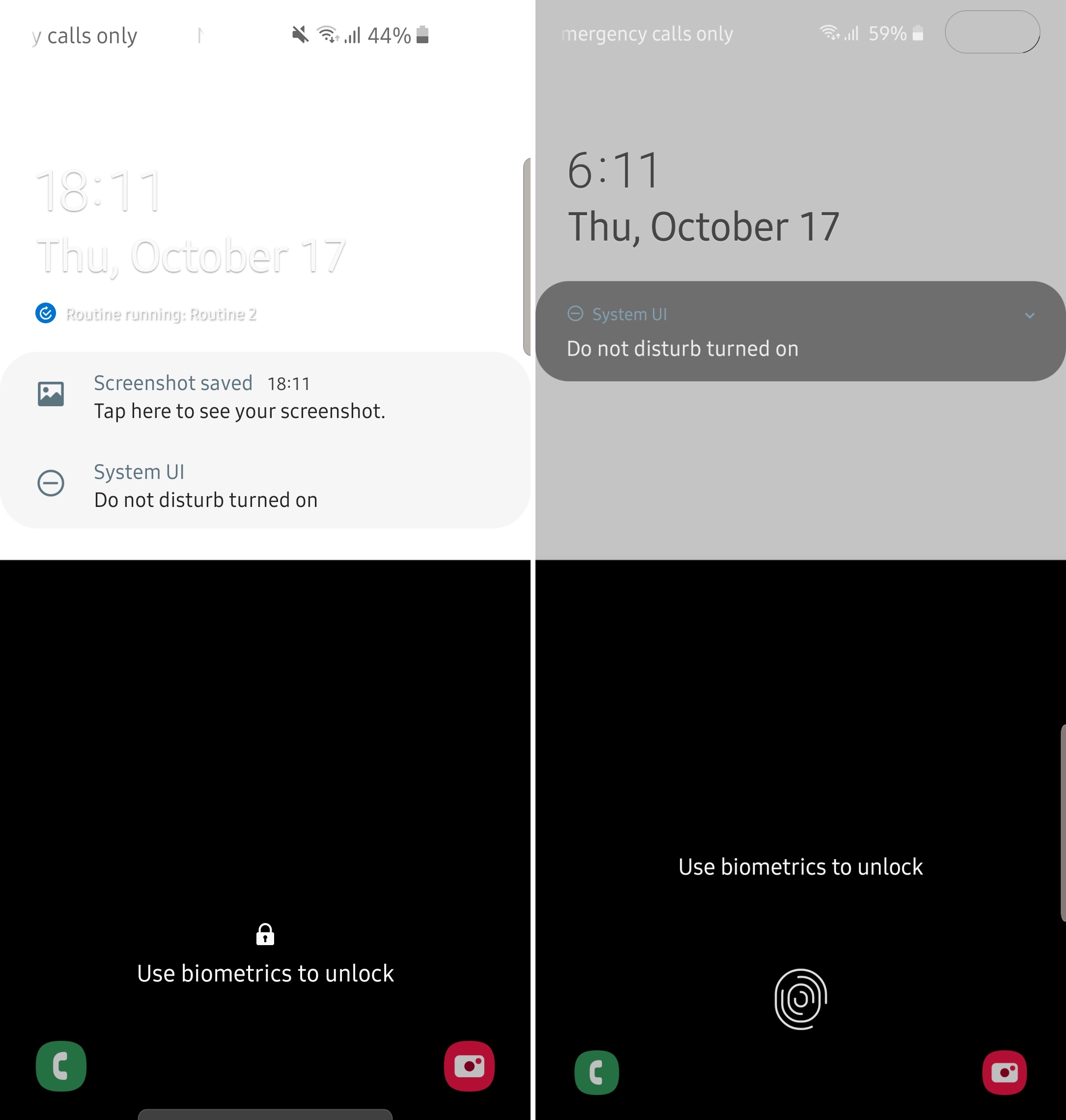
The lock screen can now detect dark and light areas of the wallpaper and change text color accordingly to increase legibility. As you can see in the picture above, with a wallpaper that's half black and half white, One UI 1.x uses white font color for all text, making it illegible in the upper half of the wallpaper. One UI 2.0 changes the text color in the upper half to black while keeping white text in the bottom half.
On One UI 2.0, if you have your lock screen set to only show notification icons, tapping any notification icon simply expands the notifications on the lock screen. On One UI 1.x, tapping notification icons on the lock screen also expands the quick toggles, which goes against the idea of presenting only relevant information to the user.
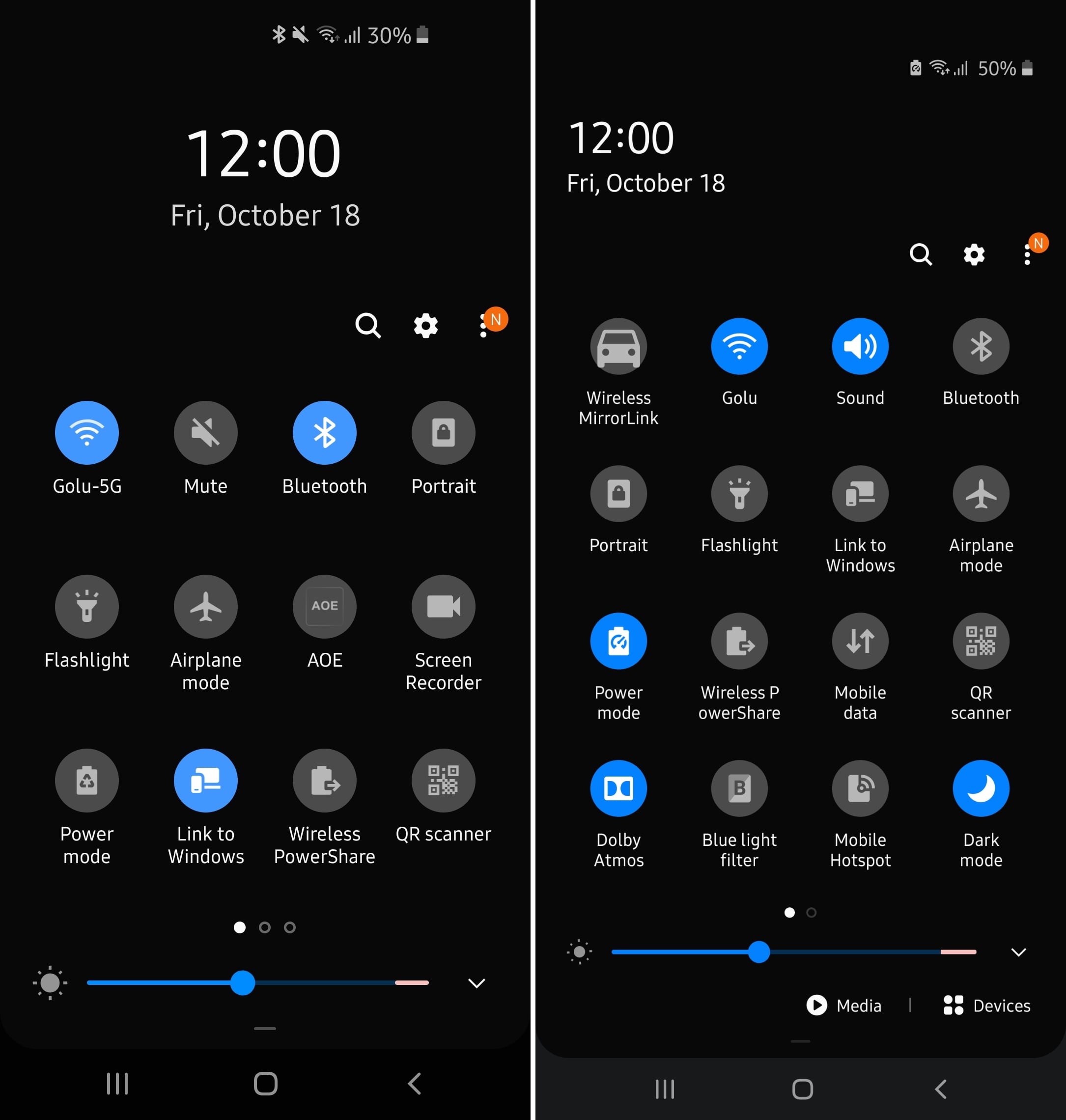
One UI 2.0 lets you see more of the quick toggles in the notification shade when it's fully expanded. The big time and date display at the top center that you see on One UI 1.x has been reduced in size and shifted to the left side, and that lets you see more toggles at once. This is a slightly disappointing change, as it makes one-handed use less convenient, since you now have to reach a higher part of the screen for the first line of toggles. It does, however, reduce the number of times you'd have to scroll to see more toggles, so we guess this is a logical compromise.
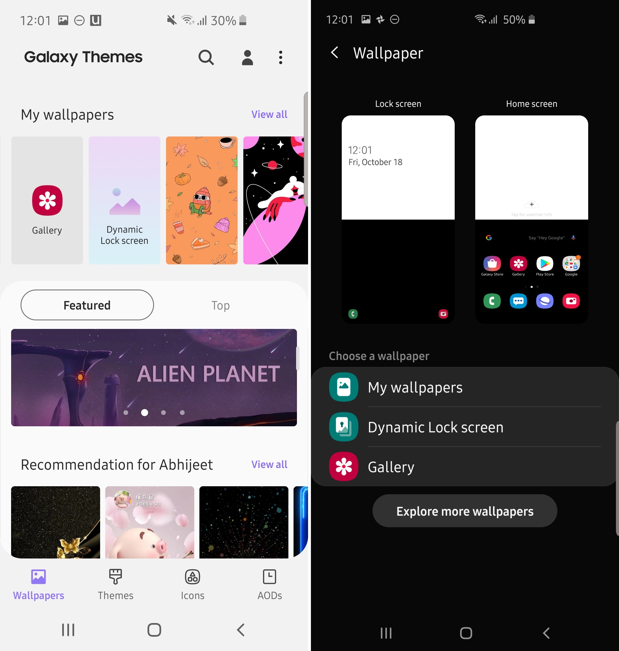
On One UI 1.x, whether you try to change the wallpaper from the Settings app or by pinching the home screen, you are taken to the Galaxy Store, where you can either browse through wallpapers from the store or access your own wallpapers. On One UI 2.0, there is now a dedicated menu for wallpapers, where you can see multiple options and also a preview of your current home screen and lock screen wallpapers.
You can either select My wallpapers to browse through preloaded wallpapers, select Dynamic Lock screen for setting wallpapers based on particular categories (more details here), select Gallery to use an image from the Gallery app, or select Explore more wallpapers if you want to look at wallpapers in the Galaxy Store.

The camera UI has been updated One UI 2.0. In addition to different icons, the Camera app on One UI 2.0 hides all camera modes except Photo, Live focus, Video, and Live focus video under the More section. You can, however, move the desired modes out of the More section to go back to the One UI 1.x look.
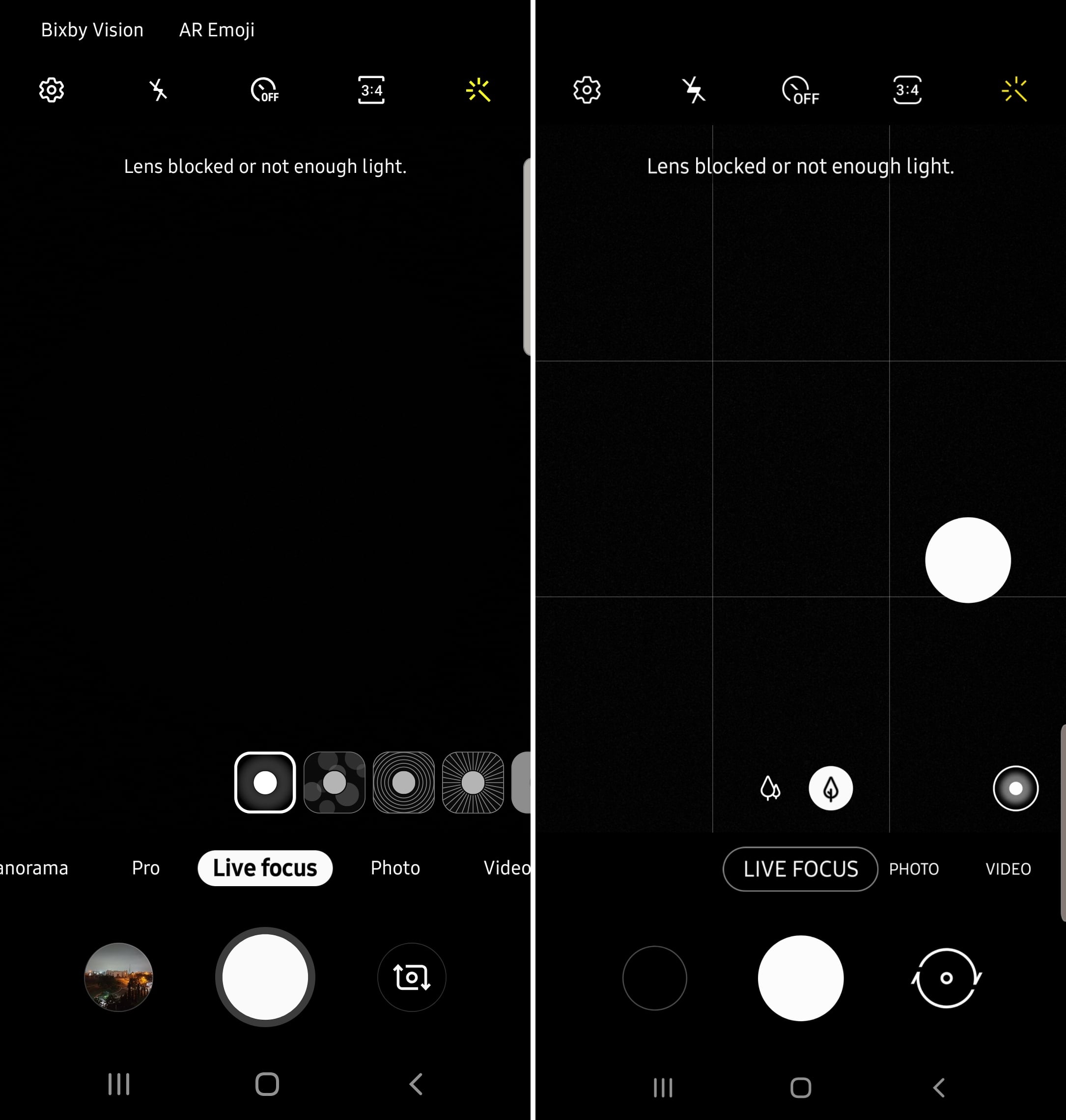
Furthermore, the method of changing the Live focus effect has been changed as well. You now have a dedicated button where the Scene optimizer toggle would be in Photo mode – you have to press that button in order to view all effects. On One UI 1.x, the effects were simply laid out above the shutter button, which may actually be what many users would prefer as One UI 2.0 adds an additional step for switching between those effects.
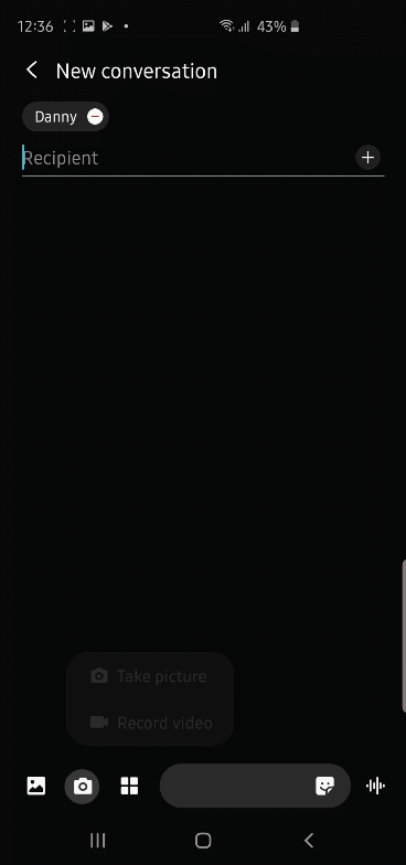
When you compose a message in the Messages app and tap the camera icon to take a photo with the camera and add it to the message, One UI 2.0 directly opens the camera app in full screen. On One UI 1.x, the camera opens in the bottom half of the screen and you can swipe up to view it in full screen if you wish. The GIFs below show the difference between the two — the first one is from One UI 1.x, the second one from One UI 2.0 (tap/click the GIF image if it doesn't automatically start playing).

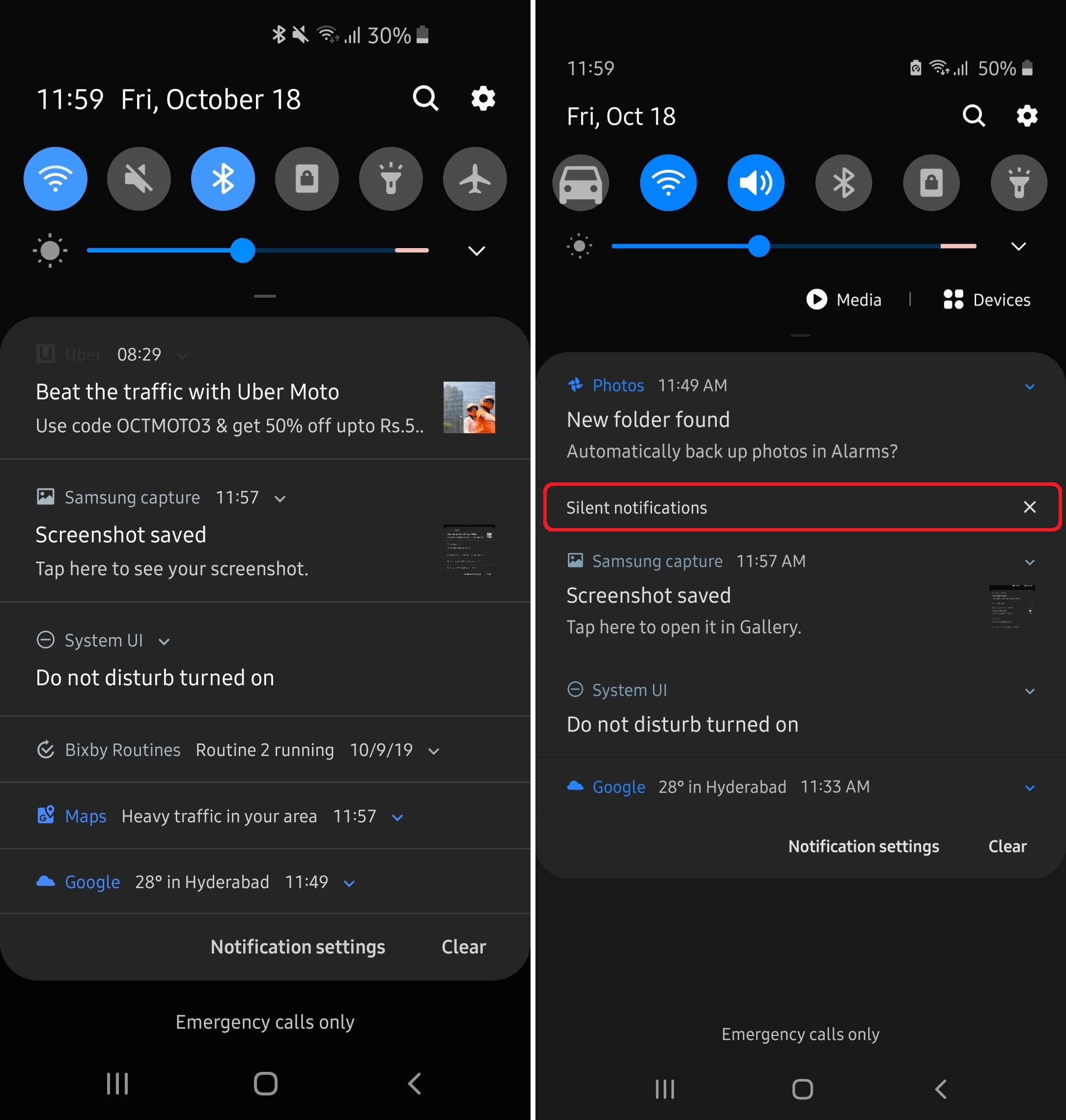
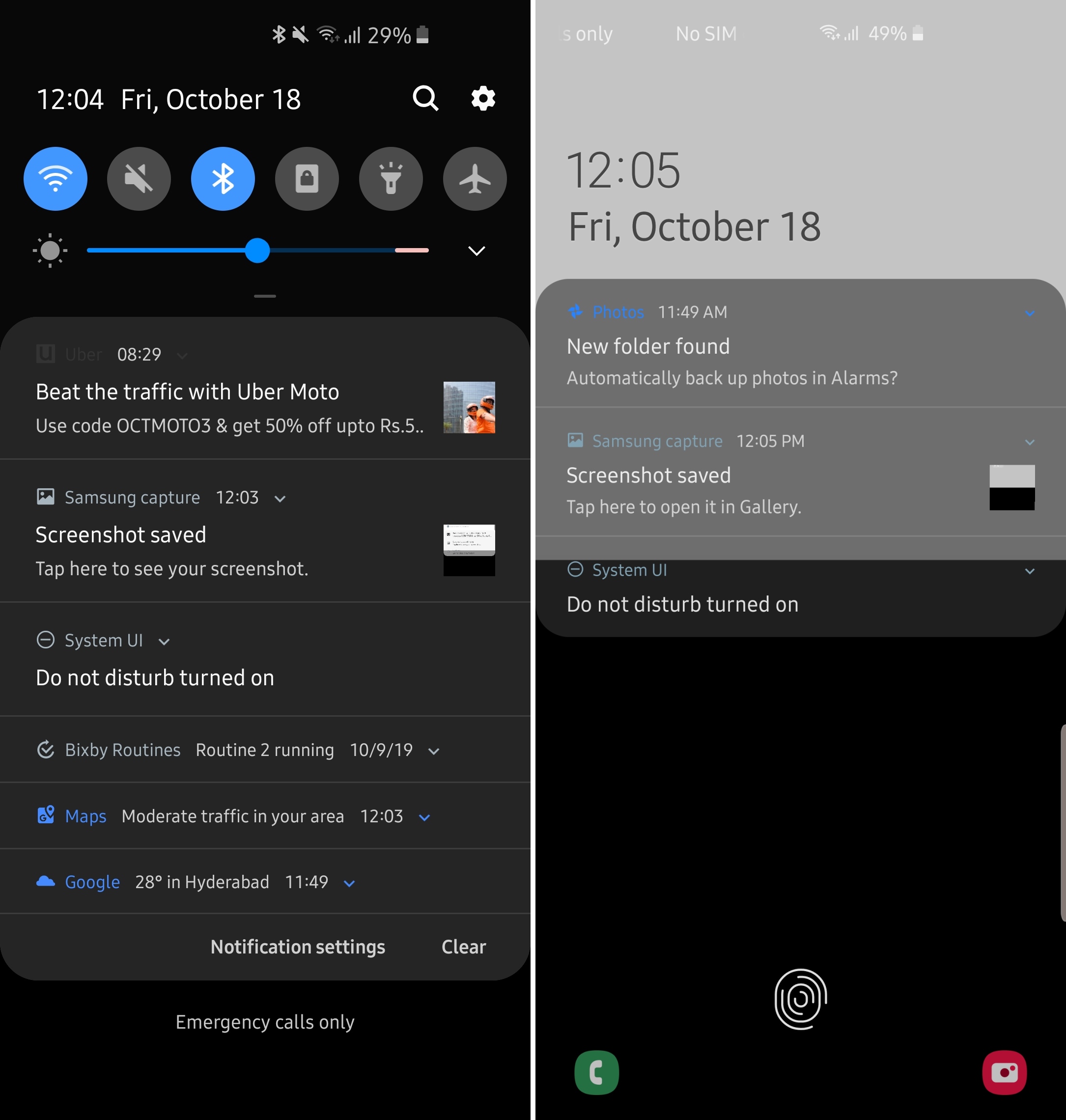
On One UI 2.0, any notification that doesn't notify the user with a sound or by vibrating the device is grouped under the Silent notifications section in the notification shade. These are mostly persistent notifications, such as the notification you see when Do not disturb mode is enabled, and notifications for things such as screenshots and Google's weather indication.
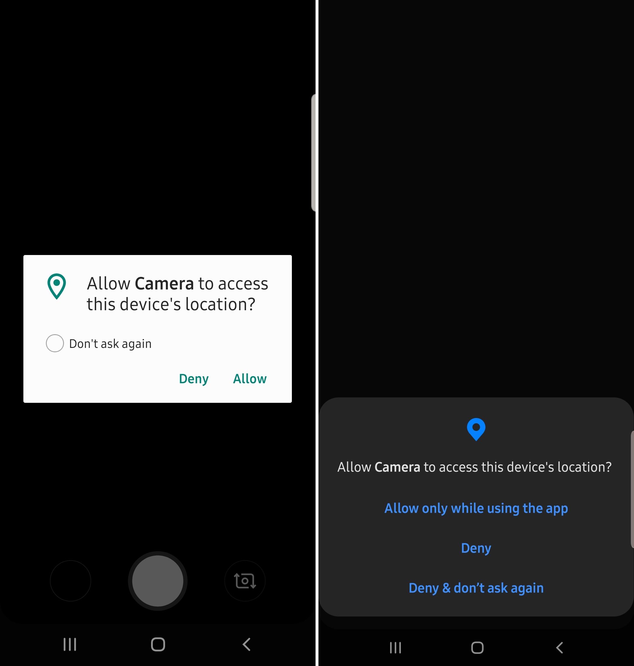
On One UI 2.0, the pop-up dialog for granting permissions to an app shows up at the bottom of the screen instead of in the middle. There are also more options for allowing permissions. For example, you can either deny a permission to the app, deny and tell the phone to never ask you again for that particular permission, allow the permission, or allow the permission only when while you are using this app so it doesn't access data in the background.
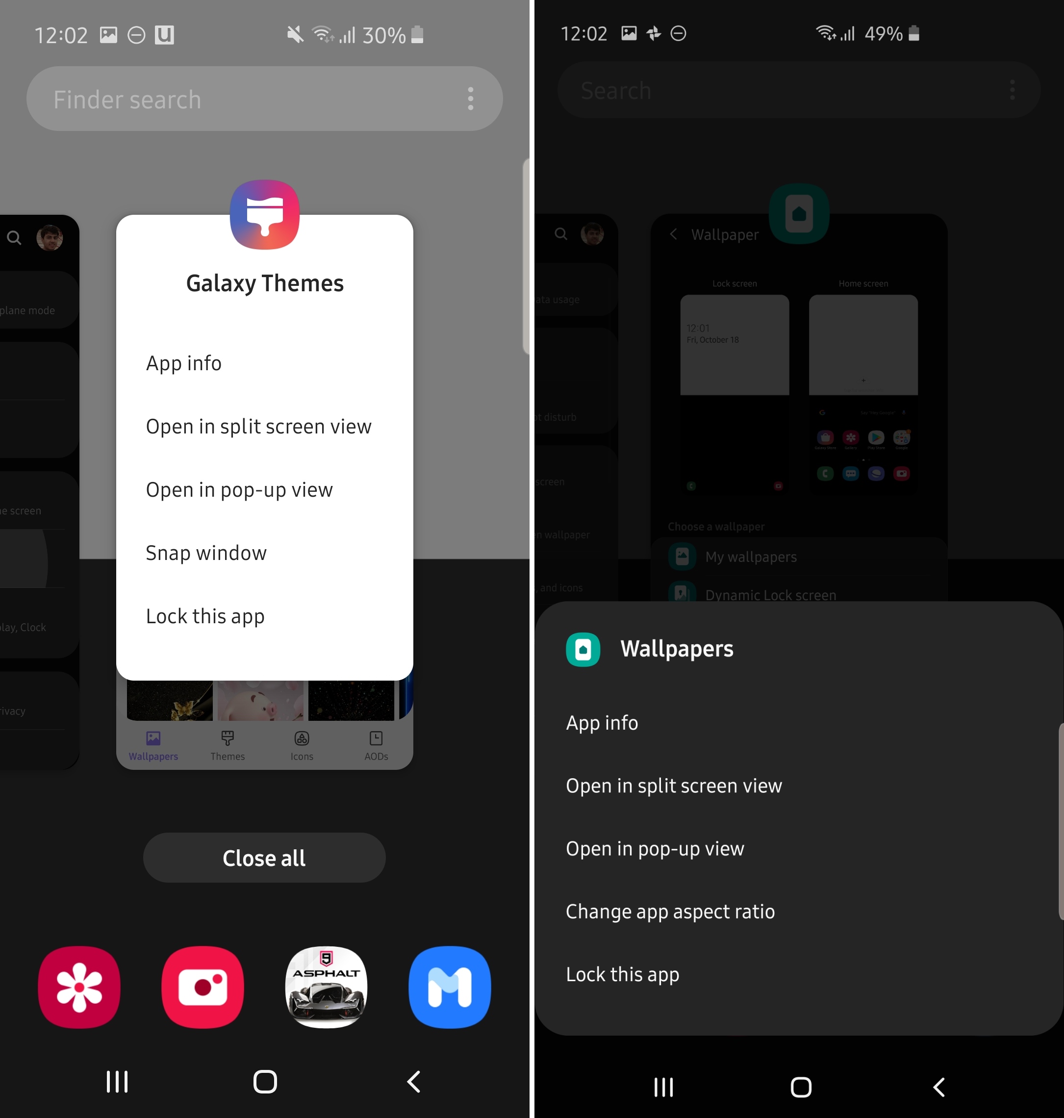
Like the permissions dialog, the pop-up menu you get when tapping an app's icon in the recent apps/multitasking screen also shows up at the bottom of the screen instead of below the app icon. This menu is where you can find the option to open an app in a pop-up window, in split-screen view with another app, view the app's information, change its aspect ratio, or lock it so it isn't cleared from memory when you tap the Clear all button.

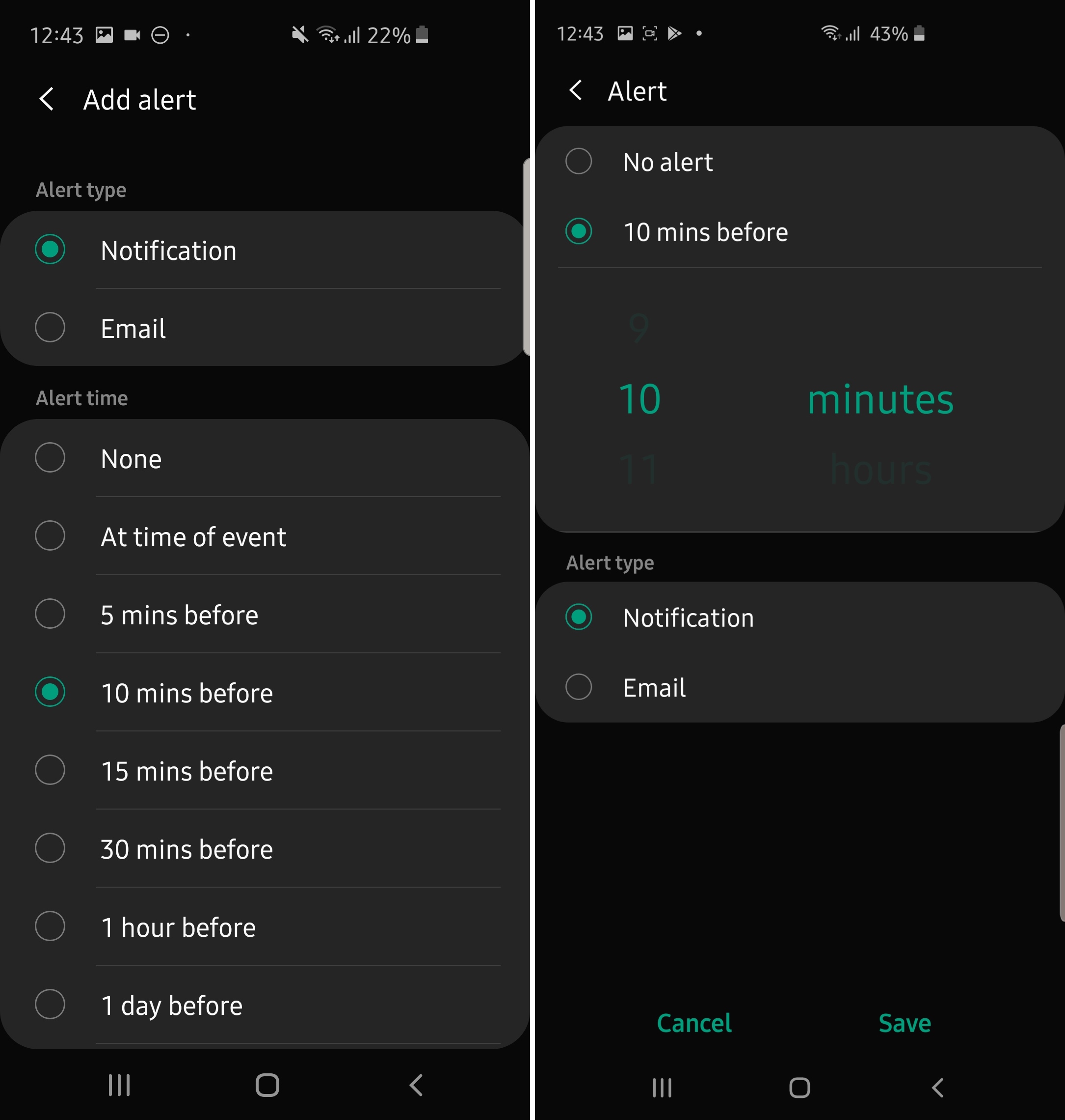
In the Calendar app, Samsung has made it easier for you to go to a particular month or year. Instead of swiping a dial to change the month, you now get all months listed as buttons on a single page. And, when you're trying to customize exactly how far ahead of an upcoming event you should get an alert, you can now manually select the minutes, hours, or days through a scrolling selection wheel.

The Device care screen in the device settings has been given a makeover, with the four main categories (Battery, Storage, Memory, and Security) now shown as a vertical list. The score calculated for your phone's overall optimization continues to show at the top.
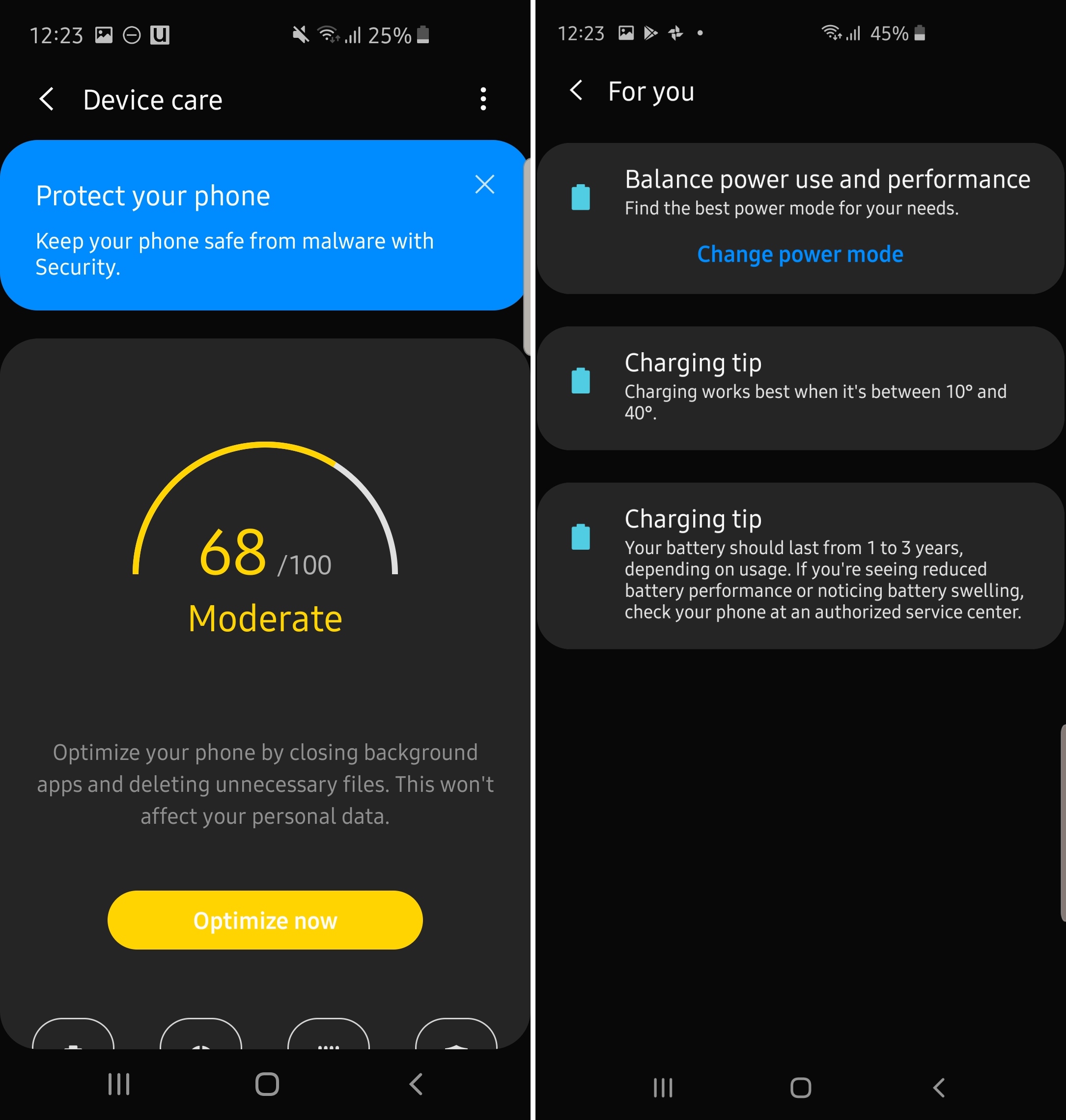
Furthermore, you now have a dedicated button at the top of the Device care screen in which you can view various tips for keeping your device optimized. On One UI 1.x, there is no dedicated tips section – you simply see a new tip at the top of the main Device care screen every time you open it.
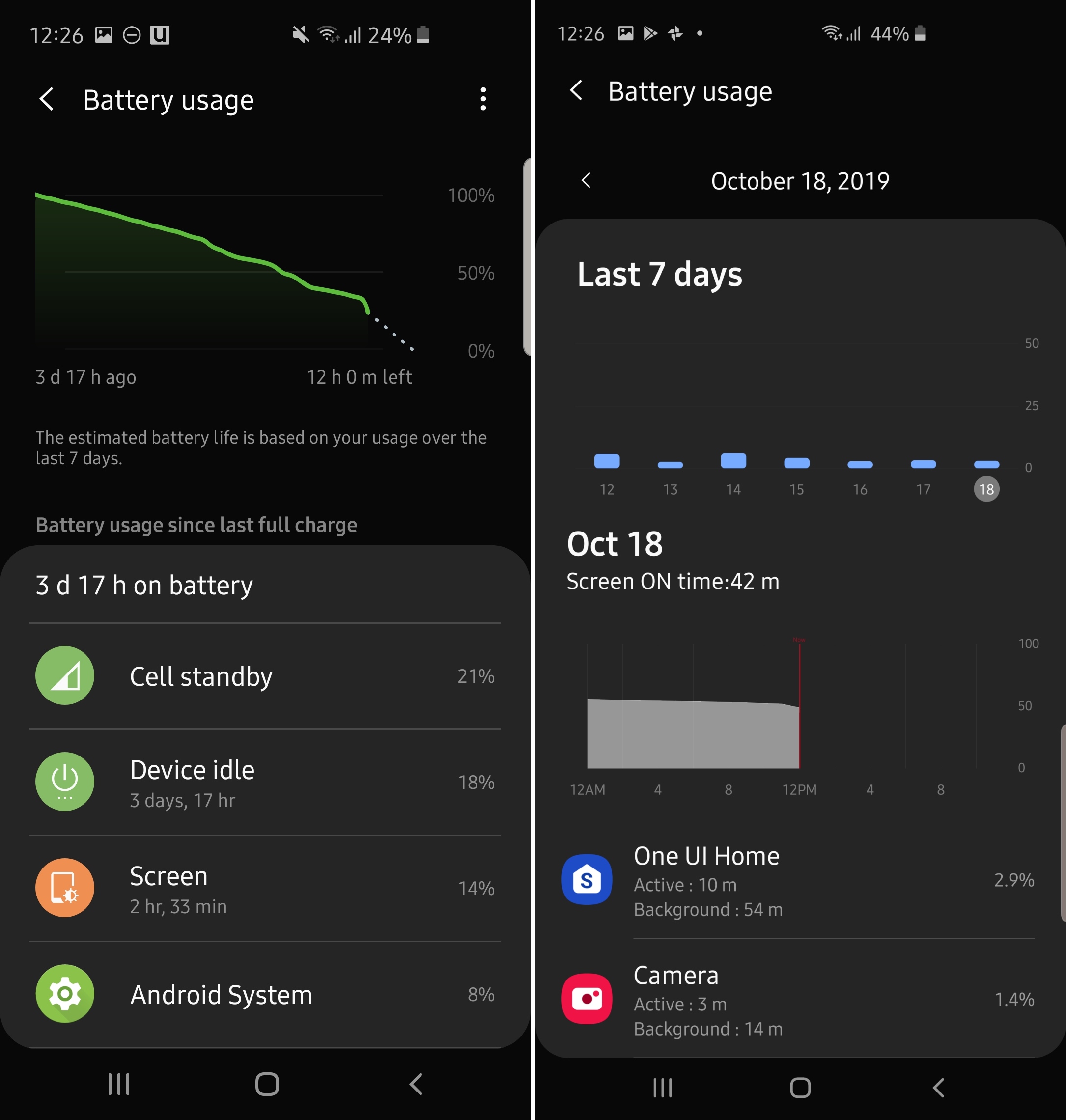
If you look at your battery stats often, either to check how long your phone lasts or to boast or curse battery life online on websites and forums, you will like the redesigned battery usage screen in Device care on One UI 2.0. Now, you can check the battery usage stats for the last seven days instead of just the time since the device was last charged. The screen on time, meanwhile, is always visible at the top.
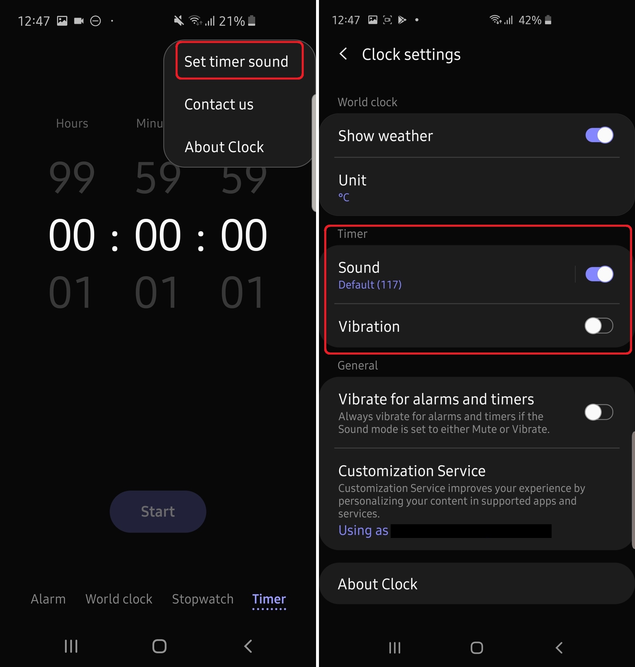
On One UI 2.0, there is a single consolidated menu for changing settings for the four different features — alarm, world clock, stopwatch, and timer — of the Clock app. On One UI 1.x, if you want to change the alert sound for the timer, you have to switch to the Timer tab; changing the weather unit to Fahrenheit or Celsius requires you to first switch to the World clock tab. Now, you can hit the three-dot button up top in any tab and find a Settings button to find all of those settings on a single screen.
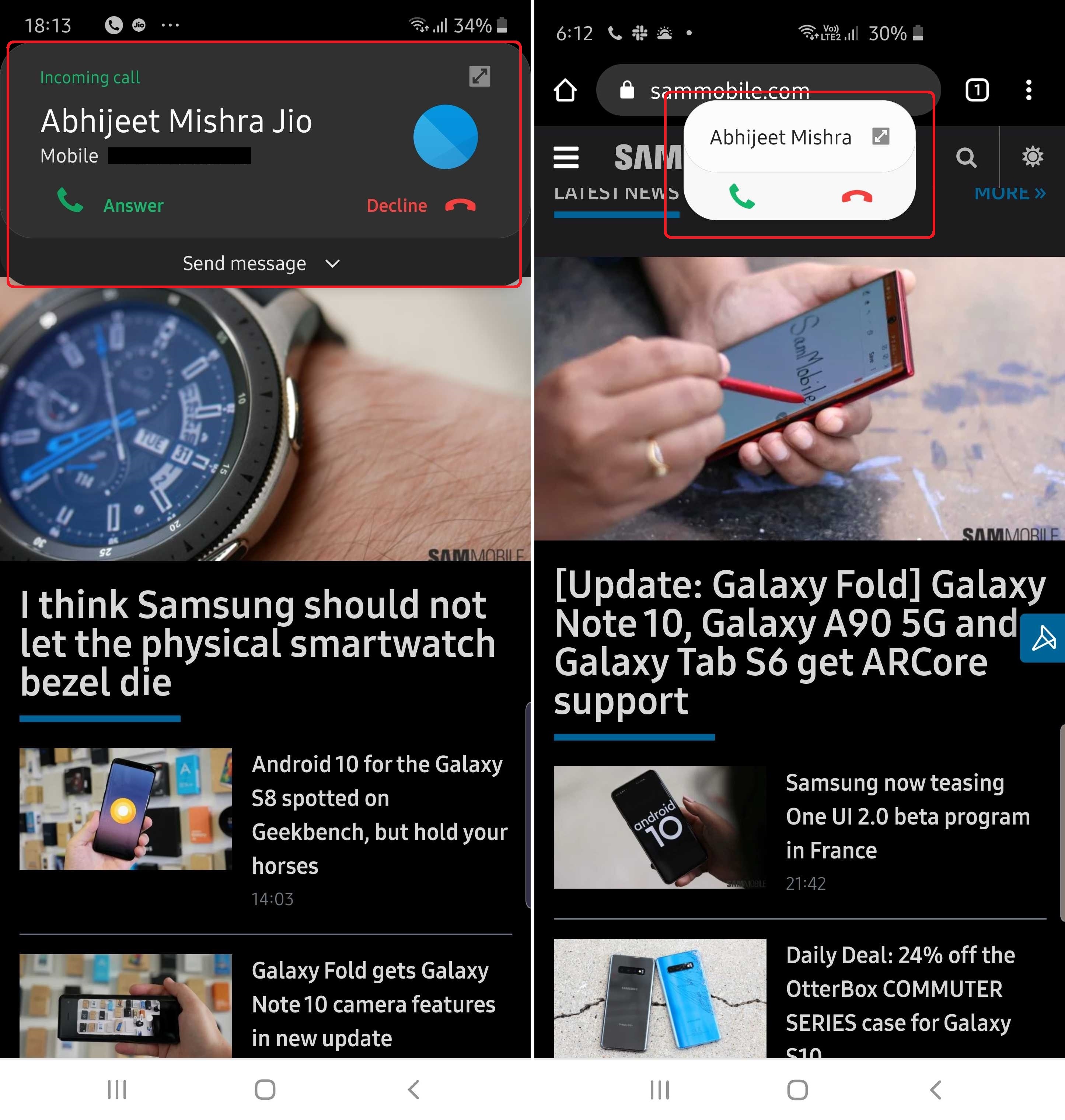
On One UI 1.x, when a call comes in while you're using your phone, you have the option to make the incoming call show up as a pop-up instead of taking you away from the app you're using. On One UI 2.0, you can change the size of that pop-up in the Phone app's settings – open the Phone app, tap the three-dot button at the top right, tap Settings, then tap Call display while using apps. The new Mini pop-up option will show just the name of the caller, the accept and reject buttons, and a button to view the incoming call in full screen.

When you use the Find on page function in the Samsung Internet browser for finding a word on a webpage, One UI 2.0 shows you the arrows for jumping to the previous and next result at the bottom right of the screen, making one-handed usage easier. On One UI 1.x, those arrows would be at the top of the screen, next to the typing field. Unfortunately, this doesn't change in Chrome, as that isn't a Samsung-made app.
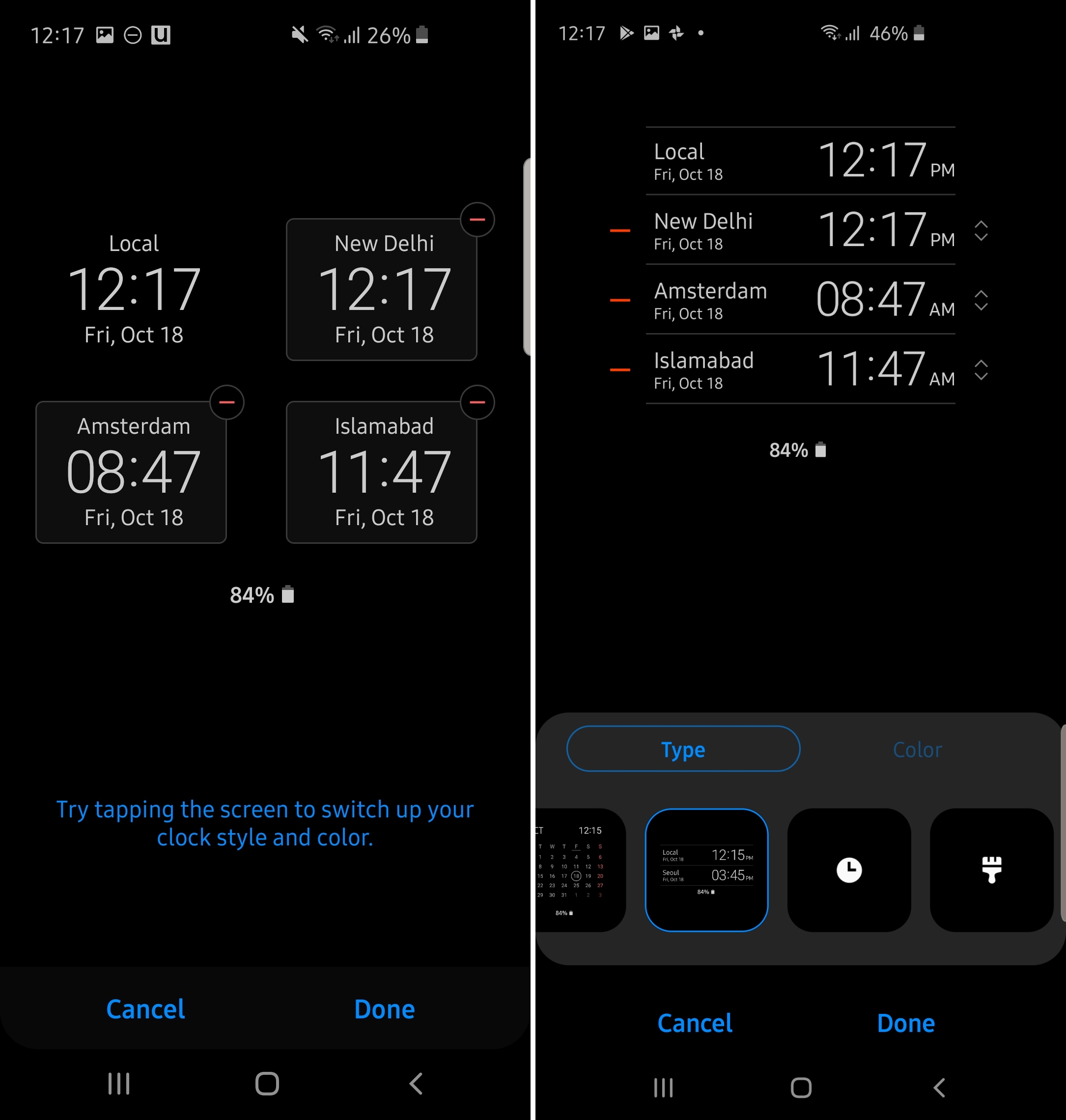
If you use the Always On Display style that lets you add multiple time zones to the AOD screen, One UI 2.0 now shows each time zone in a vertical list. On One UI 1.x, each row shows you two time zones in a bigger font, leaving less space for adding multiple clocks compared to what is possible on One UI 2.0.
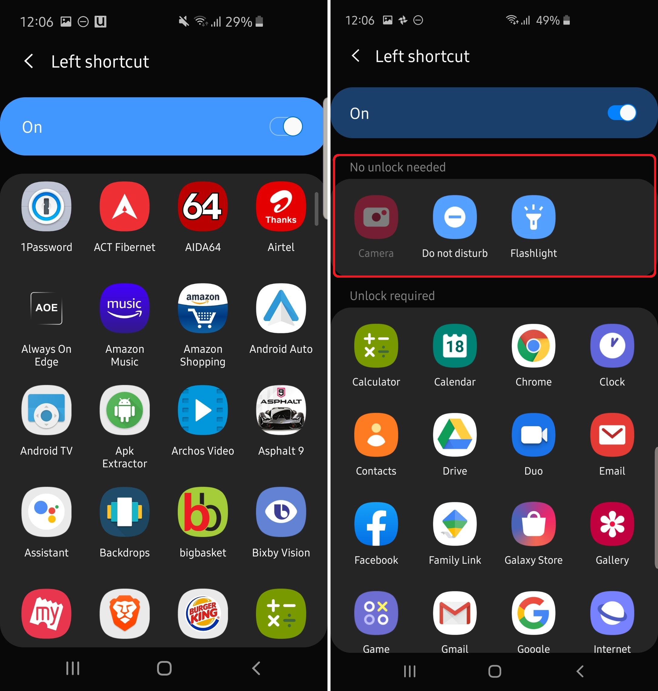
On One UI 2.0, you no longer have to have only app shortcuts on the lock screen (the ones you see at the bottom left and right corner). When you go into the customization menu for the lock screen shortcuts (Settings » Lock screen » Shortcuts), you will now see a list of shortcuts separated by whether they require the phone to be unlocked or not. Under the No unlock required section, you will have shortcuts to things as the flashlight and Do not disturb mode.

The Auto optimization feature, which can be found in the Device care section, was introduced with Android Pie and allowed the user to set a time at which all but the most recently used apps are cleared from memory and unnecessary files are deleted from storage. On One UI 2.0, Samsung is letting you choose if you want to clear all apps from memory instead of just the recent ones, and we have learned that this option will be turned on by default when the device has less than 12GB of RAM and turned off if a device has 12GB RAM or higher.
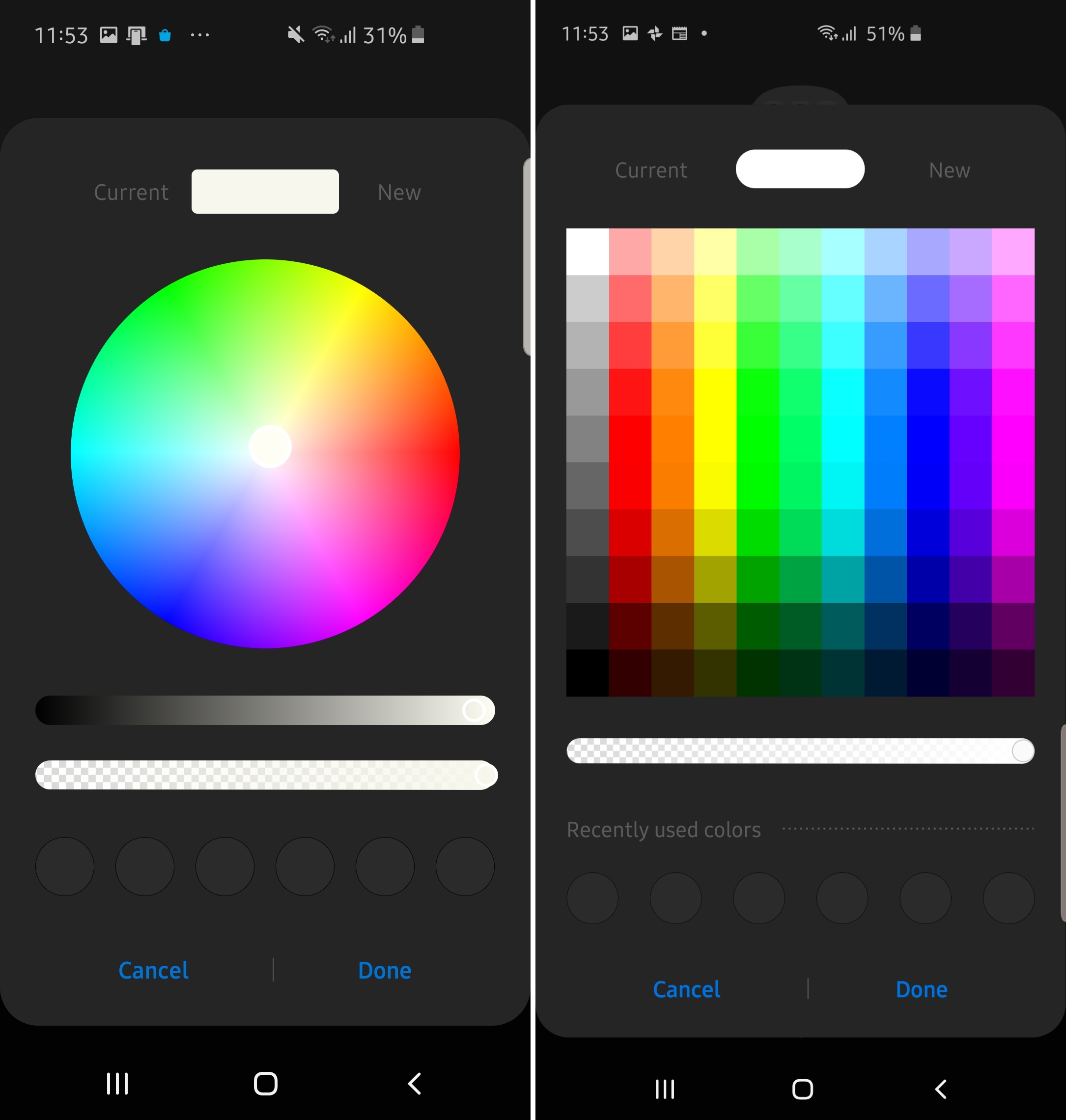
The color picker that you get when you want to, say, change the color of a folder on the home screen, you are now shown predefined colors instead of having a full RGB circle so you can select a desired color easier. You can then change the shade of the color with the slider just below.
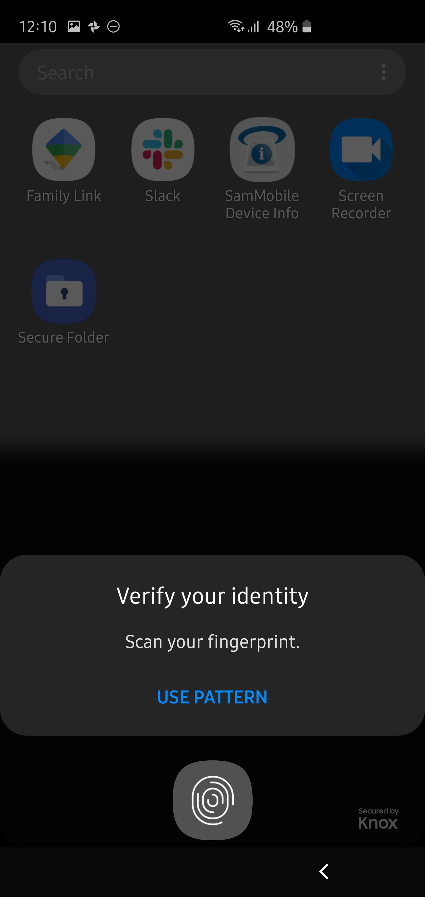
On One UI 2.0, if you have your device secured with your fingerprint and open Secure Folder, you will get a direct dialog for fingerprint recognition at the bottom of the screen, and you can go to the password/PIN/pattern recognition screen using the button below the fingerprint icon. One UI 1.x takes you a new screen as soon as you tap the Secure Folder shortcut.

See anything on One UI 2.0 on your Galaxy S10e, Galaxy S10, or Galaxy S10+? Let us down in the comments, and we'll add them to this post!

Abhijeet's writing career started with guides for custom firmware for Samsung devices (including the original Galaxy S), and he moved to SamMobile in mid-2013 and worked up the ranks to Editor-in-chief. In addition to phones and mobile devices, his interests include gaming on both PC and console, PC hardware, and spending countless hours on YouTube watching videos on tech, movies, games, politics, and internet dramas.