Last updated: November 6th, 2023 at 18:05 UTC+01:00
SamMobile has affiliate and sponsored partnerships, we may earn a commission.
Reading time: 2 minutes
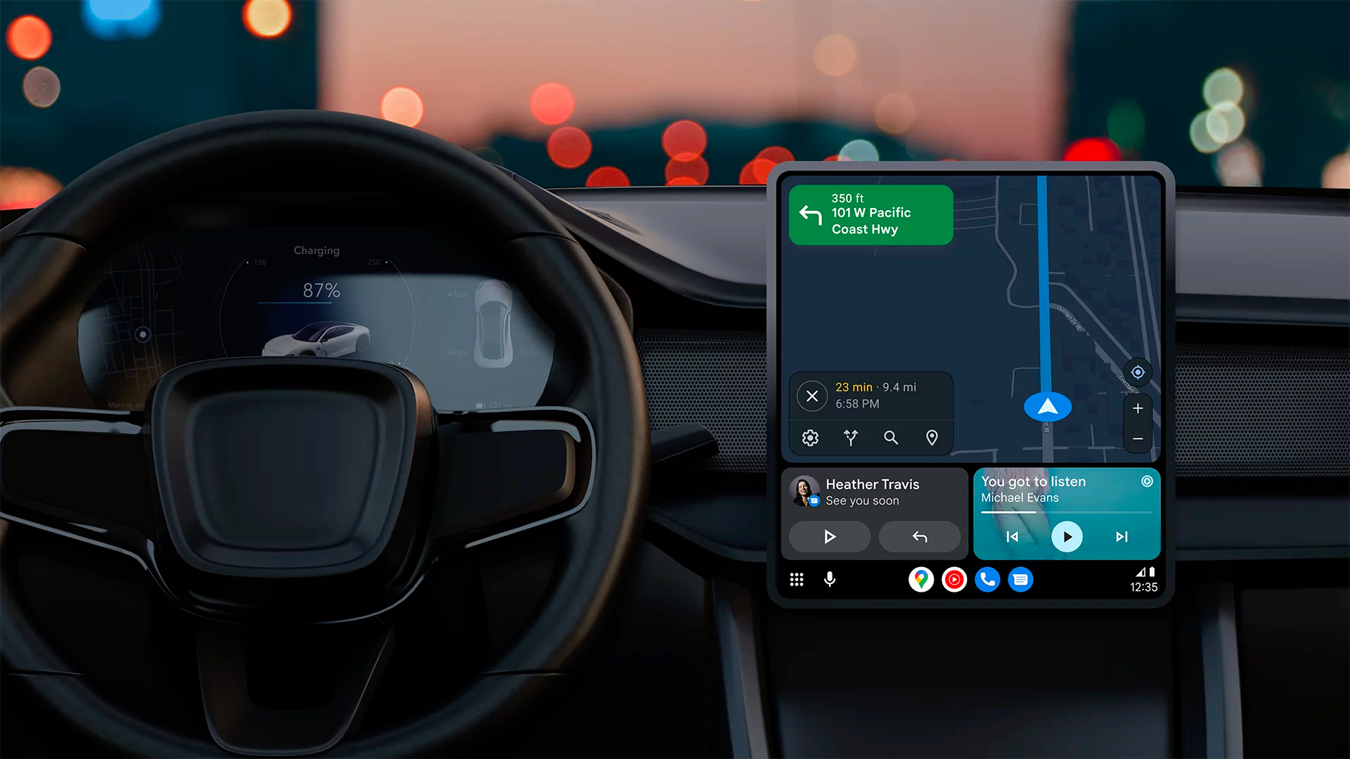
As spotted by 9To5Google, Google Maps' navigation screen is getting a design update to make the information less crowded. The Estimated Travel Time is now bolder and appears on the top, while the distance remaining and ETA (Estimated Time of Arrival) information is displayed below that. The buttons to stop navigation, alternate routes, search for more locations, the stops on the route, and the three-dot menu to display additional options are placed below without a separator line that was present earlier.
Currently, only some people might be seeing this new design as it seems to be a server-side update. So, even if you have the latest beta version of Android Auto (v10.8) and Google Maps (v11.104.0100) installed on your phone, you might not see the new Google Maps design. The whole design tweak makes Google Maps look a little more modern.
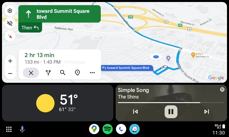
Over the past few months, Google has introduced a translucent sidebar that displays important buttons, including Settings, Mute Sounds, Orientation, Zoom In, and Zoom Out. This makes the design look less crowded compared to earlier designs.

First Samsung device: T100
Asif is a computer engineer turned technology journalist. He has been using Samsung phones since 2004, and his current smartphone is the Galaxy S23 Ultra. He loves headphones, mechanical keyboards, and PC hardware. When not writing about technology, he likes watching crime and science fiction movies and TV shows.