Galaxy S9 Android Pie beta leaks ahead of official launch
An early Galaxy S9 Android Pie beta build has been leaked online ahead of the beta program’s impending launch. Some evidence surfaced recently which suggested that Samsung will soon launch the Android 9 Pie beta program for the Galaxy S9 and S9+. We have already seen leaked alpha builds of Android 9 Pie for the Galaxy S9 and Galaxy Note 9. Some of the minor issues in the alpha builds have been addressed in this beta.
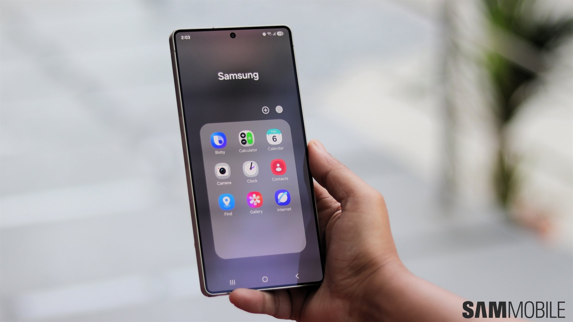
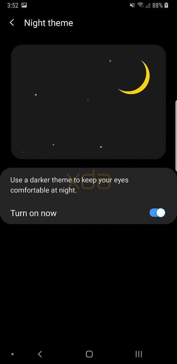
Samsung will be introducing a system-wide night theme with the Android Pie update. The alpha build had white cards on top of a black background which didn’t really look good. That has been changed in this beta so gray cards are now displayed on a black background.
Galaxy S9 Android Pie beta leaked online
The gestures in settings were broken in earlier builds and they have been fixed in this beta. Swiping up in the position of a button on the nav bar works now. When this is enabled, the nav bar will be hidden completely and apps will stretch all the way to the bottom of the display.
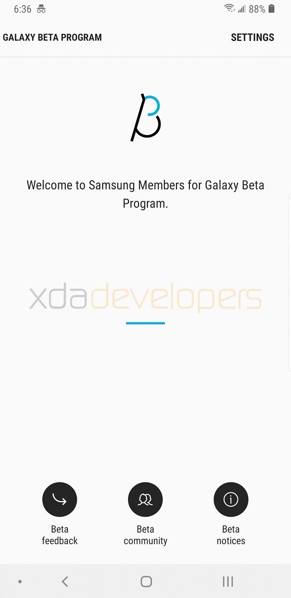
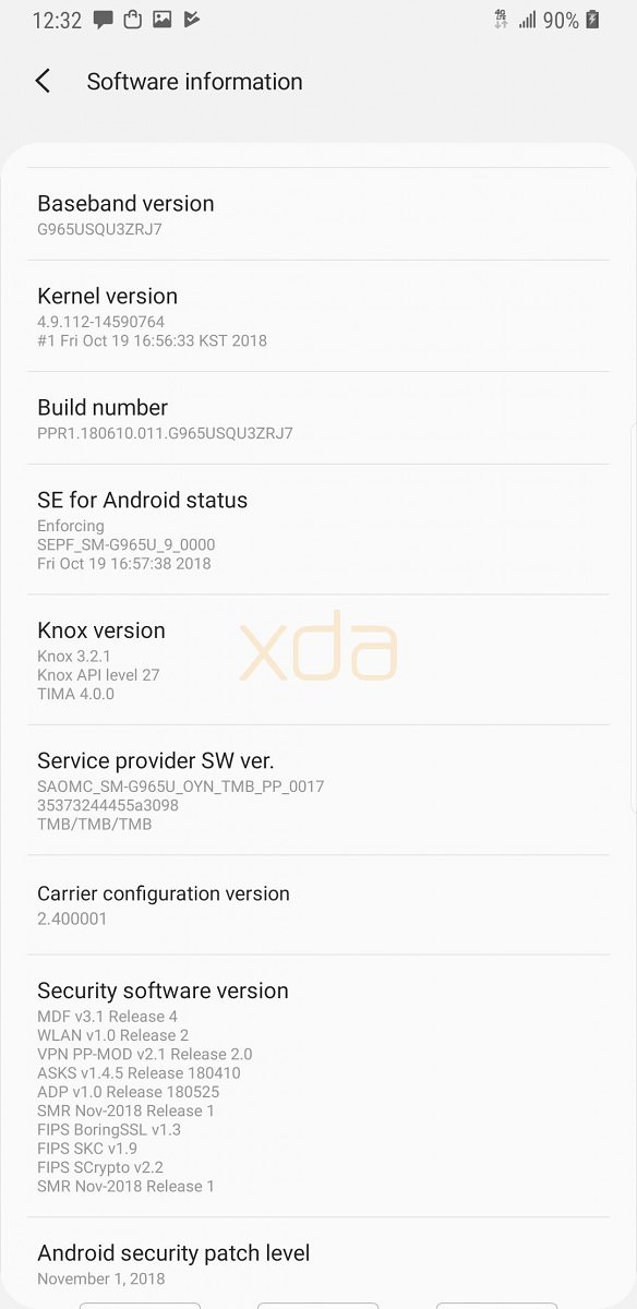
This beta build includes Samsung Members and the Samsung Beta Services apps. It’s a good indication that this is indeed a copy of the beta that will be rolled out in the near future. Samsung will enable users to sign up for the beta once it goes live. The beta may initially be launched in South Korea and the United Kingdom. It will have users sign up for the beta through the Samsung Members app.
It’s also mentioned that the Galaxy S9 will receive some software features from the Galaxy Note 9 – Scene Optimizer and Flaw Detection to be precise. These are camera features that use AI to improve the imaging experience on the device. These features were launched with the Galaxy Note 9.
The app icons have received a fresh coat of paint as well. Also check how Samsung apps on Pie look compared to their Oreo counterparts to get a sense of what has changed. The overall UI changes are significant and from the looks of it, the changes will have Samsung fans divided.
Samsung is yet to confirm when it will officially launch the Android 9 Pie beta program for the Galaxy S9.
48 Comments
Sign in »48
Leave a Reply
icons and ui very bad
The new icons is very ugly WTF with you Samsung!?!?
Waste of screen space and lost the classic clean interface. But this is beta. Hope final would be clean and classic.
Did Someone too tolerant of Samsung? It’s not just a beta version of SE10,the whole design team has clearly changed from the team designed the Galaxy S8 hardware and software(SE8) before ,which is awful.Also just use theme and icon pack?NOT every Android users like to mess up their phones.If the official software design style is beautiful,why you have to use third-party team theme?They can not be better to official by using theme tool.I chosen Samsung instead of HUAWEI because HUAWEI official design is a mess.If official version of SE10 is like this,I should change my Android phone to SONY or… Read more »
The new icons look so bad the looks like kid made them please keep the old icons
Yep, they are literally ugly while the old icons are pleasant to the eyes.
The oldd icon look moree classic and beauty
This new icon like for children😂
I think i am the only one who loves those icons 🙂 The beta is only for S9? I own a S8 and i’d love to get it.
It seems to be worse than the currently used icons icons is better with each new version of these icons can be used for many years when there is no need to change the icon
It is currently used pisdi icons icons is better than these icons can be used for many years and there is no need to change the icon when each new version
and actually I love changes, and it seems like it is very nice (but the icons that looks like gs7 marshmallow and nougat) When IOS 7 came out everyone hated it but now we agree it looks better than iOS 6.. lets see how final version would look
is beta for note 9 also included or we only know for galaxy s9?
Official beta will likely only be for the S9/S9+.
Is the beta for the exynos version? If so, any download links? Might be blind..
Why are people losing their minds here? Are they insane? 1. It’s just a beta. 2. There are literally thousands of themes and icons in the theme store. Some people are just Iike negative moaning old women. Lol. Btw, the system wide dark mode….. Definitely looking forward to seeing that.
This is clearly a step backwards in design… Samsung get serious for a moment.
Wtf are you doing samsung?
What happened to the beautiful Samsung Experience icons? Bring them back!
It’s just a beta. No need to lose your mind. Lol. You have thousands of icon choices in the theme store. Chill man, CHILL! 🙂
All the good ones cost, and I’m not willing (and I’m sure many aren’t either) to spend 2 bucks on an icon pack that only changes system app icons anyway
There are lots of great free themes and icons. You would know that if you had the phone.
I’ve had an S7 Edge for almost 2 years, and I have yet to find a really good theme or icon pack that is free, other than the High Contrast one offered by Samsung. There are some awesome wallpapers though.
Maybe it’s just my taste, maybe other people (including you) prefer some of the free themes unlike me
I love the stock SE 8/9 icons. They are so beautiful. If Samsung add the stock icons to the theme store then it will be fine.
Icons looks too childish like stock android, wth is going on
The icons and the whole UI are so disgusting. I don’t know wtf is going on? Samsung! wtf is bubble design??? it’s so ugly. It’s probably the most ugliest UI Samsung has ever design. I don’t actually like the icons on my s8 as well, I think the icon and UI in android 6/ android 7 on s6/s7 is the best😍
I am switching to iPhone/Huawei or even Xiaomi after my s8 dies
Are you an idiot? There are literally thousands of themes and icon styles in the theme store. My guess, you’ve never had a Samsung. If you had you wouldn’t have made such a stupid comment. 🙂
They really ruined the UI and Icons
Thabk god for Icon themes….
please give credit to source (OP of xda thread) thanks.
They never do and it’s frustrating.
We always do. Your claim is unsubstantiated.
The big fat button at the end which says “Source” links to XDA.
I guess time to change your UI then, its not easy to find
The UI element for the source is conventionally located at the very end of the body. I could give you countless examples but let’s just stick to XDA. Even their source button is at the very end, exactly where you say it’s difficult to find on SamMobile. We have it in a contrasting color from the background so that it stands out. If you’re only cribbing because the post body doesn’t mention those three letters seemingly because we want to obscure the source even when we have posted screenshots that have XDA emblazoned in the middle, then I suggest you… Read more »
Some people are blind Adnan.. They want flashing lights or something! Smh
If I was blind I wouldn’t have posted any leaked beta build. My eyes are sharp and well to notice lots of things which allowed to find the beta build in the first place.
And yeah he deleted my other comment about UI element
None of your comments have been deleted, that I can assure you.
lol, your UI description on how it stands out. I browse it on desktop and it doesn’t standout a bit, that whole section looks like tags and more difficult to find when its in between similar colored UI elements. take a look at it yourself in this screenshot: https://imgur.com/a/4zXrw6T And if you call yourself a journalist who writes good news articles then keep your ego with yourself. I have nothing to do with that xda post I have my own XDA thread which posted about Beta builds hours before the post you are sourcing, I just wanted to let you… Read more »
It does say source and it has a different color doesn’t it??
All this wining for nothing.. For me it is clear and for all others aswell. You guys are the only ones that wine about this…
Mate, we browse SamMobile on a desktop browser as well since we write on it, and the source button does stand out from the other buttons. Perhaps mixing it with the tags makes it a tad unclear, but that’s only when the tags are fewer and everything is in one line. But even then, the different color for via and source still remains. We ALWAYS credit sources for every story, and we believe the links do stand out in the story.
Ego and attitude? I gave a comprehensive reply to an unfounded accusation from you that we had not given credit to the source. Now you say I am being egotistical?
There’s no use going around in circles over this. I have disagreed with your claims as is my right and your response is on the record too.
That looks way better not sure about these icons tho..
Icons arr similar to those on 6.0lolipop, if you remeber, when notification panel was blue and yellow, to me looks like those… i dont like new baack home recent keys, i barely got used to theee on Nougat and Oreo, but Pie are ugly
Ikr, they leave a lot to be desired.
Thank god for icon themes then….
Martin, never offer themes as an alternative for poor stock design. Most of your SamMobile comrades here don’t use themes, either. 😛
That is true… Still it is handy we have thos Themes…
Those icons are god awful.