Last updated: December 19th, 2025 at 17:29 UTC+01:00
SamMobile has affiliate and sponsored partnerships, we may earn a commission.
Must be my least favorite update in recent memory.
Reading time: 5 minutes

Whenever I experience a new software update, I remain open to changes and fresh ideas, and I don't actively seek out things to dislike. Even so, sometimes I do end up not liking things, and unfortunately, I had that feeling, stronger than usual, after I experienced the recent One UI 8 Watch update.
One UI 8 Watch reached my Galaxy Watch 5 a few days ago, and so far, I'm not a fan. On the contrary, I seem to dislike the biggest aesthetic and functional change introduced by the update: the redesigned Tiles.
Don't get me wrong, I really like Tiles in general. Or I used to like them and now I'm not so sure anymore. After experiencing One UI 8 Watch, I really had to wonder if Samsung even has a set of criteria that defines what makes a good Tile. And if it does, did Samsung throw those criteria out the window?
Crucially, I believe that smartwatches should have UIs designed specifically for the form factor. Even if a smartwatch UI shares some aesthetic similarities with a smartphone UI, it shouldn't copy the smartphone UI wireframe.
A good example of how each form factor has to be approached from a different angle has to do with visibility at a glance. While smartphone UIs don't have to worry too much about this aspect, I think good visibility and ease of use are far more important factors in good smartwatch UI designs.
The way I see it, before One UI 8 Watch, Samsung's Tiles adhered to a design language that focused on these factors:
Instead of full-screen Tiles, the new One UI 8 Watch Tiles are more like oblong smartphone widgets, multiples of which can be added to the same Tile screen.
As such, every Tile screen can cram in more information and essentially turn into a vertically scrollable list of oblong widgets. Tiles and Tile screens (a distinction necessary only in One UI 8 Watch) can now be scrolled horizontally and vertically.
It sounds good in theory, but in practice, this makes Tiles smaller and harder to control. Plus, everything seems unnecessarily complicated when smartwatch UIs should be as straightforward and easy to read as possible.
But don't take my word for it. Let's instead take the Daily Activity Tile as an example. Similar font sizes aside, the old Tile is easier to read because of the large, heart-shaped progress bars that almost cover the entire screen.
Daily Activity Tile before One UI 8 Watch
Conversely, in One UI 8 Watch, the Daily Activity Tile is much smaller. And there's another problem. Some One UI 8 Watch Tiles are short, while others are tall. Neither is actually full-screen, and One UI 8 Watch doesn't offer both sizes for all Tiles.
The Daily Activity Tile isn't available in the taller variety, so if you want just this one Tile on a single Tile screen, you'll end up with a huge Plus button taking half the screen.
Daily Activity and Food Tiles together after One UI 8 Watch
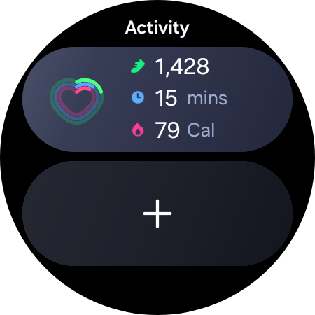
Daily Activity Tile in One UI 8 Watch. The only size option.
Last but certainly not least, I can't stress enough that I don't understand why Samsung gave each new Tile in One UI 8 Watch an oblong shape with a visible background color.
Most old Tiles used to be black (rather transparent on a black background), which helped hide the screen bezel. Even the few Tiles that had a colored background were full-screen, so everything looked well thought out and ordered.
One UI 8 Watch's new Tiles and Tile screens look like Samsung tried to fit oblong pegs into round holes. Quite literally. I mean, sure, you might be able to do it, but it's not the right way to do it. And it doesn't look good while you're at it.
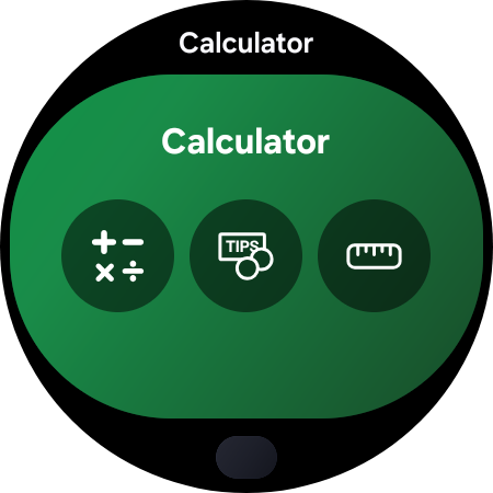
One last niggle, just because this train wreck seems endless: Tile screens can now be named, and by default, they often share the same name as the Tiles themselves. Check out this oblong Calculator Tile on top of this circular Calculator Tile screen.
It's redundant, misshaped, and arguably ugly. And while you can rename/remove the name from the tile screen, it requires unnecessary extra steps when none of this should have been a problem in the first place.
I may be too harsh, but I can't hide the fact that I don't like the direction Samsung pushed this update. While I usually adapt to changes quickly and find things to like about new designs or features, I don't think I'll accept these ones.
To me, these new widget-like Tiles are the biggest change in One UI 8 Watch. And unfortunately, that same biggest change turned out to be the thing I dislike the most, making One UI 8 Watch one of my least favorite updates in recent memory.
Maybe I'll warm up to these new Tiles eventually. Never say never, right? But I doubt it. I'll let you know if I ever have a change of heart.
Author's Note: Are you looking for a holiday gift in the form of a Samsung wearable? Check out our full guide for the 2025 holiday season.

Mihai is a blogger and column writer at SamMobile. His first Samsung phone was an A800 which took a lot of beating, and a part of him still misses the novelty of the clamshell design. In his free time, he enjoys watching shows, documentaries, and stand-up comedy; listening to music, taking walks, and occasionally playing old(er) video games.