Last updated: April 8th, 2016 at 07:34 UTC+02:00
SamMobile has affiliate and sponsored partnerships, we may earn a commission.
Reading time: 5 minutes
After analyzing one of the most anticipated phones of the year, the Galaxy S7 edge, it is time for its smaller sibling. Let us have a look at how the Galaxy S7's display fares.
If you want to know what the graphs in this measurement mean, please refer to this post.
First, the basics. The Galaxy S7 has a 5.1-inch Quad HD Super AMOLED screen. It has a resolution of 1440 x 2560 pixels and a pixel density of approximately 577 PPI. The screen has the exact same pixel layout as the S6 – the infamous Diamond PenTile pixel layout, which you can see in the close-up picture below.
Brightness Levels
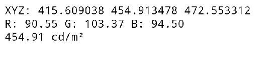
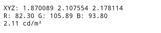
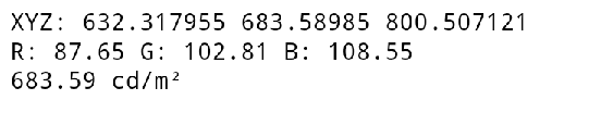
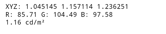
First things first, the screen has a maximum brightness of around 454 cd/m2 (nits) in manual brightness setting, and 683 cd/m2 in auto brightness. At the most dim setting, the screen can go as low as 2.11 cd/m2 in auto brightness mode, and and in manual brightness it can go as dim as 1.16 cd/m2.
What this means is that this is an excellent screen in terms of brightness, and you can read the display easily in bright sunlight while at the same time keep your eyes safe from strain in the dark. Do keep in mind that the phone will only go so bright when there is a really bright source of light falling on the sensor, for example in the sun or something like an LED lamp. In regular lighting conditions the brightness levels will be considerably lower, somewhere in the 500 nits range.
Adaptive Display
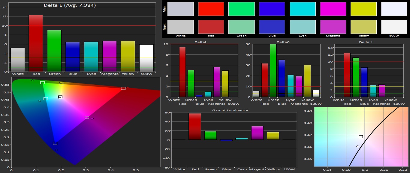
When we look at its color gamut and the colors in the sRGB color space, we can conclude that every color misses its target point and the screen is thus oversaturated (a common theme on AMOLED displays and with this display it isn’t any different). The white point is pretty much off target (which you can see in the graph on the right side below) and is leaning towards the colder side of the colors (the blueish colors). The margin of the displayed primary and secondary colors isn’t that good, with a Delta E error of 7.38 being too high, which is something we see all the time in this screen mode.
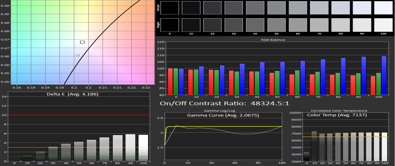
The error of the Grayscale color is not too great at 4.1 and the whites are blueish here as well; that is something manufacturers do to make the whites look more white, especially on AMOLED displays. The contrast ratio, however, is unmeasurable so that is extremely good. Blacks are really black, yet when we get to the lighter colors we see that blueish tint popping out. This is something you can see at the color temperature as well, with a temperature of 7137 being too cold (6509 is the sweet spot).
Basic Mode
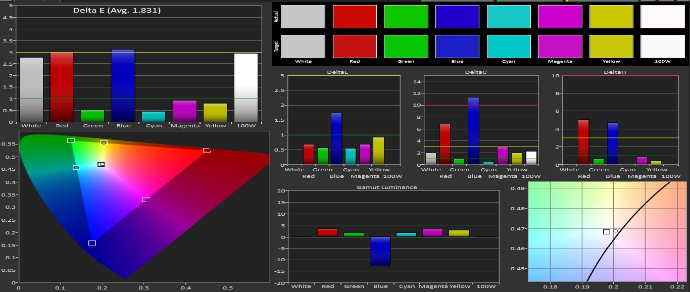
Same old, same old, that’s the case once again with Adaptive mode. We aren’t a big fan of it (not that some of us mind using it), but it can be changed to Basic mode. The basic mode is the closest you can get to a nicely calibrated screen, though the display can look a little dull when you first lay your eyes on this screen mode. In the sRGB color space it scores great as it hits most of the targets, with the margin of the displayed primary and secondary colors having a Delta E error of 1.8 which is extremely good. The white point is just a tad off-center, but nothing to make you worry about.
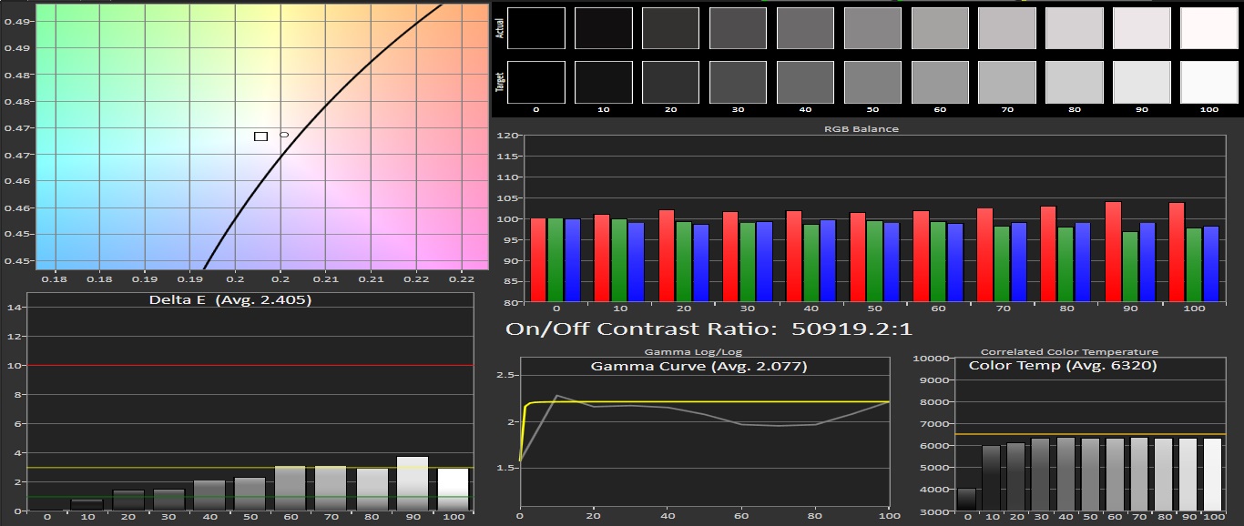
It’s a similar story in grayscale, although it boosts red a little too much which results in a warmer feeling screen and that is something you can see at the color temperature as well. With a color temperature of 6320 it is a lot closer to 6509, which would be the best score. The margin of color error in Grayscale of Delte E 2.4 is good but not better than other Basic Modes we measured; for example the Galaxy A8 had a Delta E of 1.5 in the Grayscale color error.
AMOLED Photo
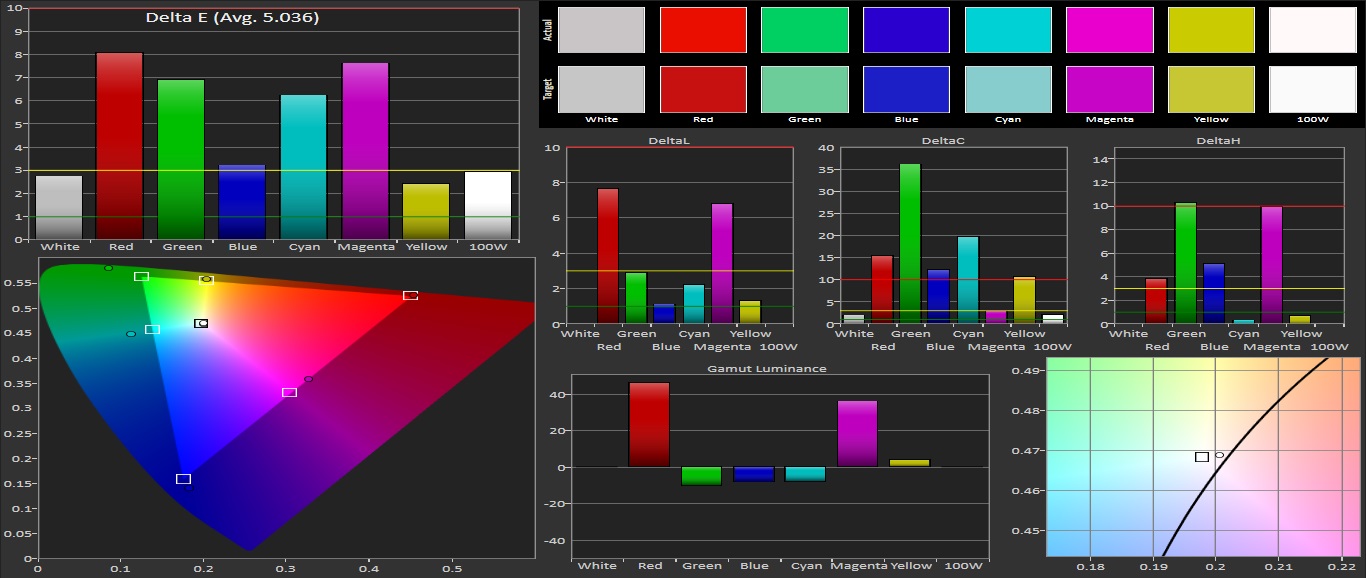
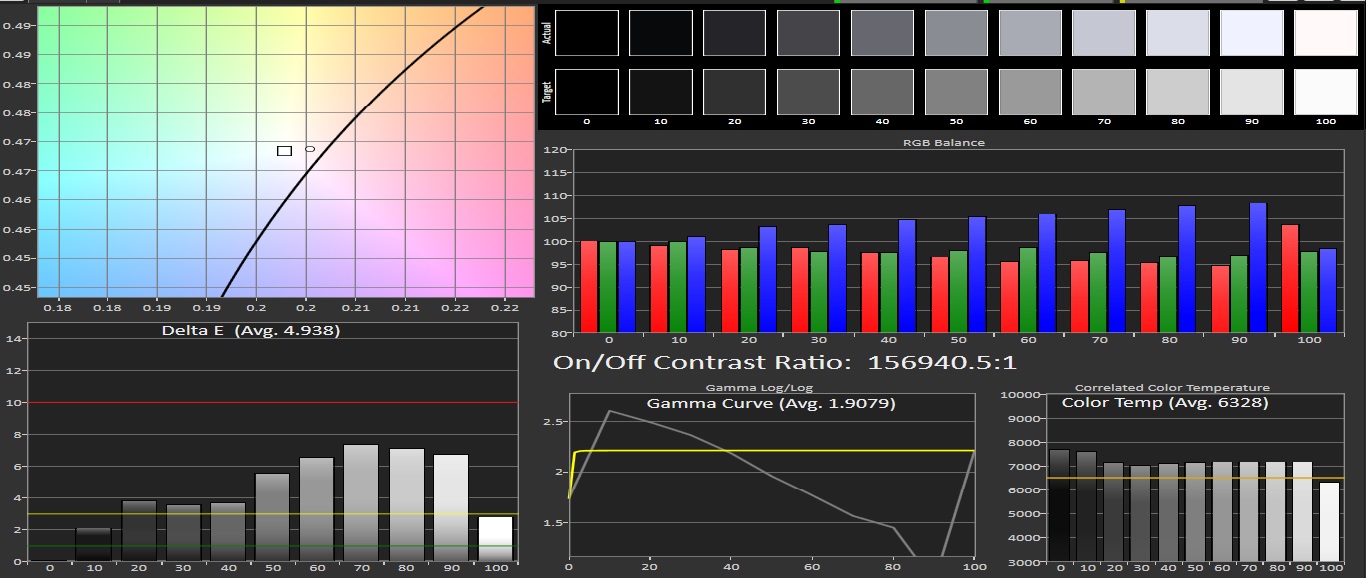
The mode I always use is AMOLED Photo, which gives you the punchiness of Adaptive Display mode without making it feel a bit too much. Both the margin of the display primary and secondary colors and the error of Grayscale color – 5.0 and 4.9 respectively – are acceptable. Color temperature is almost the same as Basic mode, and contrast ratio is just as good as the other modes.
Conclusion
It is funny to see how displays can differ from each other across the same lineup. The Galaxy S7's screen is a little less accurate than the S7 edge's. Of course, even though it differs the S7's display is still better than any other screen on the market. It has extremely good contrast ratio and in the basic mode, its color temperature is almost perfect. Its brightness levels are top-notch, and Samsung has delivered a jewel of a display with the Galaxy S7.