Last updated: October 30th, 2023 at 06:07 UTC+01:00
SamMobile has affiliate and sponsored partnerships, we may earn a commission.
Reading time: 2 minutes

As of now, YouTube Music derives color from the album art and puts it in the background. However, in the latest test, the Now Playing tab has a gradient background that has more color at the top while gradually getting darker as the image goes to the bottom. The color is muted so that it doesn't mix up with the album art itself.
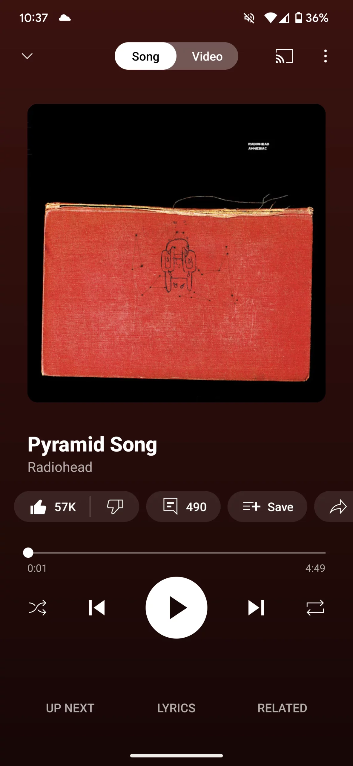
Thanks to the YouTube Music Now Playing tab gradient background, the play/pause, next/back, shuffle and repeat buttons now stand out against the background. That's not the only change that is under testing. Notably, the Up Next, Lyrics, and Related buttons are no longer housed inside a separate section on the bottom. They just now float as simple text and look a bit unclean.
You can still swipe up from the bottom to open up the queue. Although there are multiple user reports about the YouTube Music Now Playing tab gradient background for Android, it doesn't seem to have been widely rolled out yet. Overall, this new redesign seems subtle but brings a new feel to the music streaming app.