Last updated: April 15th, 2026 at 14:04 UTC+02:00
SamMobile has affiliate and sponsored partnerships, we may earn a commission.
It's probably not even by design.
Reading time: 3 minutes
Abhijeet Mishra / SamMobile
I’m not usually one to complain about Samsung apps. In fact, I often prefer them over Google’s alternatives or most third-party options — which is why I regret the looming demise of Samsung Messages.
But not all Samsung apps land the same way. For me, Try Galaxy sits at the bottom of the list, even though Samsung seems particularly fond of it.
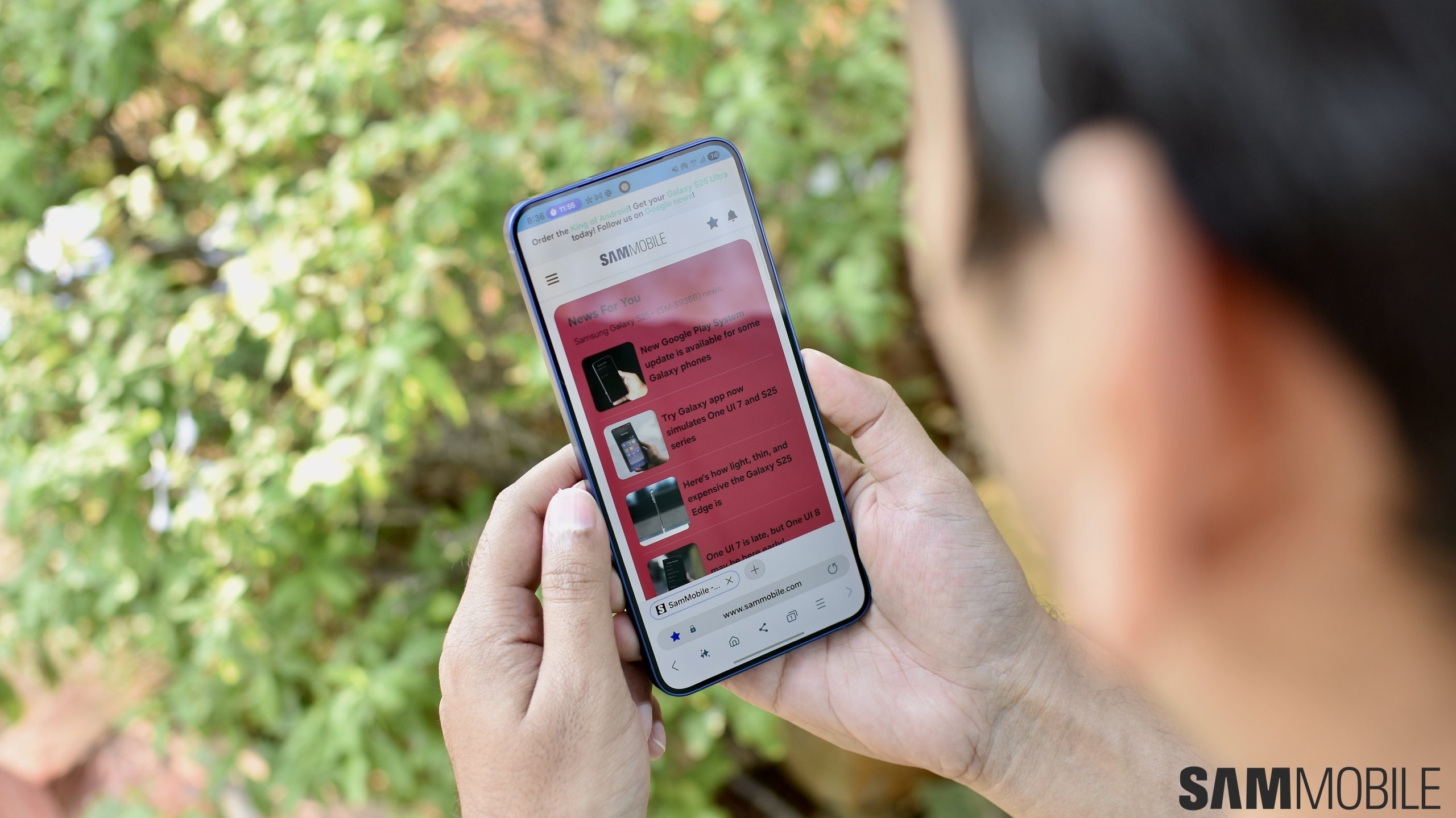
Try Galaxy is meant to simulate One UI and show off the latest Galaxy features to potential phone buyers and iPhone users who are considering switching sides. In theory, it makes sense. In practice, it never really gets there.
From using both One UI and Try Galaxy, I can tell you the difference between the two is obvious. One UI feels like a real, system-level experience, because it is. Try Galaxy feels like a web-based demo running in Chrome, partly made up of short clips designed to showcase new features — again, because that's what it is.
But oddly enough, there is one interaction — a gesture — in Try Galaxy that I actually prefer over One UI. And frustratingly, it feels like something Samsung could and should have implemented properly by now.
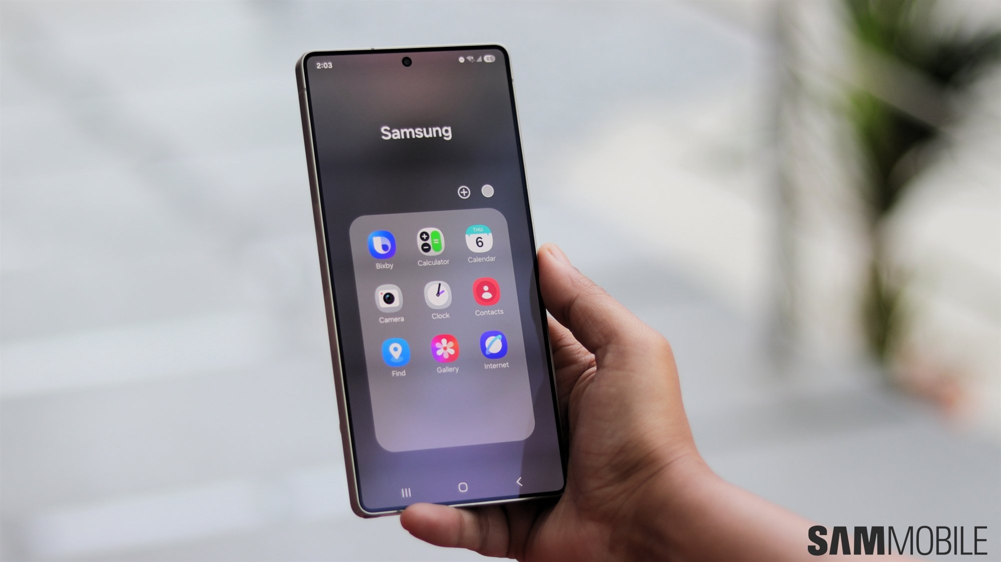
When using the separate Notification and Quick panels in live One UI 7 and later, swiping down on the left side of the status bar opens Notifications, while the right side opens Quick settings. The behavior can be slightly adjusted in Good Lock, but that's the gist of it.
These gestures work well once you get used to them — and maybe after a bit of Quick panel editing to avoid accidentally dragging the brightness and volume sliders whenever you want to switch between the two panels.
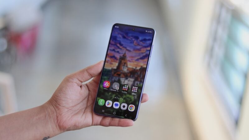
However, this key distinction between swiping down on the left or right side of the status bar exists only for the status bar. On the rest of the live One UI home screen, a swipe down gesture can only act as a shortcut to the Notification panel.
Try Galaxy does it better. You can swipe down anywhere on the simulated home screen, and depending on which half of the home screen you're swiping on, you'll access either the Notification or the Quick panels.
It doesn't sound like much, but it changes how the entire gesture system feels on the home screen. It makes the home screen behave more consistently with the status bar logic in a way One UI currently does not.
And that is the frustrating part. This feels like something One UI should already support. It's something I believe Samsung should have implemented after introducing the split Notification and Quick panels in One UI 7.
Instead, it is Try Galaxy, a web-based demo, that ends up feeling more complete in this one specific interaction. And the irony is hard to ignore. It is probably not even intentional, which makes it worse.
Will Samsung ever update the real One UI to make that home screen gesture distinction? I can only hope. Samsung created Try Galaxy to mirror One UI, but in this case, I wish it would go the other way around. Not something I expected to say, but here we are.

Mihai is a blogger and column writer at SamMobile. His first Samsung phone was an A800 which took a lot of beating, and a part of him still misses the novelty of the clamshell design. In his free time, he enjoys watching shows, documentaries, and stand-up comedy; listening to music, taking walks, and occasionally playing old(er) video games.