Last updated: March 25th, 2015 at 13:56 UTC+01:00
SamMobile has affiliate and sponsored partnerships, we may earn a commission.
Reading time: 2 minutes
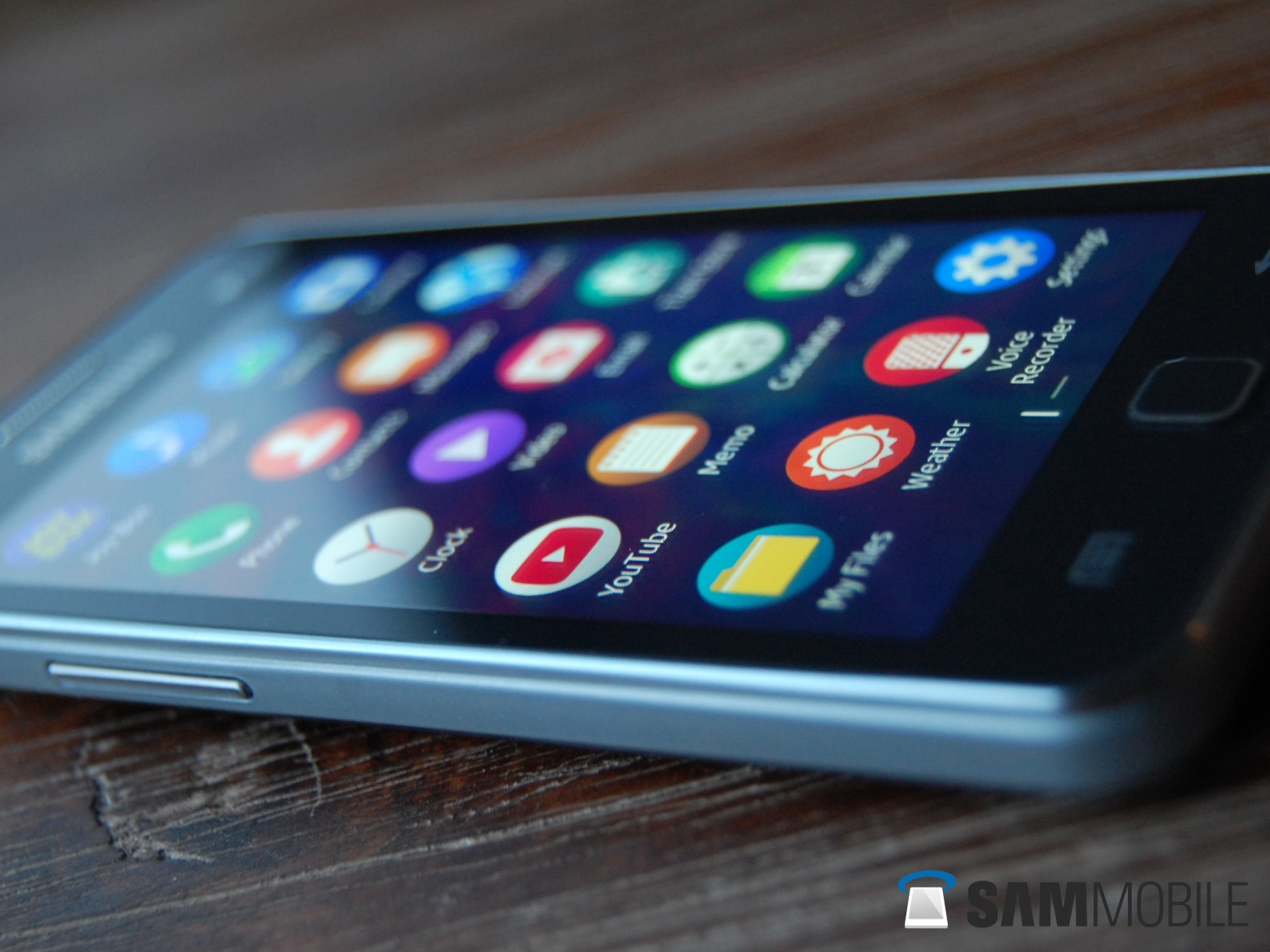
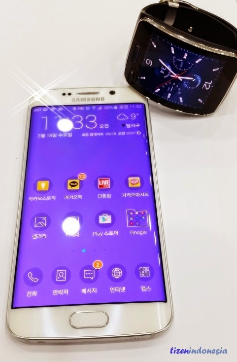
A Tizen source now claims that Samsung’s new TouchWiz UI, which the Korean manufacturer claims is 40% lighter than before, is more inspired by Tizen than Material Design. The reasons for Tizen inspiration involve the bright colors (which don’t necessarily exist in Material Design), the use of round avatars instead of square ones, and the Contacts app (similar to the Tizen contacts app).
While one could claim that these differences also mimic Google’s Material Design makeover, Tizen’s customizable themes that allow you to change the look of your UI setup are a distinction that Material Design does not provide. According to site G for Games, the new TouchWiz’s “wide range of themes with customized icon packs, colors, fonts, keypad designs, and more” show Samsung’s desire to incorporate traces of Tizen on even the company’s latest Android smartphones.
In all honesty, however, Samsung’s been doing this since the arrival of the Galaxy S5. The Galaxy S5, one of the most underrated smartphones of 2014, brought with it a grid settings icon layout that is reminiscent of the new Tizen OS look on the Z1 as well as the new look on the Galaxy S6 and S6 edge. A number of Samsung users may not care for Tizen, but Samsung’s certainly warming them up to it with each new Galaxy smartphone. Take a look at the photos below and judge for yourself.
![]()