Last updated: May 5th, 2014 at 09:56 UTC+02:00
SamMobile has affiliate and sponsored partnerships, we may earn a commission.
Reading time: 2 minutes
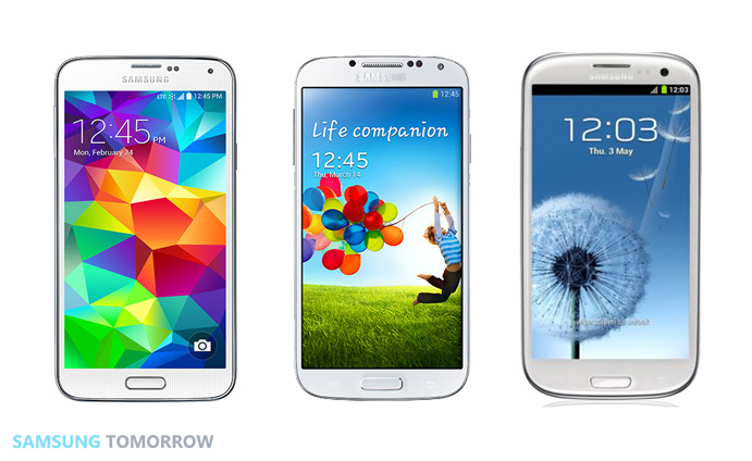
The interface and app icons have also been redesigned to be more simpler and stylish. For example, gone are the 12 hour dots in the clock icon, leaving just the hour, minute and second hands; similarly, the music icon is now a music note inside a circle instead of a play sign inside a circle with the music note at the side. Icons are also rounder and cleaner, though this does make things look a bit odd in some areas, like the notifications area. Also reduced is the number of total apps installed on the device, from 51 on the Note 3 to 40 on the Galaxy S5, something which Samsung did after reading data on what apps its consumers use the most.
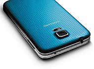
Samsung also details why it went with the band-aid-like look for the back cover, with the design team having “touched hundreds of fabrics in different colors, sizes, and types such as plastic, wood, textiles, glass, and adhesives” before deciding on sheepskin leather with small holes for a more tactile feel in-hand. There's a lot more Samsung talks about, so go ahead and check out the source link for all the details.
![]()

First Samsung device: SGH-D500
Abhijeet's writing career started with guides for custom firmware for Samsung devices (including the original Galaxy S), and he moved to SamMobile in mid-2013 and worked up the ranks to Editor-in-chief. In addition to phones and mobile devices, his interests include gaming on both PC and console, PC hardware, and spending countless hours on YouTube watching videos on tech, movies, games, politics, and internet dramas.